Category Archives: research point

Research point: Pure watercolours vs mixed media

Think about the differences between using pure watercolour and mixed media. If you can, visit a gallery or galleries with both kinds of painting on show and make comparative notes on the differences between the two.

My own experiences during this project

From my own experiences, working purely with watercolour was very different from using mixed media. I had trouble integrating other media at first, because I did not want them to dominate the painting. With some practice, I began to welcome the additional possibilities and even felt that including other media helped to emphasize the particular character of watercolours. I think this was because opaque media like gouache and oil pastels emphasized the transparency and lightness of watercolours. I also enjoyed the contrast between the fine dark ink lines and textures versus the bright colours in the mixed media flower bouquet (second large study with dark background).

In a way, using mixed media is one solution to overcoming limitations of pure watercolour. For example if one wants to paint light colours agains a dark background, this can be achieved using opaque media. It relieves the necessity of meticulous planning of tonal areas and in my case, it helped me to produce more energetic and spontaneous paintings.

Starting from initial dislike and reservations against mixing watercolours with other media, the experience has changed my views. I highly appreciate this!

Looking at other artists

I did a Google search for artists who employ both pure watercolours and mixed media approaches, but did not get very far. There were a few contemporary artists and hobby painters, of which I chose three for a closer look. What I saw was quite in line with how I assessed what I produced in this part – additional media can add an element of interest, for example giving structure by adding linear marks over areas of colour. There’s always a risk of becoming too blunt or illustrative, but of course this is also a matter of taste. I saw quite energetic paintings but this may have been a selection bias and just be the result of what by chance turned up in my Google result list.

Karen Dawson (United states, contemporary)

Karen Dawson seems to always work in mixed media, I found no pure watercolours. I selected two paintings of a series in yellow oil pastel with watercolours.

Street game: This is a nice scene and I think it’s a powerful subject, but I think the painting is somewhat underdeveloped. It is energetic but maybe lacks colour intensity. I guess I’m realizing it because it is something I recognize in some of my own paintings. For example my pineapple painting is similar in this “lack of intensity”. I think my pineapple is more varied with textures than Karen Dawson’s painting, but it also lacks some depth and intensity.

Random: Works with the colour effect of opaque yellow lines against the flowing effect of watercolours. It has more of the qualities I appreciate in watercolours, in particular colour intensity.

Karen Dawson XXXX Street game     Karen Dawson XXXX Random

Kathy Wariner (United States, contemporary, trained artist)

Kathy Wariner 2013 Daisy and red cloverAgain I found no pure watercolours, instead quite energetic watercolour paintings with linear elements that are probably underdrawings executed with charcoal or graphite. I imagine how the paintings would lack structure without the linear elements. The lines have a double effect – they tame the flowing colours, but they are also energetic  in themselves. I think lines and washes work very well together here.

This is something quite inspirational for my own paintings, because so far, I have made underdrawings in hard pencil and lost track of them as I added layers of watercolour. I might be more courageous with integrating my underdrawings in the final painting.

– Daisy and red clover
– Flowers
– Still life with bananas

Kathy Wariner 2013 Flowers     Kathy Wariner 2013 Still life with bananas

Edith Dora Rey (Swiss/Canadian, contemporary, trained artist)

The two paintings I selected are very similar in colour and composition, but only the second one has some linear elements. It’s nice to see how this changes the overall effect into something more edgy. I admire the simplicity of shapes and the intensity of colours. I’d like to have more of this in my own paintings.

– Gravy jug: Pure watercolour
– Salt shaker: Watercolours with line

Edith Dora Rey 2014 Gravy jug     Edith Dora Rey 2014 Salt shaker

For now, I will leave my research at that, but I’m definitely sensitized to application of mixed media with watercolours. With more time, I guess I’ll come across a broader variety of mixed media works and get a more comprehensive understanding of the effects and differences compared to pure watercolour paintings.

References

Karen Dawson http://www.karendawson.com/mixed.htm and http://arugulayumyum.wordpress.com

Kathy Wariner http://kathywariner.wordpress.com/ and http://www.roundaboutmadison.com/InsidePages/ArchivedArticles/2005/0905HCArstCraftsGuild.html

Edith Dora Rey: http://doreyme.blogs.com/

Research point: Examples of mixed media pictures

Look for other examples of mixed media pictures such as Henry Moore’s Pink and Green Sleepers (page 23) which uses wax resist, and John Marin’s The Singer Building (page 145) which uses pencil and charcoal.

Henry Moore 1941 Pink and green sleepers

Pink and Green Sleepers 1941 by Henry Moore OM, CH 1898-1986I came across the series of drawings by Henry Moore (English, 1898 – 1986) to which this drawing belongs during the drawing course. The scenes depict people in the shelters during World War II bombings. This drawing was made using graphite, ink, gouache and wax on paper. It is very sombre in atmosphere and captures the Angst of the times. But there’s also a sense of comfort in seeing the two people in company and protected.

Technically, the watercolours are very pale and stand back, the painting is dominated by the tonality and the textured surfaces created through scratching.

Tate Britain http://www.tate.org.uk/art/artworks/moore-pink-and-green-sleepers-n05713

John Marin 1921 The Singer Building

John Marin 1921 The Singer Building

This painting by John Marin (American, 1870 – 1953) dates from the early Twenties of the 20th century and depicts a building in New York. It is very energetic and loose. The media were watercolour, charcoal, and black conté crayon on wove paper. Interesting is how these elements fall apart and seem to explode with energy. In the same way, the drawing is not tight and accurate, but fragmented and sketchy.

Philadelphia Museum of Art http://www.philamuseum.org/collections/permanent/50636.html

Having looked at the two suggested mixed media works, I was slightly unsure how to continue this research, because “mixed media” is a wide field and I did not know which artists to look at. I wanted to avoid getting back to my usual suspects and therefore did a Google search on the keywords “Mixed media” and “Mixed media painting”. One of the first hits was the website of Kellie Day, a contemporary mixed media artist. I was enchanted and surprised by this chance find as her style is very close to my understanding of mixed media today.

Kellie Day, a contemporary American mixed media artist

I’m including the first paintings I saw as a reminder, because they attracted me to stay on the website and look further into this artist’s work. I find her paintings light, colourful, energetic and very friendly.

Kellie Day XXXX Bike Diptych      Kellie Day XXXX Vino Blanco

Kellie Day XXXX Holy war (female nude)      Kellie Day XXX The sun never says (mountains)

There’s a short video “Peek into my studio” where she presents herself and her methods. She considers herself a mixed media artist and works in various techniques on canvas: Drawing, painting and collage, using multiple transparent and opaque layers of paint and ink. Kellie Day is a trained artist with a background in fine arts and illustration. She works from photos which are displayed on a wide-screen laptop that is placed next to a huge, high working table. This is quite similar to my setting when I work from photos, except that my studio space is tiny, compared to hers, with a much smaller and lower table. What I particularly liked was seeing that she works standing, not sitting at her desk! This confirmed my idea that standing is better when making art, because it is somehow liberating, it permits broader arm movements and helps to let go of fiddling with details.

Then, big surprise, there was actually a painting of sunflowers among her works! It is really beautiful and much lighter than my sunflower paintings so far. It’s a bit like my pencil sunflower sketch translated into paint.

Kellie Day XXXX Your Sweet Ass (Sunflowers)

Pablo Picasso, from the Guitar series (Moma Exhibition)

There were no more interesting hits in that search, so I went back to Pablo Picasso (Spanish, 1881 – 1973) because I remembered that he employed and combined many different media and was very inventive. My Google search turned up a link to an exhibition at the Moma New York in 2011, showing a series of increasingly abstract works around the topic of a guitar.

The works mostly combine drawing, collage and paint on canvas. Although no watercolour was used, I think they are inspiring even 100 years after they have been made. I see the beginnings of cubism in them and I like the composition/decomposition aspect of playing with partly recognizable shapes, adding colour and tone. They also have an element of openness and “breathing space” which my own drawings, paintings and prints often lack.

Picasso 1913 Guitar, Gas Jet, and bottle    Pablo Picasso 1913 Head of a man
Guitar, Glas Jet, and bottle (1913): Oil, charcoal, tinted varnish, and grit on canvas
Head of a man (1913): Cut-and-pasted wallpaper, newspaper and paper, charcoal, ink and pencil on paper mounted on canvas

Moma exhibition website: http://www.moma.org/interactives/exhibitions/2011/picassoguitars//index.php

Further Google search on mixed media did not turn up many interesting other hits so I decided to look into a more serious resource, the Oxford Art Libary and searched for mixed media there. This did not turn up any paintings so I searched for watercolours and from the result list, I selected those which looked like employing watercolours with additional media. One of the first results was a painting by Paul Klee

Paul Klee 1921 Tale à la Hoffman

Paul Klee 1921 Tale a la HoffmannThis painting by Paul Klee (German/Swiss 1879 – 1940) was made using watercolours, pencil and transferred ink on paper. I found this very interesting because I know the technique from the printmaking course. It’s called “Backdrawing” or “Transfer drawing” and is achieved by placing the image on an inked surface and drawing lines on the backside. When the paper is pulled off the inked surface, the lines drawn appear on the face side of the paper, because the ink has transferred due to the drawing pressure. I now recognize that Klee must have used the technique in many of his paintings. The overall impression of this painting is very unique, very characteristic for Klee and very different from any other watercolour artist I’ve seen before.

John Lewis Krimmel c. 1813 Merrymaking at a wayside inn

John Lewis Krimmel ca 1813 Merrymaking at a wayside inn2This picture by John Lewis Krimmel (American/German born 1786-1821) combined watercolour and graphite on white laid paper. To me it is very characteristic for the classical 19th century watercolour illustrative drawing style. Watercolours serve to colorize a drawing, the graphite helps to achieve tonal differences. The graphite does not stand out on its own as separate medium, but serves to give structure to the image.

My approach of using additional media was similar in intention, although my style with watercolours was different.

Honoré Daumier c. 1860-65 The connaisseur

Honoré Daumier ca 1865 The ConnaisseurThis drawing by Honoré Daumier (French, 1808-1879) is similar to that by Krimmel in its subtle combination of watercolour with other media. It used pen and ink, wash, watercolour, lithographic crayon on wove paper.

Concluding remarks

This was quite an interesting research point, although there’s the problem that once started, I could go on and on without any hope of ever covering the field in its entirety, because there’s so much art out there. But I think this brief starter covered several different approaches:

– The illustrative style where watercolour serves as a coloring medium for a drawing. This style was present in the two 19th century works by Krimmel and Daumier, but I’ve also seen it in contemporary illustrations, for example in children’s books
–  A dynamic, loose and sketchy drawing approach like the work of John Marin.
–  More painterly approaches like that employed by Kellie Day
–  Abstract, graphical approaches similar to works by Picasso and Klee

Again I’m rethinking my choice of subject, whether to stay with the sunflowers or to switch to the cats (or even doing something completely different next time). Due to the near impossible of making detailed drawings or paintings of the cats without resigning to photos, the subject might actually help me to let go of accurate depiction and become more adventurous in approach.

On the other hand, the sunflower painting by Kellie Day is like a proof that the mindset is important, not the characteristics of the subject. I’m not sure. Maybe just give it another try with the cats and see what happens. I think my series of sunflowers somehow calls for a change of subject.


Research point: Artists who painted the sea

Before you do this exercise [painting the sea] spend some time researching the work of artists who have painted the sea in different ways and think about their approaches and techniques.

Winslow Homer (North America, 1836-1910)

It seems that Winslow Homer is becoming one of my most favourite watercolour artists… true that I really admire his work. Looking at how he paints the see, I recognize all the qualities I like in watercolour paintings. It’s so colourful and vivid, nothing overworked, and I love the subjects he paints.

Winslow Homer 1897 Canoe in the Rapids: Not actually the sea, but water looks as if it were the sea.

The sponge diver 1898-99: the sea from very close, shape of the body under water
https://www.artrenewal.org/pages/artwork.php?artworkid=31507

The coming storm 1901: very quiet water, darkened in the shade of a huge storm cloud
from http://www.nga.gov/collection/gallery/homerwc/homerwc-55578.html (with date)

Key West, Hauling Anchor, 1903, watercolor over graphite on paper
from http://www.nga.gov/feature/homer/homer26.htm

Winslow Homer 1897 Canoe in the Rapids   Winslow Homer 1898-99 the_sponge_diver Winslow Homer 1901 the-coming-storm   Winslow Homer 1903 Key West, Hauling anchor

Winslow Homer 1899 The Gulf Stream (oil on canvas)The Gulf Stream 1899: It’s oil on canvas and depicts a highly dramatic scene – the man on a small boat in the tormented sea, sharks lurking to get him. There are strong contrasts from very dark, almost black blue, to almost white foam on the wave tops. Looking from close, I can’t help thinking that compared to oil, watercolour is the better medium to capture the fluidity and transparency of actual water, and I find this confirmed in Homer Winslow’s watercolours. Image from http://en.wikipedia.org/wiki/Winslow_Homer

J.M.W. Turner (England, 1775‑1851)

I’m including four examples of watercolour seascapes. I find these very different in style from Winslow Homer. Turner apparently observed particular phenomena – waves, weather conditions – and captured them in a very light and loose style. At first I found these watercolours very unfinished but looking at them a little bit longer, I’m beginning to appreciate the correspondence between the style and the characteristics of the sea – fleeting, always changing, very undefined.

Sea and Sky circa 1813-1818 by Joseph Mallord William Turner 1775-1851   Running Wave in a Cross-Tide: Evening circa 1820-30 by Joseph Mallord William Turner 1775-1851   Sunset over Water circa 1825-7 by Joseph Mallord William Turner 1775-1851   Arch of Clouds over the Sea circa 1840 by Joseph Mallord William Turner 1775-1851

A stormy sea and sky by daylight, c. 1813 https://www.tate.org.uk/art/artworks/turner-a-stormy-sea-and-sky-by-daylight-possibly-a-study-relating-to-the-eddystone-d10256
Running wave in a cross-tide, evening, c. 1820-30 https://www.tate.org.uk/art/artworks/turner-running-wave-in-a-cross-tide-evening-d25433
Sunset over water, c 1825-7 https://www.tate.org.uk/art/artworks/turner-sunset-over-water-d25332
Arch of clous over the sea, c. 1840 https://www.tate.org.uk/art/artworks/turner-arch-of-clouds-over-the-sea-d33671

Other artists, not watercolour

I came across Egon Schiele’s Port of Trieste and was intrigued how the artist’s style of strangely distorted lines that characterize his drawings comes back here in the depiction of the reflections on the water. It really captures the wiggly movement of still water in a port.

Leonid Berman’s painting was interesting because of the viewpoint – a bird’s eye perspective, and I wondered how the artist took up the position. It looks as if it was painted from a balloon slowly moving through the air. What is also interesting are the colours – the blue that switches to turquoise and back to blue, with white foam in between.

Since these two paintings are not watercolours they can’t help on the technique for watercolour, but they are inspiring for their approach the subject and how the artist’s personality shines through.

Egon Schiele 1907 Port of Trieste, Oil & pencil on cardboard
Leonid Berman 1952 Faraduro, Portugal, Oil on canvas

Egon Schiele 1907 Port of Trieste, oil & pencil on cardboard Leonid Berman 1952 Faraduro, Portugal Oil on Canvas

Some more reflections

I will leave it at that for this research point, knowing that there’s a wealth to explore and study, but not being able to devote more time now because coursework has to continue. The water subject has increased my attention since I first read the course materials on it and I began looking out for depictions of water and sea. I guess this will continue and apparently water comes right next to my other favouriste subject, plants and flowers.

Research point: Painting sky

For this research point, I looked at four artists: J.M.W. Turner, John Constable, Winslow Homer and John Singer Sargent. I have already researched them elsewhere and found it interesting to see how they treated the sky in their watercolour paintings.

J.M.W. Turner (English, 1755 – 1851)

Looking at Turner’s sky studies makes me feel less miserable about my own attempts at painting skies! There are brushstrokes, many ambiguities, muddy areas… things I didn’t like seeing in my watercolours. So maybe there’s hope I might improve if I continue to practice…

The skies Turner creates are very atmospheric. It’s interesting to see how he blends the colours wet in wet and they still remain separately visible as blue, yellow, orange and red.

Venice: The Doge's Palace and the Riva degli Schiavoni, from the Bacino 1840 by Joseph Mallord William Turner 1775-1851   A Sunset Sky circa 1825-30 by Joseph Mallord William Turner 1775-1851
Crimson Sunset circa 1825 by Joseph Mallord William Turner 1775-1851   Running Wave in a Cross-Tide: Evening circa 1820-30 by Joseph Mallord William Turner 1775-1851

Venice: The Doge’s Palace and the Riva degli Schiavoni, from the Bacino 1840 https://www.tate.org.uk/art/artworks/turner-venice-the-doges-palace-and-the-riva-degli-schiavoni-from-the-bacino-d32154

A sunset sky c. 1825-30 http://www.tate.org.uk/art/artworks/turner-a-sunset-sky-d25486
Crimson sunset, c. 1825 http://www.tate.org.uk/art/artworks/turner-crimson-sunset-d25331
Running wave in a cross-tide, evening c. 1820-30 http://www.tate.org.uk/art/artworks/turner-running-wave-in-a-cross-tide-evening-d25433

John Constable (English, 1776 – 1837)

John Constable was a direct contemporary of J.M.W. Turner and I see some resemblance in how the sky was treated – with respect to some attempts to make brush mark contours disappear by overworking them with water.

In the study of clouds and trees (1821), the sky looks very fresh and not overworked. By contrast, the other skies look like there’s been considerable effort to create the desired shape from some initial painting. Nevertheless, there is a really dramatic effect from the choice of colour and the strong contrasts within the sky. If Old Sarum and Stonehenge had a clean blue sunday afternoon sky, this would create a completely different and much less dramatic atmosphere.

John Constable 1821 A study of clouds and trees w-o frame      John Constable 1932 A house amongst trees
John Constable 1834 Old Sarum      John Constable 1835 Stonehenge

A study of clouds and trees 1821
A house amongst trees, 1832
Old Sarum, 1834
Stonehenge 1835

all from http://paintwatercolorcreate.blogspot.com/2014/01/constables-watercolor-landscape.html

Winslow Homer (North America, 1836 – 1910)

I’m completely overwhelmed by Winslow Homer’s skies. What I admire is that the brushstrokes are so nicely integrated in the paintings, and also the intense and brilliant colours.

Winslow Homer 1880 Sunset fires   Winslow Homer - Storm, BahamasWinslow Homer 1889 Adirondack Lake   Winslow Homer 1880 Gloucester Sunset
Winslow Homer 1880 Eastern Point Light   Winslow Homer 1880 Sailboat and Fourth of July Fireworks

Sunset Fires, gouache, watercolor, 1880
Storm, Bahamas, watercolor on paper
Adirondack Lake, watercolor, 1889, Museum of Fine Arts, Boston, MA
Gloucester Sunset, watercolor, 1880, Private Collection
Eastern Point Light, watercolor, 1880
Sailboat and Fourth of July Fireworks, watercolor, 1880

All from http://paintwatercolorcreate.blogspot.com/2013/05/picturing-sky-with-watercolors.html and http://paintwatercolorcreate.blogspot.com/2014/05/homers-watercolor-evening.html

John Singer Sargent (North America, 1856 – 1925)

The skies by John Singer Sargent have much more prominent brushstrokes. I don’t know if I were satisfied if I had made them (taking into account that I’m practically always dissatisfied), but looking at them as made by someone else, I do like them and think they work well as a sky. So maybe… just be more friendly with myself? That is, besides practicing a lot which is definitely required!

John Singer Sargent 1905-6 From Jerusalem   John Singer Sargent c. 1900-10 Sky
John Singer Sargent c. 1909-11 Sky and mountains    John Singer Sargent 1897 Clouds

From Jerusalem 1905-6,
Sky c.1900-10
Sky and Mountains c.1909-11
Clouds 1897,

All from http://paintwatercolorcreate.blogspot.com/2013/05/picturing-sky-with-watercolors.html and http://paintwatercolorcreate.blogspot.com/2014/05/homers-watercolor-evening.html

Research point: Landscape depictions

I was quite overwhelmed by this research point. The instructions mentioned 7 or 8 artists from different time periods, and I came across three more contemporary watercolourists. I was curious about them all, so I researched them all… it was a decision between selecting only one or two and digging deeper, or trying to get acquainted with them all, but more superficially. I chose the latter and will include selected works that I found particularly interesting.

Contemporary watercolourists

David Prentice, David Curtis, Trevor Chamberlain
Edward Wesson, Edward Seago, John Yardley

David Prentice (English, 1936 – 2014)

What I found interesting in these watercolours was how the complex landscape was simplified into larger shapes, and how the light was captured. Both paintings I selected are backlit scenes, which accounts for a reduction of detail and dominance of silhouette shapes rather than surface texture. I particularly like the intense colours and would like to adopt some of this in my own watercolour practice.

David Prentice 2007 Black_Hill_below_British_Camp    David Prentice Herefordshire-Lane-Green-July

Black Hill below British Camp (2007) http://en.wikipedia.org/wiki/David_Prentice
Green July, Herfordshire Lane http://www.lemonstreetgallery.co.uk/exhibitionImages/summer-exhibition-2012/Herefordshire-Lane-Green-July.jpg

David Curtis (English, born 1948)

Another contemporary watercolourist, but with a much more detailed approach. I was impressed by how the glaring summer light was captured in these two watercolour paintings. Interesting is also how the amount of detail is balanced from foreground to background. I think the atmosphere of a hot summer day in New York is captured perfectly in the second. The colours are much less intense, I think the main focus on was the extremely bright light.

David Curtis The-main-street-through-Bubinon-Sierra-Nevada    David Curtis Street-corner-Vendor-New-York

Main street through Bubinon, Sierra Nevada
Street corner vendor, New York

Artist home page with gallery of watercolours: http://www.djcurtis.co.uk/david-curtis-watercolours.php

Trevor Chamberlain (English, born 1933)

I found these watercolours very atmospheric. They are less detailed than those of David Curtis and mostly in pale colours, with few hard contrasts. The focus is on tonality here. The rain scene is painted in cooler colours. The harbour scene is in warmer colours which creates the atmosphere of late afternoon on a sunny day. The landscape elements are mostly painted as shapes against a lighter background. Internal details are present in the foreground, but not in the background.

Technically, I think there is a mix of wet-in-wet and wet-on-dry: Wet in wet makes the colours run into another, while wet-on-dry is used to create the more defined shapes.

What I would like to learn is this way of focusing on simple structures and including only the amount of detail that is necessary to create recognizable elements. I realize that I need much more practice in the different watercolour techniques!

Trevor Chamberlain Rowers River Lea    Trevor Chamberlain - (rain scene)

Trevor Chamberlain - (some boats and buildings in the background)    Trevor,Chamberlain River,Arno,Florence

Rowers, River Lea http://www.mineonline.co.uk/trevor_chamberlain_roi_rsma__.php
Umbrellas, Charles Bridge, Prague. http://imageweb-cdn.magnoliasoft.net/bridgeman/supersize/trc115549.jpg
(Boats on a river with Buildings in the background) http://www.wetcanvas.com/Community/images/02-Oct-2004/47691-Chamberlain.jpg
River Arno, Florence http://www.myartprints.co.uk/a/chamberlain-2/riverarnoflorencewconpape.html

I found three more contemporary watercolour artists referenced in a Webforum post: Edward Wesson, Edward Seago, and John Yardley, and decided to follow up.

Edward Wesson (English, 1910 – 1983)

Edward Wesson - London Bridge at dawnThese watercolours are also very atmospheric, buildings included as silhouettes in the London Bridge painting and in brighter colours with more details in the Ostend Harbour scene.

I’m beginning to recognize the watercolour principle: Wet-in-wet is used for tonal gradations, wet-over-dry when clearer lines for details and shapes are needed. Leaving out white areas creates the impression of intense sunlight.

Edward Wesson - Ostend Harbour   Edward Wesson - Waxham beach, Norfolk

London bridge at dawn
Ostend Harbour
Waxham Beach, Norfolk

From Somerset Fine Art collection of works online, http://somersetfineart.co.uk/rw_shop/ShopViewCat.php?&cat=1405&man=867&dx=1&ob=3&rpn=shopviewcat1405&page=2&sid=a8401e87e77e424b41fcf460acb6cf7d&page=1


Edward Seago (English, 1910 – 1974)

The style is again atmospheric with few details. The focal points of the paintings are where contrasts are stronger and details are included.

Edward Seago - Spanish coast, Torremolinos   Edward Seago - Boatyard on the Norfolk Broads

Spanish coast, torremolinos from Portland Gallery – very minimalistic both in colours and detail.

Boatyard on the Norfolk Broads – more details, more contrasts, more colours. The houses and boats are defined shapes in contrast to the loose style used for the landscape elements. The clouds are impressive in this one!

Image collection at Portland Gallery, UK http://www.portlandgallery.com/artist/Edward_Seago

John Yardley (English, born 1933)

Boats at Cadaquez – a harbour scene with boats, houses and hills in the background. Strong contrasts in small elements create a very vivid picture

Winter at Philips House – A house, fields, cows, and snow. I wonder a bit whether the cows would really be outdoors in winter – I know only cows that are kept inside during wintertime! But the watercolour is lovely.

Both watercolours make use of the dry brush technique. This breaks up some otherwise uniform areas of colour and creates the effect of light reflecting on the surface, for example at the edges of the boats and the shadows in the snow.

Again I’m impressed by the simplification of detail and the apparently very fast working style. This is something I’d like to adopt!

John Yardley - Boats at Cadaques    John Yardley - Winter at Philips House

Bourne Gallery, Artist page and online gallery at http://www.bournegallery.com/artist/details.asp?artist_id=101

18th and 19th century

Sandby Brothers, Turner, Girtin

Sandby Brothers: Paul Sandby (1730 – 1809) and Thomas Sandby (1721 – 1798)

These watercolours from the 18th century are very different in style from the contemporary ones. To me they look like colourized drawings and less like paintings. The difference may also be a consequence of different painting materials available at that time.

Paul Sandby was the younger brother. Despite the much more detailed and naïve approach, I see a similarity to contemporary watercolourists in focus on light effects and the attempt to capture mood and atmosphere of a landscape. But the buildings have finer internal structure details, apparently painted slowly and with attention to small elements and exact shadings.

Paul Sandby Iron_Forge_Barmouth_North_Wales   Paul Sandby The Old Welsh Bridge

Rochester, Kent circa 1785-95 by Paul Sandby circa 1730-1809     Paul Sandby c1760 Windsor Castle Northeast terrace

Iron Forge, Barmouth North Wales, http://commons.wikimedia.org/wiki/File:Iron_Forge_Barmouth_N._Wales_by_Paul_Sandby.jpg
The Old Welsh Bridge http://www.darwincountry.org/assets/userfiles/index.php?GetFile=/assets/userfiles/large/sy1496.jpg
Rochester, Kent c. 1785-95 http://www.tate.org.uk/art/artworks/sandby-rochester-kent-t08474
Windsor Castle, Northeast terrace c. 1760 http://pt.wikipedia.org/wiki/Paul_Sandby

Thomas Sandby, the elder brother, was an architect by profession and this is reflected in his watercolours. They focus on accurate depiction of building details, and correct perspective. Landscape elements like trees are stylized, but differently from comtemporaries in that there is much more internal structure.

Thomas Sandby Windsor Castle from the Great Park   Thomas_Sandby_-_Whitehall_Showing_Holbein's_Gate_and_Banqueting_Hall_-_Google_Art_Project

Windsor Castle from the Great Park http://www.vam.ac.uk/__data/assets/image/0004/238549/sandby_windsor_castle.jpg

Whitehall Showing Holbein’s Gate and Banqueting Hall, c. 1760 http://commons.wikimedia.org/wiki/File:Thomas_Sandby_-_Whitehall_Showing_Holbein%27s_Gate_and_Banqueting_Hall_-_Google_Art_Project.jpg

J.M.W. Turner (English, 1775 – 1851)

Turner has the label “romanticism” attached. I think he has a somewhat revolutionary treatment of colour in his watercolours, compared to his contemporaries – loosening up the boundaries given through a detailed underdrawing.

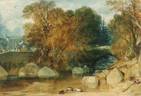
Ivy Bridge is a more conventional depiction of the subject, but a much more painterly approach, compared to the Sandby Brothers’ style. In the Dudley watercolour, showing the effects of industrialization on the Landscape, the use of colour dominates over the drawing and the contrasting colour areas almost seem to explode.

JMW Turner 1813 Ivy-Bridge    JMW Turner c1832 Dudley

Ivy Bridge 1813 http://antonk.com/wp-content/uploads/2012/04/Ivy-Bridge-water-colour-painting-by-J.-M.-W.-Turner-in-1813-trees-river-ducks.jpg

Dudley c1832 http://www.artfund.org/what-to-see/exhibitions/2014/02/14/turner-travels-light-and-landscape-exhibition – depicting the effects of industrialization. In the typical style of turner – no details.

Thomas Girtin (English, 1775 – 1802)

Although born at the same time as Turner, his works look much more conventional and closer in style to the Sandby brothers. But this may also be because he died at young age. Maybe he’d developed very differently with increasing maturity.

I found the two versions of Durham Cathedral very interesting. The earlier one is a drawing with monochrome washes to increase contrasts, the second is a coloured drawing with some looser, more painterly elements in the water and sky. A bit of loosening up the definition given by the drawing is happening.

Thomas Girtin 1799 Framingwell bridge     Thomas Girtin c1800 Durham Cathedral and Castle

Thomas Girtin 1801 Kirkstall Abbey, Yorkshire Kirkstall Abbey, Yorkshire (1801) also looks like a colourized drawing. But although less radical than Turner, I also see the departure from the Sandby’s more illustrative style towards a more painterly use of watercolours.

Framingwell Bridge 1799. http://commons.wikimedia.org/wiki/File:Thomas_Girtin_002.jpg

Durham Cathedral and Castle c1800 http://commons.wikimedia.org/wiki/File:Thomas_Girtin_%28British_-_Durham_Cathedral_and_Castle_-_Google_Art_Project.jpg

Kirkstall Abbey, Yorkshire 1801 http://en.wikipedia.org/wiki/File:Thomas_Girtin_003.jpg


Beginning of the 20th century

John Singer Sargent, John Piper

John Singer Sargent (USA, 1856 -1925)

I already researched John Singer Sargent in a separate article, but haven’t looked particularly at landscape depictions. I love his colourful watercolours.

John Singer Sargent 1917 palmettos-floridaI discovered the Palmettos, Florida (1917), which are not exactly a landscape but they are personally important for me because of the similarity to my agave plants! Great how Sargent played with the green tones. I realize how much more I could have made out of my cuban plants… It may be a question of courage to paint what I see and be more radical in my use of colour and contrast.

All in all, it was quite difficult to find depictions of buildings in landscape in watercolour made by John Singer Sargent! What I found was either landscape/nature or building, not both, or it was made in oil on canvas… The Hills of Galilee c 1906 was one of the few which offer a wide open view over a landscape. I found it interesting to see how Sargent’s style worked with this different subject. The Venetian Canal Scene shows some houses and a more open view than other Venice watercolours. But somehow I find both of them not very characteristic for Sargent’s style, of which I see more in the palmetto watercolour.

John Singer Sargent c 1906 Hills of Galilee     John Singer Sargent venetian-canal-scene

John Singer Sargent 1918 a-wrecked-sugar-refineryThe Wrecked Sugar Refinery (1918) impressed me by the choice of subject. It may have been related to the war, or simply because of changes in the economy of the sugar industry? The painting is difficult to read because elements of comparative size are missing. A sugar refinery must consist of huge steel constructions, but the painting does not have any elements to assess the size of what is depicted, for example some humans or houses. As it is, this could also be a little heap of rusted metal! Nevertheless, I think it’s an extraordinary painting for the use of colour and the unromantic topic.

Two more landscape depictions I found interesting were Corfu (c1909) and Fortress reads and rocks (undated). The Corfu painting has that tree stem going from lighter-than-background to upwards much darker. I encountered this effect in my Assignment 3 watercolour and had great trouble to paint it! Here it actually looks quite simple to achieve… The style is very rough and bold, even more so in the Fortress road and rocks painting. This is quite a departure from the 18th/19th century accuracy in depicting trees and houses in a landscape.

John Singer Sargent Corfu    John Singer Sargent fortress-roads-and-rocks

The 1917 Palmettos, Florida http://uploads3.wikipaintings.org/images/john-singer-sargent/palmettos-florida-1917.jpg
Hills of Galilee c 1906 http://www.wikipaintings.org/en/john-singer-sargent/hills-of-galilee
Venetian Canal Scene http://uploads1.wikipaintings.org/images/john-singer-sargent/venetian-canal-scene.jpg
Wrecked Sugar Refinery (1918) http://uploads1.wikipaintings.org/images/john-singer-sargent/a-wrecked-sugar-refinery-1918.jpg
Corfu c.1909 http://www.jssgallery.org/paintings/corfu.htm
Fortress roads and rocks http://www.wikipaintings.org/en/john-singer-sargent/fortress-roads-and-rocks

John Piper (English, 1903 – 1992)

John Piper’s works are quite distant from typical landscape depictions. I found it difficult to select images because what I found were mixed media paintings with drawn elements, and many prints. So in a way, they are difficult to compare to the more traditional approaches.

The artist had been among the officially designated British war artists, and I recognize an element of darkness which I had found in works of other war artists researched earlier, for example Paul Nash and Eric Ravilious.

I selected four paintings that fall broadly under the heading of landscape to illustrate the modern approach. Slopes of Glyder Fawr (1947) is indeed a landscape, made in watercolour with pen & ink. I still find it radical in its use of colour (all dark) and perspective, with almost no sky left and contrasting horizontal and vertical elements. The Dairy, Fawley Court (1940) depicts a church and some trees, the style apparently influenced by cubism.

John Piper 1947 Slopes of Glyder Fawr, Llyn Adwal, Caernarvonshire, Wales pen, ink & watercolour   The Dairy, Fawley Court 1940 by John Piper 1903-1992

The Whitehorn Priory is another church, but a very different style. It is based on a drawing, but then watercolour is applied in a very patchy manner, making the building and the painting look vibrant and “unfinished” in a positive sense. The Town in the Charente (1957) is a mixed media work, combining watercolour with gouache, ink and wax resist. The style is abstract beyond cubism, with a dark yet vivid pattern of colours, contrasts and shapes.

John Piper Whitehorn Priory    John Piper

What I appreciate is that these works illustrate that is no rule to forbid mixing watercolours with any other media or technique appropriate to convey an idea. This is important for me because when I was thinking about technical approaches to the Cuban Landscape I painted for the Aerial Perspective exercise, I had considered using oil pastels for the Agave plants in the foreground, and for the light effects of the stone fence. This would have permitted a more generous working style for the background, with darker washes which would not overpaint the foreground elements in oil pastels. But then I shyed away, sticking to a more conventional approach, maybe postponing experiments to a later stage.

Slopes of Glyder Fawr, Llyn Adwal, Caernarvonshire, Wales 1947 http://poulwebb.blogspot.com/2012/08/john-piper-part-1.html
The Dairy, Fawley Court 1940 http://poulwebb.blogspot.com/2012/08/john-piper-part-1.html
Whitehorn Priory http://www.portlandgallery.com/artist/John_Piper/item/all/12898/Whitehorn_Priory
Town on the Charente 1957 http://www.olympia-antiques.com/gallery/item/john-piper-ch-lg-town-charente

Concluding remarks

I’m not sure whether I’ve done myself a favour with this research point. Somehow it was too much squeezed in a single research session. It is one thing to look at artists’ works and be inspired, and another to write a text about it. The obligation to write down notes and observations in the learning log switches the focus from internal engagement with a topic to communicating something intelligible about it. Despite these objections, I found the research quite interesting. I only wish I had more time to do everything more thoroughly, both the research part and the writeup part.

I have seen so much that it’s hard to decide where to begin with all the possible improvement and inspirations I came across. Maybe there’s one central theme for me – be more adventurous and experimental, and practice many different approaches. I thought it’s all a matter of practicing to see and depict things, but there’s also the technical aspect of learning the different effects that can be achieved with watercolours.

Research point: Still life

The Still Life genre exists since Roman times and has evolved over time. I selected five paintings from different artists after 1600 to look at developments since the 17th century.

Roelant Savery 1624 Still lifeRoelant Savery’s 1624 Still life seems to exemplify the love of detail of medieval paintings. He depicted 44 different species of animals and 63 species of flowers in a single painting.  There may have been symbolic meanings in his choice of species, but these are not immediately accessible to a 21st century viewer of the painting. Contrasting to still lives from earlier times, there are no direct allusions to religious topics, reflecting the turn of the times to science and humanism.

Anne Vallayer-Coster c1770 Still life with a round bottleAnne Vallayer-Coster, c. 1770, Still life with a round bottle represents a more modern style, still naturalistic but less overburdened with details compared to Savery. Vallayer-Coster was a French painter whose style was very successful in 18th century France. Hers is like an archetypical still life: A selection of ordinary objects, nicely arranged and depicted naturalistically.

Henri Matisse 1910 Still life with GeraniumsHenri Matisse’s 1910 Still life with geraniums shows influences of modern abstraction through the somewhat distorted perspective, beyond directly naturalistic depiction.

Georges Braque 1910 Violin and CandlestickGeorges Braque’s 1910 Violin and Candlestick illustrates the influence of Cubism into the still life genre.

Giorgio Morandi 1956 Natura MortaFinally Giorgio Morandi’s 1956 Natura morta (oil on canvas) painting is entirely focused on tonal values, leaving out problems of colour. The composition serves the particular aim of studying light on objects. The still life as such has no meaning. Where cubism abstracted from object forms and classical composition, Morandi abstracted from colour and any meaning the particular objects might have for those who live with them and use them. This is a stark contrast to still life paintings of earlier ages which were often full of symbolism.

Background/foreground: Savery’s background is a stylized window sill. Similarly, Vallayer-Coster has a neutral but realistic background – just the table and the shades of light on a wall, no objects. Matisse places the actual arrangement in a rich context – a table with a tablecloth, a wooden background, floor planks, pictures in the background. Braque’s cubist still life has no clearly defined foreground/background composition. Morandi’s background is flat and abstract.

Space between objects: Savery’s, Vallaer-Coster’s and Matisse’s spacing between objects seems natural, with Savery’s arrangement a bit stuffed, but filling the entire picture plane. In Braque’s cubist still life the spaces are again beyond traditional understanding of object placement because object boundaries are not clearly defined. Morandi’s composition is a bit strange in that the objects are very close together in the center of the painting, with lots of empty space around them. This space is filled with shadows on the right side, otherwise the relatively large plain area shows subtle tonal variations created through the painting technique.

Sources
– Wikipedia Article: Still life, http://en.wikipedia.org/wiki/Still_life

Research point: Some different approaches to colour theory and painting

I chose two painters of who lived at approximately the same time and looked at how they used colour in different ways: Paul Klee and Piet Mondrian.

Paul Klee

Paul Klee (1979-1940) was a Painter of Swiss-German origin. Originally he was drawing and painting naturalistically but later turned to a more astract approach after a visit to Tunisia. His use of colour is very subtle with soft shadings. He reportedly excelled at drawing and graphic works from an early age on but had great difficulties with colour. Later he became a highly influential colour theorist. The visit to Tunisia in 1914 may have represented a major turning point because it inspired him to explore colour and find a personal approach, which was strongly connected to his musicality.

I chose two paintings which I found particularly interesting, “Black Columns in a Landscape” (1919) and “Tale à la Hoffman” (1921). Both paintings are rather small, around 20×30 cm. They are both watercolours mixed with pen and ink.

Paul Klee 1919 Black Columns in a Landscape

Paul Klee 1921 Tale à la Hoffmann

Klee’s use of colour was not naturalistic. This may have to do with his choice of mostly astract subjects. He seemed to use colour to convey mood and a particular atmosphere. He rarely used intense tones, but obtained relative colour intensity through the contrast to surrounding the more intense tones with paler shades of the same or contrasting colours.

The “Black columns in a landscape” employs more contrasting tones and almost no naturalistic elements, compared to the “Tales à la Hoffmann” with its dominant yellow shades around some small child-like line sketches human figures, stairs, an umbrella etc.
The eye seems to glide gently over the areas of similar tones, then is suddenly blocked by an area in a contrasting colour. The compositions create multiple pathways to wander around in the paintings. Thus for me the paintings are mystically interesting to look at again and again, because they cannot be understood in the same way as a naturalistic painting.

Piet Mondrian

Piet Mondrian 1935 Composition C (No. III) with Red, Yellow and BluePiet Mondrian (1872 – 1944) was a Dutch painter who lived between the Netherlands and Paris, later in London and New York. Mondrian is mostly known for his graphic-style works after 1920, large-scale paintings of coloured squares and rectangles, enclosed by black lines and filled in few basic colours red, blue and yellow.

I chose Piet Mondrian because I remembered his very graphical, bold use of colour, for example “Composition C (No. III) with Red, Yellow and Blue”. I saw this as an extreme contrast in use of colour, compared to paintings of Paul Klee.

Piet Mondrian 1913 Tableau No. 2 - composition No. VIIThrough my research, I realized how both painters were both influenced by cubism. As an example, I include “Tableau No. 2/Composition No. VII, 1913”, Oil on Canvas, which is a line based painting on a background of subtle colour tones and shades. The painting surprised me because I had not expected to see such subtle colouring from what I had previously known about Mondrian.

I was even more surprised when I searched still further back in time and found beautiful naturalistic landscape paintings. In extreme contrast to his later work, colour is here used naturalistically, including intense colours, colour contrasts and related colours. I chose the painting “Small farm on Nistelrode” (1904) to illustrate early works by Mondrian.

Piet Mondrian 1904 Small-farm-on-nistelrode


Sources: Paul Klee

Paintings

  • Black Columns in a Landscape, 1919; Watercolor, pen, and ink on paper , 8 x 10 3/8 in. (20.4 x 26.3 cm), The Berggruen Klee Collection, 1987 (1987.455.1) © 2011 Artists Rights Society (ARS), New York / VG Bild-Kunst, Bonn
  • Tale à la Hoffmann, 1921; Watercolor, pencil, and transferred printing ink on paper, bordered with metallic foil, 12 1/4 x 9 1/2 in. (31.1 x 24.1 cm), The Berggruen Klee Collection, 1984 (1984.315.26) © 2011 Artists Rights Society (ARS), New York / VG Bild-Kunst, Bonn

Web Links

Sources: Piet Mondrian

Paintings

  • Small farm on Nistelrode, 1904, gouache and watercolor on paper, private collection
  • Tableau No. 2 composition No. VII, 1913, oil on canvas, 105 x 114 cm, Solomon R. Guggenheim Museum, New York
  • Composition C (No. III) with Red, Yellow and Blue, 1935, oil on canvas, 56 x 52.2 cm, private collection

Web Links

Research point: Watercolours

This task of this research point was to look at watercolour paintings from different periods and in different styles, to identify different techniques and think about their effect in the picture. It also advises to make a few sketches and notes to record observations, and how I would be able to incorporate the findings into my own practice.

Approaching the task

I felt quite overwhelmed by the task, because I’m new to watercolour and would not really know where to begin. So I first thought about strategies how I might approach the task.

My first idea was to look through the artists included in part 1 of the course materials. I could note their names and research them in the internet, by collecting some biographical information and try to get an overview and impression of their work. Another idea was to look through the book “Watercolour” from the reading list for this course, which I have bought but not yet begun to read. I also thought about trying to find out whether there are exhibitions in Berlin of watercolour artists. Or maybe a museum with important watercolour paintings. I also remembered that there is a small museum in Berlin regularly presenting works of Emil Nolde.

I started by first making a list of artists mentioned in the course material, and also noted a bit of context information. Then I decided that it would be a good idea to first have a look at what could be seen as original work in Berlin. From two German image catalogs I found www.bildindex.de quite helpful because it permitted to search for technique (watercolour) and location (Berlin). I then went through the list searching for interesting watercolours and noted down information about artist and location. I found quite a few located in the National Gallery and the Kupferstichkabinett.

I did not particularly restrict the search and verified that the index is international, but somehow the result list of my search seemed to include only German artists (plus some Swiss and Austrian, I think). Artists which interested me were: Curt Querner, Otto Dix, Ernst Ludwig Kirchner, Paul Klee, George Grosz, Johannes Itten, and Lovis Corinth.

The tricky part came when I wanted to actually see the original works. For some, no information on location was given. Others were located in private collection, thus inaccessible. Most of them were in a Museum, but spread over many different locations and would be difficult to find. The National Gallery consists of 9 Museums, and the catalog provided no information in which of these the images were. The Kupferstichkabinett is open only Monday to Friday during working hours, so I would need to take a day off work for a visit. So I resigned to the feasible option: Looking at Emil Nolde’s works and visiting the current exhibition at the Nolde Foundation.

Emil Nolde

Emil Nolde (1867 – 1956) was a German painter and printmaker, and has been a member of the expressionist group “Die Brücke”. I was lucky because the Emil Nolde Foundation had organized an exhibition which was on its next to last day, titled “From fisherman’s house to Mies van der Rohe”. The exhibition was centered around the architectural plans for a private home of Emil Nolde, planned by architect Mies van der Rohe between 1929 and 1933. Due to biographical events in Emil Nolde’s life, the building has never been realized. The exposition presented some works of the artists and how they related to the places where he lived. For example, there were watercolours depicting his house in Seebüll at the North Sea, close to the Danish Frontier, or paintings he made in the 1920s and 30s when he lived in Berlin.

Many of Emil Nolde’s watercolours and prints have been destroyed during World War II. The exhibition presented a hand-written note mentioning around 2200 watercolours being burnt when his Berlin flat was bombed. The exhibition also presented architectural models of the planned Mies van der Rohe house. Funnily enough, the house was very spacious, but the room called ‘Arbeitszimmer’ (study) didn’t have a window. The exhibition also mentioned ‘respectful discussions’ between Nolde and architect Mies van der Rohe, and I just wondered whether the painter objected against the plans for his study.

The watercolours shown in the exhibitions were very nice, but apparently not impressive as those for which Nolde became renown. There was a museum shop associated which presented art books on Nolde, some focusing on his watercolours and one large and heavy book, seemingly presenting all the major works including oil paintings, watercolours and prints. I was highly impressed by Nolde’s watercolours of flowers. They are very intense and colourful, and very expressive.


In the watercolours presented at the exhibition, Nolde seemed to be using mostly a wet-in-wet technique, which created beautiful colour blendings. Also, he seemed to be working on damp paper. I concluded this from looking closely at a watercolour reproduction of red moon flowers in one of the books. The contours of these flowers were not clear-cut, but a bit fuzzy, and this gave the leaves a very naturalistic touch.

One of the rooms of the exhibition presented landscape watercolours, depicting a renovated fisherman’s house at the countryside where he lived with his wife Ada for several years. Very characteristic for these paintings was the low horizon line, with the house lying quite flat and small, and an impressive sky with colourful cloud formations above the house, which took around 4/5 of the entire sheet. Here’s one which wasn’t included in the exhibition, but which resembles those that I saw.

Making sketches and taking notes

I went to the exhibition with the intention of maybe making some sketches, and took a light A4 sketchbook, pencils and watersoluble colour crayons with me. But I was a bit under time pressure because I had parked my car outside the museum and since the parking fees are quite high in the area, I paid only for one hour speculating that I might stay for half an hour more without a controller passing by and fining me. Nevertheless this created a feeling of pressure and I wasn’t calm enough to sit in front of a painting for a sketch. Maybe this reluctance was also because this is quite new for me. But I did make two drawings in the sketchbook: One of a wooden chair taken from one of Nolde’s homes, and the other of the architectural model of the planned house.

The wooden chair impressed me by the clarity of its design, and it was characteristic for the style of furniture which could be seen on photographs of Nolde’s homes. I thought it was typical for the upcoming Bauhaus movement and I also like the contrast between Nolde’s colourful and lively paintings and the strength and simplicity of the furniture design. Unfortunately the exhibition was on its last day, but I count on more occasions in the future to see Nolde’s works as originals. The Nolde foundation regularly organizes exhibitions, so there’s a high chance.

I also found a pointer to an important exhibition of Nolde’s works in the Oslo National Gallery from 12 October 2012 to 20 January 2013, which I would definitely like to visit.


Some more research on Nolde.

I took a look at Bridgeman education library to see whether they had a more comprehensive overview of Nolde’s works than what I had found so far. Indeed, they present around 250 works, and I selected some to further illustrate the observations I had made in the Nolde exhibition.

For example, here are two more watercolours to illustrate the low horizon line and the impressive colours of the sky in Nolde’s landscapes: Marshland Farmhouse (left) and Friesland farm with clouded sky (right).


The cyclamen may have been the flower watercolour painting where I detected the irregular shapes of the contours. The branch of blossom is another example of the masterly blending of colours in a wet-in-wet technique.


With respect to this research point, I’d take Nolde as a modern artist, and would like to look at artists from earlier times, too.  I think I will select some of those mentioned in the course materials and search for high quality images on the web. This seems to offer access to a broader variety of works than focusing on what I can see as originals in Berlin within the next few days.


Classical/Traditional approaches: John Sell Cotman (1782 – 1842)

I will have a look at the works of John Sell Cotman (1782 – 1842). Cotman lived roughly 100 years earlier than Emil Nolde (1867 – 1956)

Browsing through the Bridgeman library, my attention was captured by the watercolour painting of New Bride, Durham, c. 1805/06. I think I was attracted by the portrait format which I tend to find interesting (and not always the best choice) for landscapes, and also by the colours and good contrasts.

In the course materials, John Sell Cotman’s watercolours were presented in the context of resist techniques, and I wonder whether this painting has been developed using such a technique. I can imagine how the different tones and shapes of the landscape’s elements were developed by applying more and more layers of a resist, then laying washes on top. I think this is due to the very regular colouring, where no brush strokes can be seen. Also, there is not the typical blending of watercolour pigment when applied with a brush to create a form directly, as for example in Emil Nolde’s flower drawings.

The effect of John Sell Cotman’s technique seems to be a more static and calm overall impression – compared to the expressivity of Nolde’s flower watercolours. Interestingly, the tree on top right seems to have been developed without a resist, because the white clouds of the sky shine through that transparent layer.

Another watercolour that I found interesting is titled ‘Brecknock’ (c. 1801), and for the technique ‘watercolour with gum arabic’ is indicated. I experimented with gum arabic in this project but not very successfully, so I’m quite impressed by this painting. During my experiments, I wasn’t able to detect what exactly gum arabic could be used for, and looking at this painting, I still don’t see where and how it was applied. But the overall impression is different from a ‘simple’ watercolour.


Watercolour Painting in Britain, 1750 – 1850

Searching Google for ‘John Sell Cotman gum arabicum’ wasn’t successful with respect to my question, but returned an interesting thematic essay published on the website of the Metropolitan Museum of Art under the title ‘Watercolour Painting in Britain, 1750 – 1850.’

It includes a slideshow which presents some watercolour paintings from important painters, and the examples selected tend to be watercolour over graphite. I chose one by John Robert Cozens (1752 – 1798), ‘View of the Villa Lante on the Janiculum (Gianicolo) in Rome, dated 1782-82. The essay explains that the painting was based on a graphite drawing over which washes of watercolour were laid. Brush strokes were eliminated by blotting.

This seems to correspond well to the aim of depicting the trees further away, where visible brush strokes might have disturbed the intended effect.

I like this very traditional technique of colorizing a graphite drawing and would like to experiment with it. I’m currently doing my first landscape drawings in the context of the drawing 1 course, and find it quite difficult to create enough contrast between adjacent trees using only pencil grey. Adding tones of green to these drawings might well improve the readability of these drawings.

At the same time, I realize that this is an approach quite different from what I saw in Emil Nolde’s works, who worked very spontaneous, rather than planning and meticulously constructing details before applying colour. Similar to the work of John Sell Cotman, the overall impression of this watercolour is quiet and static, where Nolde’s works come across lively and vibrant.

Looking at a contemporary artist: Anna Teasdale

Still in the Bridgeman education library, I looked up Anna Teasdale and selected the ‘Road to Torlisk’ (2008)  for a closer view.

For me this is a very disturbing painting. I had made my selection from a thumbnail sized image result list because I liked the colours. But when looking at the large image, I was quite perplexed how Teasdale painted a forest in watercolour. She gave clearly defined contours to  individual trees, arranging them side by side, all with basically the same shape, and colourized in different blue-green tones. These trees look very artificial, like an army of soldiers waiting for the marching order. It’s a very strange painting. It is very recent, only four years old, and I wonder whether Anna Teasdale has made an artistic development towards this style, compared to the painting presented in the course materials.

And indeed, looking at her earlier work, the style seems to have been much more natural and fluid, for example ‘Near Dervaig’ (2000) or still earlier, ‘Wiltshire pines’ (1989).


By contrast, her recent work seems to be influenced by her painting in acrylic and oil, which is very realistic, massive and solid. Her later watercolour style seems to eliminate the fluidity and chance effects out of the medium, and there’s intriguing resemblance between her watercolour and acrylic/oil paintings. See for example ‘Calgary Woods. Isle of Mull’ (undated), oil on canvas. Unfortunately I wasn’t able to retrieve the creation date of this painting to verify my idea about her development towards more static depiction of the world.

Conclusion

This was a first attempt to get to know some more of the broad spectrum of watercolour styles and techniques. There’s so much more to discover!


References

Bildindex, German art and architecture image catalog
http://www.bildindex.de


— Emil Nolde

Nolde Foundation Berlin, exhibition “From a fisherman’s house to Mies van der Rohe” (Von der Fischerkate zu Mies van der Rohe)
http://www.nolde-stiftung.de/de/32/ausstellung-winter-201112.html

Brücke Museum, Berlin
http://www.bruecke-museum.de/

National Gallery Oslo (Norway) with upcoming Emil Nolde exhibition ‘In search of the authentic’ from 13 October 2012 to 20 January 2013
http://www.nasjonalmuseet.no/en/

Emil Nolde c. 1930 Sonnenblumen, watercolour
http://www.boisseree.com/fr/exhibitions/2009.html

Emil Nolde c. 1935 Sonnenblumen und Rittersporn, watercolour
http://www.kettererkunst.de/kunst/kd/details.php?obnr=112001890&anummer=400

Emil Nolde c. 1940-45 Blumen-Aquarell mit roten Tulpen
http://www.christies.com/lotfinder/drawings-watercolors/emil-nolde-blumen-aquarell-mit-roten-tulpen-5583082-details.aspx

Emil Nolde 1930 Marschlandschaft, Watercolor and India ink drawing
http://www.kettererkunst.com/details-e.php?obnr=101001748&anummer=368

Marshland farmhouse (undated)
http://www.bridgemaneducation.com/ImageView.aspx?result=8&balid=197984

Friesland farm with clouded sky (undated)
http://www.bridgemaneducation.com/ImageView.aspx?result=168&balid=197994

Cyclamen (undated)
http://www.bridgemaneducation.com/ImageView.aspx?result=23&balid=209720

Branch of blossom (undated)
http://www.bridgemaneducation.com/ImageView.aspx?result=75&balid=209721


— John Sell Cotman

New Bride, Durham, c. 1805/06
http://www.bridgemaneducation.com/ImageView.aspx?result=11&balid=155886

Brecknock (c. 1801)
http://www.bridgemaneducation.com/ImageView.aspx?result=53&balid=159498


— Watercolour Painting in Britain, 1750 – 1850

Metropolitan Museum of Art, Watercolour Painting in Britain, 1750 – 1850
http://www.metmuseum.org/toah/hd/bwtr/hd_bwtr.htm


— Anna Teasdale

Road to Torloisk, 2008
http://www.bridgemaneducation.com/ImageView.aspx?result=1&balid=365542

Near Dervaig (2000)
http://www.bridgemaneducation.com/ImageView.aspx?result=4&balid=365544

Wiltshire pines (1989)
http://www.bridgemaneducation.com/ImageView.aspx?result=3&balid=354797

Calgary Woods. Isle of Mull (undated), oil on canvas
http://www.bridgemaneducation.com/ImageView.aspx?result=33&balid=289934