Category Archives: Part IV

Themes and series

I approached this project still unsure which topic might work for a series of five paintings. I felt uncomfortable because over the course of part 5, I hadn’t been able to decide on anything particular. Though I had enjoyed the experimental aspects in the projects, finding a topic had always been complicated. Indeed, I seemed to get along best if there was no neatly defined subject at all and I could simply play with visual effects, for example when I experimented with wax resist.

A recurrent subject are flowers, but somehow I did not feel like developing a series from them. Landscape would have interested me most, but there was the problem of organizing my spare free time and being lucky with the weather. I was also not overly confident about my landscape painting skills.

But I had enrolled to a life drawing class starting in October and this turned out to be so interesting that I wanted to base project 4 and the final assignment on the subject of ‘figure’.

Preparatory work

Approaching the figure subject and first experiments

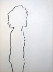
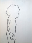
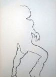
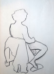
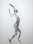
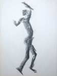
In the first life drawing session, there was a female model and we were instructed to draw short poses (5 minutes). This was my first life drawing class ever in my life and the time restriction made me choose an approach that was very fast, using the flat side of my charcoal piece to capture the main traits of the pose, without details. The drawings were made on 18×24 inch newsprint, which is approximately A2 size.

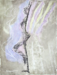
This session inspired my first experiments with the subject and technique. I liked the energy that was conveyed by the broad charcoal marks. I had not used charcoal with watercolours so far because I thought the charcoal would smudge and produce a mess when it comes into contact with water. So I used charcoal first, then spray fixed it, and applied watercolour washes afterwards.

IMG_1180     IMG_1182

These were made in the A3 sketchbook. From the first sheet, I particularly liked the flower shape and how it was based on a play with figure/ground in tone, and I explored this idea further in a second sheet. I liked the bold forms and the strong colour contrast between the dark green background and the soft, fleshy orange of the flowers. It reminded me of Andy Warhol’s screenprints and I made a mental note to rmyself, to research this artist later.

IMG_1184Fascinated by the visual effect of watercolour over charcoal, I made a self portrait (A3 format). But I felt that I was struggling with resemblance and all the effort resulted in a somewhat overworked  drawing.

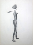
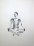
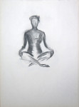
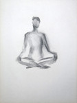
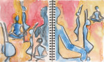
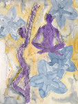
Then I went ahead and worked from selected sketches of the life drawing class to incorporate elements of the figure into a painting. I started with a standing pose and then proceeded to the seated pose, and finally incorporated several poses into a single painting. I used sketchbooks of different sizes and loose watercolour sheets for these experiments with technique, colour and composition. I liked the ideas I was developing, but found it difficult to have only my own sketches to work from, and not a real model.

Trying to develop a focal point – the male figure

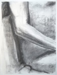
A week later, there was a male model in the life drawing class and we were instructed to do line drawings, initially blind (hence the distortion) and then increasingly “peeking” on the subject to make the representation more accurate. The final task was to make a rendering of an interesting section of the body. I chose the arm and elbow because of an interesting pattern of shadow and light. I had to spray with me and by the time I arrived at home, the drawing had been almost erased, so I reworked that one from memory, then spray fixed it.

I made attempts to develop ideas from these sketches for the watercolour project, but copying my own drawings for the purpose wasn’t interesting and I felt dried out again without a model. Despite feeling engaged with my figure subject, I did not know how I might develop the idea into a concept that would work for a series of five paintings.

IMG_1188     IMG_1185

Clothed figure and working from photos

Addressing the problem of model availability, I found a drop-in drawing class with clothed models and attended. This class had a single pose for 2 hours with breaks every 20 minutes so the model could stretch. I saw no immediate connection to my idea for the assignment, but nevertheless enjoyed the session and the possibility to explore one pose more fully.

I made a charcoal drawing of the upper body, a pencil drawing of the head (here shown in full and  close up), and a final coloured oil pastel drawing, all on 18 x 24 inches paper format. I liked the pencil drawing and felt that I had captured something of the model’s personality – a somewhat rebellious attitude, I think.

IMG_1136      IMG_1139

IMG_1142      IMG_1143

IMG_1191At home, I made an A3 watercolour sketch from my drawings (the one with the red background), but this felt rather pointless, without the model present and nothing particular I wanted to express.

Since the classes where a model was available were only once a week and I wanted to get on with the project, I began searching for online resources that I might use to practice skills and continue working on ideas for the subject. I finally chose 4 black & white nude photographs, two male and two female, for further work.

Starting with the male models, I made a few charcoal sketches of the full figures, head and parts of the torso, focusing on the volume of shapes and accurate representation. I also made a watercolour tonal sketch.

IMG_1173      IMG_1176

IMG_1190

Full figure rendering and final subject choice

The next life drawing class was with the previous male model again, a single pose and the instruction to make a fully worked out rendering of the entire figure. This time I started by making a layer of charcoal on the paper for a medium starting tone, and worked out the figure from that using eraser and chamois cloth for lights and more charcoal for darker tones. The practice from photos came in handy and despite some struggles with getting proportions right and finding the paper size (18×24 inches too small), I like the result overall.

IMG_1145

From this, I developed a concept for the final series. Starting with a similar idea and using the photo of a female model, I stopped the first drawing at a point where I felt I should leave it as open and unfinished as it was. I knew that I could continue and obtain a worked out drawing of the figure, but I liked the unfinished state because it kind of captures the elements of my process: How I had started with laying the background, then drawn in the main outlines quite roughly, and then begun to work out the shapes and give them volume. I also liked that it was the bust and not the face which was worked out because it was a breach of the convention in classical drawing and reflected what I had unadvertedly/unconcsciously perceived as the most relevant aspect of the image.

IMG_1224

I continued with an new sheet, same technique, and completed a fully worked out drawing. I felt ready to approach the final series of five paintings with this subject.

IMG_1194

Brooklyn Museum Workshop, including exhibition visits: Swoon and Judy Chicago

This summer, I participated in a workshop at the Brooklyn Museum entitled ‘Abstraction from Nature’. The workshop encouraged us to engage with two current exhibitions, Swoon’s ‘Submerged Motherlands’ and Judy Chicago’s Early Works. We also went to the Brooklyn Botanical garden for a painting session.

The workshop extended over 8 weeks in July and August 2014 and we met Saturday afternoons for 2 hours. This was the first time I participated in an art making class since starting my studies with OCA. I very much enjoyed being part of a group, looking at other’s works and having a real person instructor who provided immediate feedback and help when we got stuck. Important was not only the individual feedback, but also listening to feedback others received and also the interactions among participants. I became aware what I was missing as a solitary student in distance education, which was not sufficiently compensated for through online interaction and written tutor feedback on assignments.

That said, I highly appreciate the possibility to study via distance education, but I more and more realize that I need to complement this with real-world interaction.

Starting out: Swoon’s ‘Submerged Motherlands’

In the first session, we went to the exhibition with the instruction to take some time for looking and then draw some elements with recognizable shapes from the installation. The task was not easy because of the sheer dimension of the installation. The photos can hardly convey how huge it was – the people on the lower left of the photo give an indication.

arts-swoon-submerged-motherlands

Students chose a wide variety of subjects. I opted for “easy shapes”, taking the instructions literally, whereas others ventured to draw sections of the huge tree or the upper lace-like parts of this monumental sculpture.

Later back in the studio we were supposed to work over the drawings using ink washes that should include different tonal values. We were told to cut these shapes out and later mount them on cardboard to include them in a three-dimensional group work, but this idea wasn’t actually followed up and so this session just served as a warm-up.

P1070973     P1070975

Painting from nature

In the next session, we went to the Brooklyn Botanical Garden, which is just around the corner of the museum. Equipped with watercolours, we were advised to walk around a bit and then sketch out a landscape view we liked. As a second step, we should develop it further as a watercolour painting.

I painted a scene that included some stone benches and a view towards a pathway and some trees. I liked how the sunlight came through the trees and illuminated them. I also made a photograph of the scene, but the painting was made directly on location.

P1080027    Session-2---IMG_0064-1500x

Developing the abstraction idea

The instructor’s ideas for our workshop became somewhat clearer to me when he outlined them again. He wanted us to develop something that extended from the original painting space into all directions, thus creating a three-dimensional work. His suggestion was to take shapes from our painting and repeat these as simplified forms, cut them out, mount them on cardboard and then compose a layered, three-dimensional image.

IMG_0258The next several sessions were devoted to working this out. Initially, it was all very vague to make sense of this abstract instruction, but then the idea took off in participants’ minds and we mutually inspired us to interesting creations.

I worked on shapes to complete the elements that had been cropped at the edges of the original painting: A large and a smaller tree, a fence, a bush, and three stone benches. The painting itself was mounted on a large black cardboard. Another cardboard was attached at the bottom in a 90° angl to provide support for a construction to attach the mounted shapes.

This was the arrangement I wanted to retain. The next step was to build the backside construction to keep the shapes at different distances from the background.

Judy Chicago – Early works

Towards the end of the workshop, we all went to the Judy Chicago exhibition, showing some of her early works. This was a very irritating experience for me, probably because I had never before studied an overtly “feminist” artist or works from the late sixties/early seventies feminist movement.

Judy Chicago 1974 Female Rejection Drawing #3I had real difficulty relating to the works, finding them cold and polished. Somehow they were emotionally inaccessible to me. My attitude changed while I wandered through the second exhibition room and took a closer look at the “Female rejection drawing #3” (1974) with its handwritten notes below. The notes thematized Judy Chicago’s image of self and her experiences with others – her fears of rejection in close relationships and the difficulty of coming out as a lesbian woman in a feminist context. From then on her drawings and sculptures began to make sense to me as expressions of her personality. But a strange gut feeling remained and I was not able to like her works.

It is also difficutl to say in what ways might have an impact on subsequent work for the workshop or OCA courswork. I do remember that I was impressed by the psychological effect the exhibition visit had on me – it felt like stomach turned upside down and I needed some time to get back to normal.

Completing the installations

The remainder of the workshop sessions was devoted to finalizing our constructions. The shapes were attached using cardboard as distance holders and with several layers at different distances there was quite some fiddling with the cardboard and glue until the whole thing became sufficiently sturdy.

Zen Browne, our instructor, began attaching the finished works onto a wall for us to look at and the more that were added, the more we became impressed with what we as a group had accomplished. Starting out with a vague idea, the resulting installation was colourful and every work was different and particular.

IMG_0260   IMG_0264

IMG_1246In the final session, we could either make last touches on the work or make a painting inspired by it. I made a watercolour painting that took up the visual effect of the black cardboard background and the shapes that extended beyond it.

Overall, I think the workshop was an enormous enrichment. I loved how it was ‘un-academic’ in approach, just designed to have fun and enjoy ourselves while doing something creative. I felt that I loosened up in my application of watercolours and got more confident to try out new things and follow up ideas. It encouraged me to add real-life events and meeding people to my practice of art making. It is all a bit difficult when working full-time, but I think the benefits absolutely outweigh the additional investment in fees and time.

Exhibition at the Brooklyn Museum

I was thrilled about the announcement that our works would be included in the museum’s Educational Department exhibition, starting in September 2014 and staying on display until around January 2015. I went to the exhibition opening and was approached by one of the staff members to explain the workshop’s idea to one of the visitors, a young girl. That was about the first time that I was questioned in person about some artwork I had done, an interesting experience!

IMG_0812   IMG_0819

Resources

Swoon exhibition pictures from http://www.clawclaw.com/2014/08/swooning-over-swoons-submerged-motherlands/ and http://www.life-creative-collective.co.uk/swoon/

Brooklyn museum, educational program: http://www.brooklynmuseum.org/education/

Swoon Exhibition, Brooklyn Museum: http://www.brooklynmuseum.org/exhibitions/swoon/

Judy Chicago exhibition: http://www.brooklynmuseum.org/exhibitions/judy_chicago_los_angeles/

Tutor report: Assignment 4

Overall Comments

Hello Patricia, I’ve spent time reading through your blog in detail for this assignment feedback. I can see you have explored ideas and approaches suggested by the course and that you are constantly questioning and reflecting on your progress. I think you have made considerable progress in this section but also appreciate, from your log, that it is not necessarily the sort of progress you had hoped for. I will comment on your assignment piece and some of the individual pieces below, and will attempt to address some of the points you have raised.

Assignment potential (after Assignments 2 and 4)

I understand your aim is to go for the Painting Degree and that you plan to submit your work for assessment at the end of this course. From the work you have shown in this assignment, and providing you commit yourself to the course, I suggest that you are likely to be successful in the assessment.

Feedback on assignment 4. Landscape painting from mixed sources.

This assignment requires you to work on paper that is A3 or larger. Compose a landscape that includes 3 of the following 8 aspects of landscape.

  • Linear or aerial perspective
  • Sky and or water
  • Trees or rocks
  • Animals or human figures

Prep work.

You have explored several of the elements above in your prep work for this assignment. I was a little disappointed at first to think that you were going to do an assignment piece based on a photo and a mobile phone photo at that and in fact your final piece is based on the mobile phone photo. If working from photos, I would recommend you take several photos from different angles, using the benefit of the camera to quickly frame and explore different compositions. Also do close up photographs of different elements, textures, changing light and changing positions of people. You would take 30 or 40 photos of different aspects of this setting and then print several off, enlarged to work with, pin them up on your wall and use them and onsite sketches to work from. You may have done this and if you have I would recommend that you print off and put the photos and sketches in to your sketch book along with any notes , ready to submit for your final assessment at the end of the course.

I was relieved to read in your blog that you had already visited this garden and done sketch work there at an earlier date and that you also, after making a start on the prep work, revisited the location. This gave you an opportunity to explore several aspects in more detail such as the linear perspective, and to some degree, aerial perspective with your study of the daffodils in the foreground, and also the qualities and techniques involved in painting moving water. Whilst your onsite work afforded you the opportunity to consider executing the final scene from different angle you chose to stick  with the initial composition for your final piece and this is a strong composition.

Interesting prep work pieces are P1080029, which shows an understanding of the structure of the piece and P1080051. This is the most fluid and painterly version of the piece. The way you have had the confidence to suggest rather than painstakingly render detail gives a lovely freshness to the sketch. The actual qualities of the water colour medium come through in the larger blocks of colour and the way the two people are just about recognizable is more intriguing than seeing two detailed and described figures. The use of pencil lines in the mid ground and in some of the foreground (this could have worked well on the individual leaves of the daffodils to create aerial perspective, ) and yet none in the background emphasizes to some extent the aerial perspective. In this piece ideas and lots of different elements are starting to come together. I am aware that you have had to overcome some of the difficulties associated with painting outside and appreciate that feeling uncomfortable is not entirely conducive to creativity! However, it looks like the pencil sketches must have taken a considerable amount of time and I think you would have benefited from doing quick watercolour sketches, on even a small scale, with a travel watercolour set. You do note that you feel work done onsite is more spontaneous and has a different quality to it. You are doing well at gradually building your confidence in this area.

Final painting

This is an accomplished piece in many ways Patricia. It’s a complex scene with several different factors to bring together to give a coherent whole and I feel you have done this successfully. Technically you have covered all of the requirements set out for this assignment to a good standard. What I feel it does lack is energy, emotion or atmosphere.

I looked back to the work of yours that I thought had a real atmosphere about it , the interior apartments, the basket chairs and the colour and tone work you did in part 2, in order to draw your attention to the difference between that work and your assignment 4 piece, and that is how I came across the gallery Terraces work .

Terrace view I, II, III, III sketch 2 – . This work is excellent. I am sorry to say I didn’t see this last time. I didn’t realise I needed to look at the gallery as well as the blog. So I apologise for that and also the fact that I made a comment in your sketch book section saying it’s hard to get an idea of your sketch book work, that is still true to some extent but this work fills in some of the gaps for me. (I am just wondering how we can be certain that the assessors see all of this work as they will have less time than I do to get an overview. I think it will be important to send all of this work in, in sketch books for assessment.) These are wonderful pieces. Most of the gallery work I have seen, but there are some real gems here that I have not. I have to be up front and say that obviously at this stage , there is also the matter of taste to consider. I love work that looks quite frail and at times vulnerable. That is a personal preference, but I think some of the Terrace (and trees in central park) work really has a special quality to it.

Terrace view ii sketch 2 and terrace view II both have depth of field, aerial and linear perspective, beautiful fluidity of the medium, and lots of expression in them, they are similar to the watercolour sketch for ass4 that I commented on above. They are in my opinion accomplished watercolours and your job now is to recognize that and when editing through your work to make sure you recognize the qualities. What are your thoughts about these paintings in particular?

When you look at them in comparison to your final Ass. 4 piece which qualities do you prefer or not?

Feedback on other work in this section .

1st Ave sketch in felt pen, despite lack of varying pen thickness this is a great drawing. Life energy and a vibrancy to it.

View on 1st ave, watercolour also a great painting with lots of energy.

Out of the two Brooklyn Bridges I prefer the less defined.

Think about why you are drawing these views. Is there anything in particular that draws you to them? Is it because they are more private and you are less likely to be disturbed and this in itself is an interesting parameter for where you find yourself. In terms of a context for your work, think about this aspect. You are on roofs, under bridges, there are no people visible. What does this say about you too, as a person and an artist.

The skies are beautifully simple and effective.

The clouds paintings are very good. They are all beautifully rendered and it’s hard to pick one above the others but 10 is particularly simple and effective. You don’t seem to have translated this same style or approach in to your sky dominated landscapes. I wonder what the reason for this was?

Painting water. 2 and 11 jump out at me. 2 because of its simplicity and the evidence of the brush strokes adds to the energy of the painting. 11 has a life to it and the moving water is captured again with energy, and this is a strong composition.

Overall your pencil sketch work needs to have a much wider range of tones in it. It is all the same tone and this then translates in to the final pieces if you work from sketches. I think you would still benefit from doing much quicker and more spontaneous sketches just to develop your vocabulary of mark making.

The final human figure in the landscape, the picnic painting is very strong. It’s a more detailed style than your most accomplished pieces before but in this one you have captured a quality of light that brings vibrancy to the painting and the content of the painting suggests a narrative of some sort. The earlier human figure sketches have an energy about them too, good work.

Strawberries 1, lovely composition, depth of colour, beautiful manipulation of the media, a frailty to the painting which all add to its overall impact.

Cuba sketches, less evocative when they get tighter.

Sketchbooks

See comments above. Regarding pencil drawings and sketch work evidence required for final submission.

Learning Logs or Blogs/Critical essays

You have reflected well on your approach to watercolour painting in this entry. You are also starting to think about how you might develop your work after the course as well as considering how what you’d hoped to get from the course has matched up with reality and you are contemplating how the course might be falling short for you in this respect.

There is less research and reflection on individual artists in this section but you have approached this thorougly in previous sections. In part 4 you are more concerned with the idea of what is abstract and that is a very good line of research to develop. In terms of studying the painintg degree it may well be something that you contemplate time and again.

I notice you mention style and how to develop your style in your log and that you also feel restrained creatively at times by the project briefs. I can understand and empathise with this. The water colour course is conventional in its approach. Hopefully part five will allow you a little more creative freedom and I think you will find that if you continue with the degree level 2 painting courses also allow more freedom in this respect. I think you can also do a more experimental level one theory course which encompasses several of the arts ‘The Creative Arts Today’  as part of your painting degree. It is largely theory based but does allow for some development of contemporary knowledge which can feed in to your practical approach on later courses. Taking for example your approach to landscape painting, or painting outdoors. You could choose to paint specific sorts of landscapes because the appeal to you in a conceptual way, a political way, an emotional way or a way that comments on the society around you. Think about these isuues when you are feeling restrained and see if they can add more to the purpose of the work for you so that it’s not just going through the motions of techniques.

Suggested reading/viewing

I’m going to take onboard your learning log comments not to overload you with input. What I want to try and do here is give you references to two or three artists who’s work may broaden your experience of what an accomplished watercolour painting is allowed to look like. And I hope that by seeing their work you might feel more confident to develop your own work in a direction that I can see you already have ability.  The artists’ whose work you admire doesn’t always match with what your own style might be so this is something to be aware of.

Here’s an interesting blog to sign up to and this post on watercolour is a good place to start. http://makingamark.blogspot.co.uk/2013/03/exhibition-review-rws-contemporary-watercolour-2013.html

I notice the Christine Berrington piece may be of interest to you style wise. Her website is down at the moment but it may worth looking out for it. The work of hers that is available to see on line is illlusrartion based, which is very different from the onus of the Painting Degree, however from a watercolour point of view it is worth looking at her illustration work of trees and parks in order to get an idea of how she uses greens and intensity in the greens to capture depth of field. Other wise much of this work is a little too graphic for the purposes of fine art.

Another interesting take on watercolour from last century.

http://www.tate.org.uk/art/artworks/moynihan-dead-tree-at-nigadoo-lake-t06840

Also have a look at the work of Naiza Khan. For the style as much as the political content as I know you have touched briefly on this in your last log (politics ) and it doesn’t play a part as such in your own work.

http://www.naizakhan.com/gallery/shifting-ground/#!prettyPhoto[shifting-ground]/5/

You are signed up for the painting degree and whilst much of this level one course is about introducing you to some of the basic techniques in watercolour, you are also at a stage now where it would be good to start thinking about the content and context of your work as well as the style. Your uniqueness will come from a combination of content context and style. It can take a very long time to develop your own style but being aware of the changes in your work is a good starting point on the journey.

Pointers for the next assignment.

  • Reflect on the different approaches you have taken to watercolour over the course so far and consider which you feel most comfortable with.
  • In your log and sketch book start to consider context in your work and how you approach the set projects in a way that is personal to you.
  • Develop pencil sketch work tonally (think back to the drawing exercises in drawing 1, and the left hand work etc too)  and consider how using that as prep work translates in to your painting style.
  • On this final section be brave, make mistakes, push yourself and have fun.


Assignment 4: Landscape painting

I had considered going outside to find a nice motif for the assignment… but again reverted to photos, for practical reasons: Availability, the possibility to plan my painting and study times – and not being subjected to weather hazards. Summer in New York is typically hot and muggy and it’s not very pleasant to stay outside.

2014 LG Android IMG072So I went through my photos and found one which I made this spring, using a mobile phone. It depicts the midtown mini-park associated to a synagoge. It’s close to my workplace and I sometimes go there for lunch. It features a high, terrassed waterfall, a magnolia tree, walls covered with ivy, and flower plants changing in the seasons. I found this photo to be a little gem because of the young couple sitting by the water, giving the scene something very lively.

The scene comprised several of the features we were supposed to include in the assignment: Human figures, trees, rocks, water, and linear perspective. So I decided to have a go.

The couple

P1080031The first element I studied was the couple, using pencil in my sketchbook. The first attempt was a little smallish, the second try below the first worked out better. I found it difficult to capture the essential marks in the face of the young man, but was surprised that I managed to convey the asian character of the girl by the form of her cheeks.

I used an enlarged view of the photo and drew right off the computer screen


The greenery

The second element I liked a lot were the yellow daffodils to the lower left. I saw them as contoured blue-green leaf shapes with curly yellow flower buds in between, before a darker background from the shady root area of other plants. I found this visual pattern quite typical and studied it using coloured pencils and wash.

I also studied the magnolia which was just beginning to flower, with thin green and large white flower buds. The challenge here was the light stem before the dark background, and keeping some white for the flowers when darkening the tones.

P1080034      P1080036

P1080044I realized that I had to practice in watercolour as well, to tackle the problems with that medium too. So I made a third close up, choosing the dark green conifer on the mid-ground roof top. I included the surrounding buildings as context. I liked this one because I felt that my use of the brush, laid flat to the side, began to work for the depiction of the plant. I liked how the lighter and darker green tones worked together within the branches. I also liked the quality of the washes I produced for the surrounding buildings and walls.


Sketching the waterfall

P1070024 I found the waterfall the most difficult and challenging element of the scene. I had made a first drawing of this waterfall about 8 months ago, on location, while working on part 3 (painting outside, http://ocawatercolour1.patricia-karsten.de/?p=741). The waterfall is quite fascinating to watch, with the water falling down over the stones which form little terrasses. The water masses also make an incredible noise.

P1080046I had the idea of using wax or oil pastels as a resist to reserve white space for the foam on the water, and tried this out in the A4 watercolour sketchbook. The wax crayons were too thin to work as a resist, so I added a layer of oil pastels before applying more paint. The effect was not as clear as I intended and I wasn’t sure whether I’d want to use this technique for the final painting.

I decided to make some more pencil drawings to study the tonal values of the rocks and the falling water, and went on location several times over the next days. The two portrait format drawings were made on location, the landscape format was worked out from a section of my selected photo.

P1080040These drawings are more refined than the earlier one in black ball pen, including more tonal variation but lacking a bit of contrast. I was focusing on depicting the moving water and think the drawings made on location better capture the water’s energy and flow.

It may have to do with the different size dimensions – working in front of the real, large-sized object versus working from a small computer screen. But it may also be due to the richer sensual impact on location – looking at a real, three-dimensional moving object is different from looking at a two-dimensional photo snapshot.

P1080038      P1080042

P1080048On a third occasion, I made a watercolour sketch of the waterfall on location. The format is roughly A3 (34 x 24 cm). It was a novel experience – having my watercolour box and a glass of water with me, and painting in public. But the little park is quite protected and it was early evening so less people around, and I managed to concentrate and not feel overly self-conscious. I quite like the result, as it’s light and fresh.


Tackling the entire scene

P1080050After having studied the main elements by themselves, I wanted to see how the entire composition would work together. I knew I’d have to work quite large to have the space for details. The first attempt was roughly A3 size (38 x 28 cm). I used watersoluble wax crayons, a box of 12, which is actually a nice medium because it permits to start with a drawing and then work over with water to achieve denser colours, as in a watercolour painting.

A difficulty is the restricted palette and that using black to darken the values smudges all colours, even if applied only in traces. So I used purple and brown for the darker tones and was very reluctant to work towards the muted colours of my photo source. As a result this piece has a slightly psychedelic colouring.

But I liked how the elements came together on the page and decided to begin with the final piece. I chose the largest format I have – 60 x 45 cm (18 x 24 inches watercolour pad), and made a fairly detailed pencil drawing, trying to get the linear perspective right and the shapes and lines of various elements. I made a break before proceeding to painting with watercolours due to other commitments.

To loosen up a bit, I wanted to make a quick watercolour sketch in large format before tackling the final painting. Inspired from a technique used in the Summer Painting Workshop at the Brooklyn Museum, I chose a charcoal pencil to draw some outlines, then applied generous washes for the main elements of the painting. I tried to work out the greenery and the water without getting too much into detail work.

I wasn’t really satisfied with how I depicted the plants in the foreground. I felt that I had made too many brush strokes, rather than setting those significant ones for the shapes that defined the contours of the daffodil leaves. But overall I fairly liked the approach and the resulting painting.

P1080029      P1080051

The final piece: Townscape with waterfall

Then finally I got to the large painting. I worked approximately 8 hours on this one. I tried hard to get the tonal values right without painting too many layers. Already by its size, I find the painting quite impressive (60 x 45 cm). I have somewhat mixed feelings with this painting. On the one hand, I realize that I made quite some technical progress, for example in the depiction of plants. On the other hand, I think there is not enough room for the fluency and chance effects of watercolour as a medium. But I managed to retain some transparency and I won’t work over it any further. May future pieces bring more progress!

P1080054

Assessment of my learning (Guided reflections)

Looking at my work for Part 3 (Painting outside) and Part 4 (Landscape painting), I feel I’ve come quite a long way. I feel more confident with the medium and made technical progress in many ways. Deliberate study of landscape elements in part 4 permitted to focus on particular difficulties and I think the effect is visible.

I think my biggest step forward occurred while painting skies and clouds. I had a real lightbulb moment in the final sky dominated landscape – an entirely different approach, loose, with much water and liberally mixing in pigment and letting the medium do the work. I wasn’t able to repeat this for the assignment piece. I tried to in the large preparatory watercolour painting, but I guess in the final piece, the composition I chose seduced me to work more tightly and focused on detail.

Working on the assignment was also satisfying because I felt that I developed a systematic approach with the preparatory studies, without exhausting my energy and motivation for the topic. I found this mildly surprising and it may have to do with the availability of the real thing, beyond the selected photo source. I think the excursions to the waterfall and making sketches and a watercolour on location greatly helped with keeping up the flow.

I think the waterfall was the most difficult element and it did not turn out quite as I had imagined, but nevertheless I think it is recognizable and somehow corresponds well in style with the rest of the painting. The greatest achievement for me personally is how I painted the daffodils and the other greenery. There are different green tones, the shapes of the flowers are nicely “accidental”, and there is a silhouette of daffodil leaves behind a darker background, just as I wanted it. The plant to the right in the foreground also turned out nicely, with some characteristic leaves and dark negative space in between.

Linear perspective is quite prominent in the composition due to the buildings in the background and the ‘built environment’ nature of the scene, and I think I got this mostly correct. I considered using a ruler to obtain real straight lines, but decided against it with the rationale of training my eye and hand on this. There are many painterly details which I wouldn’t have seen or wouldn’t have been able to depict before part 4 – like the trunks and branches of the magnolia which alternate from light before dark and dark before light background. So overall, I’m aware I made quite a step forward technically.

Creatively, it’s a different story. I feel quite restricted from an overly prescriptive course concept. Working full time, I have extremely few time available for painting, and this is filled up with guided exercises. To develop creatively, I’d need more freedom to explore my own topics and paint what I’m interested in or deem necessary for technical reasons. So in this creative aspect I only see minimal progress. I do take my freedom in choice of medium for the preparatory studies. But I don’t feel that the course concept helps me much in finding my own voice. I rather feel distracted and hindered from developing my own interests because of the sheer amount of exercises, research points and tutor suggestions. I do appreciate creative input, but in my case, less would be more.

Ideas and plans for future development

I’m not sure about my future development with watercolours. I see the danger that with the course ending, I won’t get back to the medium because it still isn’t anchored in my creative aspirations. I do like other people’s and artist’s watercolours, but I struggle seeing my own as valuable and important for me personally. It may have to do with the enforcement of certain topics to make student work comparable and easier to assess.

Despite this, I feel that abandoning watercolours would be a real pity so maybe this aspect of developing my own interests should be the most important thing to focus on in the final part of the course: Finding my own, personal approach and beginning to use the medium creatively to express something personally meaningful, rather than focusing on the technical aspects of project exercises.

During parts 3 and 4, again and again I came across the watercolours by Winslow Homer which has become a favourite painter. I admire the freshness, clarity and simplicity of his watercolours, and achieving this has become a practical goal in my own paintings. I know I’m still far away from this but it’s good to see paintings that work for me – this helps a bit to sustain while struggling with the difficulties of the medium.

During part 3, I brought up the topic of abstraction on several occasions in the reflections on my paintings, in particular when I struggled with detail and over-attachment to realistic depiction. Tutor feedback on assignment 3 included some pointers to abstract artists and the suggestion to do multiple versions of the exercises, trying out different approaches. Somehow I had lost track of the topic until re-reading the feedback while working on assignment 4. So I took the time for some research on the suggested artist. What struck me most was the feeling that I had a completely different concept of abstraction compared to those artists.

Common understanding seems to focus on artwork with geometrical shapes and colouring without recognizable reference to actual objects of the real world. By contrast, I had in mind the process of abstracting from knowledge about the objects towards ‘painting what I see, not what I know’. To me, this means an improved visual analysis. For example, when I paint a chair, trying to capture the shapes distorted by perspective and the colours changing according to light and adjacent colours, rather than depicting an idealized version of the chair with plain angles and singular colour everywhere. I’ve followed up the suggested artists and wrote a blog article (http://ocawatercolour1.patricia-karsten.de/?p=1548) about abstraction and what it means to me.

Another topic that came up in tutor feedback on assignment 3 was the question about the influence of the societal and political context on my paintings. I must admit that I am a very unpolitical person and tend not to engage in political topics. Likewise, I wouldn’t want to make art to exert political influence or put the finger on societal problems. But I’m quite conscious that there is a great luxury in having the kind of secure and quiet life that there’s room for making art just out of pleasure, compared to many people living in different circumstances. A motivation beyond this relates to my background in psychology and the idea of using art as self-expression in psychological therapy. I’m actually more interested in the psychological than the technical or political aspects of art, and am often fascinated about an artist’s personality when it shines through his or her style.

One example that comes to mind is Egon Schiele, whose style runs through all his motifs, people as well as objects. I don’t think this influences me to attempt drawing or painting in a similar style, but it makes me think about what might become my own personal style some day, something recognizable like the human handwriting or the voice of a person. And so this is a full circle, I’m about to search for my own voice, in art.
More artists: Abstract paintings

Working on the Part 4 Assignment piece confronted me again with the topic of abstraction. Getting back to my tutor’s feedback on assignment 3, I took the opportunity to look at the abstract painters suggested and reflect about the meaning of ‘abstract’.

Contemporary: Tomma Abts, Tauba Auerbach

I’m not particularly into this kind of painting. It is decorative but doesn’t talk to me.

Tauba Auerbach (England, Contemp.) http://taubaauerbach.com/works.php

0364 Untitled (Fold)-Tauba-Auerbach-small   0158 Shatter II-Tauba-Auerbach-small   0132 50_50 XIV-Tauba-Auerbach-small

Tomma Abts (England, Contemp.) http://www.davidzwirner.com/artists/tomma-abts/

Tomma Abts 2005 Mehm    Tomma Abts 2003 Folme

20th Century: Kandinsky, Miro, O’Keeffe, Martin

Wassily Kandinski (Russian, 1866 – 1944)

I remembered the very graphical and geometrical, colourful works by Kandinsky from other occasions, but don’t like the geometrical style. But my taste seems to have changed with age, because I remember that in my twenties I was quite fond of playing with shapes and colours in similar ways. While researching, I was surprised to find paintings with more realistic forms that referred to real objects, as for example in the landscape below, which I actually like for its expressive colours.

http://en.wikipedia.org/wiki/Wassily_Kandinsky
http://www.wassilykandinsky.net

Wassily Kandinsky 1923 On White II     Wassily Kandinsky 1912 Landscape with two poplars

Joan Miro (Spanish/Catalan, 1893-1983)

Miro was also known to me and I can’t say anything else but that I like the colourful and playful paintings, of which I’m including two typical examples. About two years ago I experimented with printmaking and watercolour layers using the ‘Wall for David Fernandez Miró’ as a starting point. I loved the various shades of blue background tiles and the black linework and abstract creature shapes on top of it.

Dominant blue tone: Woman in front of the sun, 1950
Earth tones: Constellation Awakening at Dawn, 1941

Joan Miro 1950 Woman in Front of the Sun   Joan Miro 1941 Constellation-Awakening-at-Dawn

Ceramics: The Wall for David Fernández Miró, 1983
http://catalogue.successiomiro.com/catalogues/ceramics/mur-pour-david-fernandez-miro-1983-436.html

Joan Miro 1983 Wall for David Fernandez Miro

Georgia O’Keeffe (North American, 1887 – 1986)

I had come across Georgia O’Keeffe last year in November, when I had been deliberately researching American painters for the drawing course. I have also been to an exhibition at the Whitney Museum of American Art, ‘American Legens: From Calder to O’Keeffe’ where some of her colourful floral works were shown.

I am quite fascinated by her work, but with few exceptions don’t think they are abstract in the same sense as the geometrical works by Kandinsky or Miro. I rather see them as based on observation of natural shapes and reduction to basic forms. As an example, I’m including one of the more abstract ones (compared to her floral or landscape paintings).

Blue and green music, 1919-21 http://en.wikipedia.org/wiki/Blue_and_Green_Music

Georgia O'Keeffe 1919-21 Blue and green music

Agnes Martin (Canadian-American, 1912 – 2004)

I have never heard of Agnes Martin before. Her works seem to be mostly in soft colours, creating fabric-like patterns. I find them aesthetically pleasing, but cannot relate personally to this style.

The islands, undated: Presentation of works online at Pace Gallery http://www.pacegallery.com/artists/290/agnes-martin
Untitled, 2001 (blue stripes): from http://drawingroomlondon.blogspot.com/2010/05/agnes-martin-at-timothy-taylor-gallery.html

21930_MARTIN   Agnes Martin 2001 Untitled

A different concept of abstraction?

I was quite stunned when I followed up the suggestions from tutor feedback. At first sight, they had nothing to do with what I had in mind when stating that I’d like to develop towards abstraction. I wouldn’t count these artists among my favourit painters, although I’m generally fond of abstract paintings, maybe even more than realistic paintings. I began to analyse what may have been the reason for the apparent contradiction.

Firstly, it may have been the choice of artists. When I think of abstract paintings, I think of Picasso, Richter, de Kooning, but also Cézanne or other painters whose style is very different from the geometrical style of Kandinsky or Miro. It is abstract, but still there’s much reference to real world objects (Picasso, Cézanne), or the abstraction is very organic and open, almost like withered by nature (de Kooning).

Pablo Picasso 1907 Self portrait   Paul Cézanne 1879 Maincy bridge   Willem de Kooning 1946 Untitled

Then I realized how difficult it is to actually define the meaning of ‘abstract art’. The easy way would be something like ‘no real object recognizable’, but this would exclude many paintings I’d consider abstract, and it wouldn’t even be a clear demarcation. For example, Georgia O’Keeffe depicted organic forms of flowers in a way that changed them to something very abstract. I see much realism and observational skills in these paintings, so according to the simple definition, they wouldn’t be abstract. Or what about Picasso whose abstract women have their eyes and noses at unusual places and still remain recognizable and convey emotion.

It occurred to me that what I had been referring to was something dfferent: The process of abstraction during work on a drawing or painting. At the heart of my struggle was the inability to depict the objects as I saw them, because I wasn’t able to properly analyse what I saw, or maybe I didn’t even see properly (due to far-sightedness), or maybe it was also the technical problem of transferring to paper what I actually saw. I remember this vividly as it happened while I was working on the assignment 3 watercolour (The Cloisters, an ancient building surrounded by trees and with a group of trees in the foreground).

My idea of developing towards abstraction was not to abandon realistic depiction in favour of a focus on geometrical shapes and colour. Or maybe yes it was, exactly this, but in a style quite different from late Kandinsky, Miro or Mondrian. I would like to simplify and ‘paint what I see, not what I know’ about the objects. How this relates to watercolour is still a different question. So actually I’m more confused than ever by the various meanings of the terms ‘Abstraction’ and ‘Abstract Art’. What remains is that I would like to improve on observational and technical skills, and I hope that with more practice, I’ll also develop a style that suits me. I’m definitely not into photorealism, but I can’t say what I’m actually aiming at, maybe I will only recognize little steps towards the direction that ‘feels right’ for me.

Human figure in the landscape

This was another exercise which I really enjoyed and hadn’t expected this. I felt that drawing and painting figures went quite well for me. Proportions may not be 100% correct in all cases, but for me, the figures as such work in the context of the drawings and paintings. I did work from photos though, knowing that with drawing from life, it’s a different story.

I used the photos I made last Saturday when I was in Brooklyn and briefly went to Prospect Park. It was a rally nice summer day – sunny and warm, but not hot. In the spot I visited there were quite a few people enjoying themselves. It was a really friendly and calm atmosphere.

P1080019I made three preparatory sketches. The first was a pencil drawing of a boy on a scooter. It may sound strange, but in this drawing I (re-)discovered cross hatching as a technique to achieve tonal variation.

The second was a drawing of a group of people, using coloured pencil, worked over with a wash. It is very sketchy, but I really like this style. Then the third was a watercolour sketch in A4 of a woman walking her dog.

P1080021      P1080024

In all three prep studies, I had the feeling that the main difficulty were not the figures, but the landscape context – I had technical difficulties depicting the lawn and the trees.

For the larger painting, I chose three people preparing a picnic table in the park. I found it quite fascinating how they extended their living space to the outside, making themselves at home outdoors. Again I think my treatment of the figures was quite successful, whereas the greatest difficulty was with the background trees and the lawn.

P1080025

Guided reflections

What would the picture look like if either the figures or the landscape itself would be removed? Assess your handling of both figure(s) and landscape. Have you achieved what you set out to do in terms of conveying an atmosphere or hinting at relationship or activity?

Without the figures, the landscape would loose its interest. The three mid-ground trees before the much darker background foliage are ok. The dryer, brownish grass in the foreground doesn’t work very well, it looks too earthy. The figures without the landscape would still work, but I think I suceeded in providing good tonal contrast from the landscape.

I think the painting is also successful in conveying the atmosphere and in telling the story of what the people do. I tend to find it somewhat overworked for the trees and for the foreground grass. I realized this while painting but decided to continue because I wanted to darken the green tones in the background.

For the future, the great challenge will be to paint people from life. I’d also like to improve on painting grass and trees.

Animals in the landscape

This was an exercise that I really enjoyed. I did get back to photos rather than painting from life – again for practical reasons, because in view of my time restrictions, I can’t afford spending a day on a trip outside New York without actually being sure there will be some kind of animal… I’m hoping that things will come together later, maybe after the course, when I’m sensitized to all kinds of different subjects and when making excursions, just grab the chance of whatever presents itself.
So this time, I did a Google image search on farm animals – chicken, sheep, and cattle. Then from my selection of photos, I just chose whichever I felt like trying to draw. I began with monochrome pencil drawings, then did a coloured and a graphite drawing with wash, and then tackled the watercolour “landscape with animals”.

P1070998   P1080001   P1080004   P1080006   P1080007   P1080010   P1080012   P1080014

I think the sequence of drawing shows growing confidence and how I got more and more involved with the subject. I’m quite happy with my work for this exercise and didn’t anticipate that drawing animals could be so much fun.

The watercolour with animals also went very well. I felt at ease with painting the cows and the most difficult part in this picture was the landscape in the background, with rows of trees in different green tones. I recognized aerial perspective with the blueish green tones in the farther distance. I struggled but I think the trees in this painting are better than earlier attempts.

P1080017

Painting rocks

During the week I was working on the exercise, I took my sketchbook with me and made drawings during office lunch break. I made one close-up drawing of a tree at the UN garden, and two drawings at Hammarskjöld Plaza on Farmer’s Market day, with the vendor’s huts in the background.

P1070959    P1070961   P1070963

I think the drawings show all the difficulties I have with focusing on a subject and being concentrated long enough to make a meaningful drawing with some accuracy in depiction. Nevertheless, I think there’s some progress – firstly, in that I try to draw regularly despite feeling stressed and busy all the time, and secondly, I feel that the drawings are slightly improving, compared to what I did last year for the drawing course.

Drawing rocks

For this exercise, I chose the rock formations at Tarrytown lake as a subject. I had been drawing them on location earlier, and also taken some photos.

P1070903    P1070904

P1070964I selected one of the photos for this exercise. First I made a sketch using children’s crayons, size 28 x 38 cm. I’m quite satisfied with this drawing, because I achieved some degree of contrast and the shapes come out nicely. It took some time to draw because the crayons are very limited in the colour range, so I had to experiment a bit until the colours and tones began to work.

P1070967The second work was a watercolour painting, size 33 x 43 cm. I painted this over two evenings. I’m quite unsure about it. After the first session, it lacked contrast but was very light and fresh. In the second session, I added darker tones and tried to work out the shapes. I’m not very satisfied with how I painted the rocks and think the problem was that I was too tired in the evening to properly concentrate on the task. I painted fast which corresponded to the mood I was in. I wanted to paint the little rocks to the lower left side, but wasn’t able to capture the forms. At one point I stopped because I felt I could only spoil by overworking.

P1070969Then I made a drawing with Inktense coloured pencil in dark brownish green, on watercolour paper, in the same size. I tried to depict the shapes of the rocks more accurately and indeed it was much easier with a pencil than with a brush. I finished this drawing the next day and then went over it with a wash. I quite like the result because the shapes of the rocks are more accurate.

Then finally I decided to give it another try with watercolours . My intention was to make a simpler painting with less detail. I’m again unsure of the result. The little rocks to the lower left again did not work out and the shapes and shadow area of the large rocks don’t look quite right. It’s more the painting as a whole that seems to work nevertheless.

P1070971

I found painting rocks very difficult and felt at a loss with my technical ability, or lack thereof. The course had exercises about mixing greens and analysing tonal values, but it doesn’t seem to fall into place when I try to paint something. Probably rocks in a landscape is a subject that is very complex, both analytically and technically. Despite feeling I’ve had insufficient practice, I’ll leave it at that and proceed to the next exercise, because I’m trying to keep up with the course schedule.

Painting trees

This first exercise of project 5 was quite difficult. Trees are a complicated subject, and when I approached it for the first time in the drawing course about a year ago, I was bogged down by the feeling of inability to capture and reproduce what I saw. In the meantime, I drew and painted an occasional tree or groups of trees, but didn’t focus on the topic. So I anticipated it would be a challenge again. I devoted two weeks to this exercise. This is way too long in terms of keeping up with the course schedule, but I know that I have to invest time if I want to improve. Overall, I think there are tiny steps forward in that I’m getting a bit closer to capture what I see, but there’s still a long way to go.

Reflections on my drawings for this exercise

My painting style with watercolours has loosened up somewhat. I think this began during project 4. In particular, cloud painting helped me with this. I’m still in the process of finding the balance between putting in enough detail and working generously, and I think the style should be still looser, but I feel the direction I’m taking is right for me.

During work on this exercise, I took a sketchpad with me for lunch break whenever time permitted, so some of the drawings are made from life rather than from photo source. I managed to find some spots midtown New York where I felt safe enough to draw in public and I enjoyed the experience. In particular, the UN Garden which is at 5 minutes walking distance from my work place offers a nice view over the East River and there are some trees. It will be too hot in summer because no shade is available, but for now it was ok.

I also painted trees opposite from my terrace. Overall I feel now slightly more comfortable when painting with limited equipment so I think chances are that I’ll be painting outdoors more often.

One big difficulty for me with painting trees or landscape views is that I’m horribly impatient. Most of the time I’m in a stressed mood and not able to calm myself down sufficiently for making fine and detailed marks to capture all the intricate details of a scene. I realize that I observe only briefly and want to capture broad lines, but then most of the paper remains white and I get nervous about how I might fill it with marks. I guess this impatience is why I get along quite well with charcoal – it rapidly fills a sheet with expressive marks, and it doesn’t support fiddling with details.

Towards the end of the series, I think there was some improvement in how I captured the shapes, colours and tonal values of trees, both in drawing and painting. All in all, I think there’s still quite a way to go for me, but for now I’ll leave it at that and try to catch up with the course schedule.

Initial studies: Terrytown lake

Recently I was on a business outing with my collegues, and while they were enjoying themselves kayaking on the lake, I took the opportunity for a walk through the forest around the lake, sketching and taking photos. I drew an uphill view of huge rocks amidst the woods. While sketching, I wasn’t satisfied because I found the rocks and other elements of the scene difficult to recognize, but now I like the sketches for their abstract qualities and expressive lines. I also made a quick sketch at the railway station while I waited for the train back home.

P1070903   P1070904

P1070907

2014-06-15 Betriebsausflug Tarrytown Lake P1070851

Next day at home I went through my photos and selected one of a tree trunk with very interesting bark texture. I made pencil sketches and a quick watercolour of it, but felt that it all looked artificial and did not capture the bark’s qualities nor the atmosphere of the scene. I did not know how to tackle this differently so proceeded to another subject.


P1070909   P1070911

P1070913    P1070914

I selected a photo of a view through the woods and made a sketchbook study in coloured pencil and wash which I found more successful. I think I like it better when I manage to achieve more resemblance, although I really struggle to keep up concentration for this.

2014-06-15 Betriebsausflug Tarrytown Lake P1070831    P1070917

Over the following two weeks, I went out drawing during office lunchtime. In the evenings I was too tired for painting, but I did continue work on the exercise on the weekend. Two themes emerged: Studying singular trees, and studying groups of trees embedded in some context. I worked alternatingly on both themes, sometimes from life and sometimes from photo sources. I will group my works by theme for the discussion.

Single tree studies

P1070924

I spotted Dag Hammarskjöld Plaza in Midtown New York as a place where I could make little sketches during lunchtime. These three sketches were made on different days. It wasn’t on purpose but apparently I was interested in the structure of the main tree trunk and its first branching. I shyed away from the foliage, too complex a subject for the short lunch break.

P1070927    P1070928


2013-11-01 Brooklyn cemetery P1060620At home, I selected a photo from 2013 of a single tree at the Brooklyn Cemetery, and made a charcoal study in the sketchbook. I’m quite satisfied with it, because it looks  complete as a tree without being fiddly or overworked. In my notes, I mentioned that I began to see “foliage masses”, areas of lighter and darker tones within the overall shape of the tree. I think there are signs of this visible in the sketch. I also tried a watercolour of that tree. The mixing of greens is nice, but the placement of light and dark tones is a bit arbitrary and an aspect I have to work on.

P1070918        P1070931

I selected a second photo of a single tree, one with foliage in autumn colours. In my notes I stated that the painting was overworked, but by now I find it quite vibrant. I noted that I might benefit from painting the tree again, trying to paint more fluidly and generously. A week later I made a second version, deliberately trying to work wet in wet rather than pre-mixing colours. I think the colours came out better in the first one, but this may be due to lack of practice with painting wet in wet and mixing colours on the paper. I think the wet in wet technique helps to loosen up the overall style and supports the unique qualities of watercours.

2013-11-01-Brooklyn cemetery P1060525      P1070933

P1070950

Groups of trees in context

One weekend, I painted the view from my terrace over to the trees at the opposite side of the street. It was a very bright day and I struggled to adapt my eyes when switching from the sunlit upper parts of the trees to the lower areas in shade that were hardly recognizable. I now understand that the process of adapting the eyes to the different light situations was actually detrimental for the painting, because I painted the lower areas much too bright and so the painting lacks the lower dark tones for good contrast.

P1070899      P1070934

P1070921I also made some quick sketches of trees on the street. The sheet looks unfinished and chaotic, but with hindsight I realize that I was working on foliage masses and making the separation between trees more recognizable by adding darker values.

P1070936Another attempt at capturing the tonal values that separate single trees in a group was made in the oil pastel sketch after photo source (a park view from Berlin, taken 2011). I liked the perspective effect of the large trees in the foreground and the small ones at a distance, which also had paler tones and weaker contrasts. But the oil pastels as a medium did not work for me here. I think the sketch is underworked as a result of my reluctance to fill up the paper with the oil pastel medium.

P1070938Over the following week, I made some sketches from life. One was at Tudor park in Midtown Manhattan, made with Jet black pencil on A4 paper. I like this one because I  managed to fill some more of the paper with marks in different tones, which creates some depth. The other sketches were made at the UN garden, where I focused on a northbound view towards a group of trees with some high-rise buildings in the background and the East River and Ed Koch bridge to the right. In between, I made a little sketch of the Henry Moore statue which has a temporary place in the garden without proper inscription, but I recognized Henry Moore’s style.

P1070940    P1070943

P1070946   P1070945

The actual watercolour painting of the view was made at home after a photo which I took while on location. What I like about this painting is that it captures the very bright summer light. I’m not quite sure how this was achieved, but I think it’s the combination of rather pale colours with very dark shaded areas.

P1070949

I also like how I painted the sky with clouds. I started with the light grey tone for shades and then used a middle blue tone for the sky, leaving out the larger cloud area as white of the paper. I like this technique better than using kitchen towel to take off paint. Compared to the tree view off my terrace, I painted much darker tones for the shadowy tree areas and I think this works much better. Only the dark block below the second tree to the left doesn’t work at all, although it’s quite similar to what I saw, which was just very dark without any internal structure.

Two contrasting paintings that feature trees

From my works for this exercise, I’d select the second version of the single tree at Brooklyn Cemetery, and the group of trees at the UN garden. I think the palette roughly matches the actual colours of the scenes, better for the group of trees and less so for the single tree. But the single tree is already too densely painted and it wouldn’t help to add more layers of colour on top.

P1070950     P1070949

To conclude, I think this was an important but very difficult exercise due to the complexity of the subject. The main progress may be in heightened awareness for the difficulties, rather than actual improvement. But I hope I’ll get better with time.

Painting water: The sea

I’m still hopeful that I’m going to overcome myself and go painting outdoors one day, but for now, painting from photographs seems to be the safer option – independent of weather conditions and giving me the privacy I need. Luckily I found some photos I liked, from earlier travels and excursions. I still have in mind to make a trip to the seaside this summer so maybe I’ll take up the topic again, later on.

Mallorca (photo source, 2007)

2007-12-23 Mallorca P1000510The photo depicts a rather foggy day with muted colours. The first watercolour was a bit faint, but I like the loose and fast style in which I painted. I was somewhat dissatisfied with the lack of recognizable detail and therefore proceeded with a pencil sketch of the scene.

P1070786  P1070784
Mallorca I, watercolour on paper, 33 x 43 cm
pencil sketch, 23 x 30 cm

Aiming for more intense colours and improved details, I made a second watercolour attempt. I think it is slightly overworked in the mountain area, and I had some accidental cauliflowers in the sky. I used white oil pastel as resist for the water foam, but found the waves not very recognizable.

P1070790

Mallorca II, watercolour on paper, 33 x 43 cm


Baltic sea (photo source, 2004)

2004-08 ostsee 051This photo was made in the evening, and the light cast a shimmer of rose on the scene. I tried to capture this and made a light rose background wash, before painting the sky, sea and sand. I think I need to improve on the waves, but I like how the sky came out as a wash of rose and blue. There’s progress in that I gave room to let the watercolour do some of the work.


P1070796
Baltic Sea, watercolour on paper, 23 x 30 cm

Cuba (photo source, 2005)

2005-03-04 hava 155What fascinated me about this photo were the blue and turquoise colours of the water. I made two watercolour paintings, the second slightly larger than the first. I tried to improve on the shape of the waves and continued to use white oil pastel as a resist for painting the white foam. Again I see some progress in the washes and how I painted the sky with clouds. Points to work on are “lack of efficiency” in my marks. For example, the white squirly marks I made for the foam in the foreground somehow don’t capture the essence of its pattern on the water.

P1070797     P1070800
Cuba I, watercolour on paper, 23 x 30 cm

Cuba II, watercolour on paper, 26 x 36.5 cm

Concluding remarks

I think there’s some progress in my work. I’m beginning to abandon the tight style, painting looser and learning to be patient, watching what the medium does, letting layers dry before applying the next. The washes are improving as I’m beginning to get a feeling for how much paint I need for the area I want to cover. I’m getting along better with smaller formats of around A4 or 20 x 30 cm, and think this is because the format better fits with the size of my brushes. Larger formats require really large brushes to achieve a generous style, and with my reluctance to mix much paint, this typically results in fiddling, running out of paint etc.

I think that my observational skills need improving, I’d like to paint “more effectively” – achieve more with less work, less fiddling. But overall, I’m already happy about the development towards a looser style.