Monthly Archives: October 2014

Assignment 5: Series of five paintings

The general idea I had was do work towards abstraction from my photo, starting out with an observational painting and then increasingly follow what I might discover while studying my subject. I chose a large format (18 x 24 inches / 45 x 60 cm or roughly A2) for my series based on the experience that I like to have a bit of space to work on.

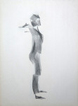
Figure I

This painting started with a pencil underdrawing, focusing on accurately capturing proportions and tonal areas. The idea of abstracting by neatly separating tonal areas lingered through my head and informed the approach. But soon after some layers of watercolour, I felt that the entire painting had become too dark and too tight, therefore decided to wash it all off and rework on top. But then looking at the washed off painting, it looked so natural that I just added the contour lines of the figure with charcoal pencil, spray fixed it and stayed with the result.

IMG_1151

At this point, I made a break and did some research on Tamara de Lempicka (blog article), because my charcoal drawings of the female nude had reminded me of her paintings. It was very interesting to learn that she had also painted in cubist style. I spent quite some time reviewing her paintings and was impressed by their strong visual language without ambiguities and the intense colours.

Reflecting on my own first painting, I made some notes about what I wanted to take further:

  • Move towards abstraction. I had in mind the progression I developed in the series of paintings from the rocks at the seaside, where I tried to follow up visual ideas and depart from accurate representation
  • Experiment with media and colour. I was interested in using transparent wax to retain white areas while being able to work with broad strokes over the entire surface. I also wanted to experiment with the technique of a charcoal underdrawing to create lines and shades, then use watercolours to emphasize shapes and perspective. I also thought about using ink to obtain real deep, waterproof black marks and clear lines. Pen and ink combined with a wet-in-wet technique was might also be interesting
  • Try out different approaches towards ‘painting a figure’. One idea was inspired by the life drawing class instructor, who pointed to the concept of ‘surface planes’ to depict the three-dimensionality of the body. These surfaces were oriented in different orientations and angles in space and he suggested to train our eyes to perceive these surfaces when looking at the model. Another approach I considered was to try and find increasing simplification of shapes and reduction of detail.

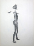
Figure II

The second painting was also based on a pencil underdrawing for the figure, but I tried to loosen up a bit. I used transparent wax for the lighter areas, then made a wash over the entire surface, and after letting it all dry, used black ink to block in the shadows of the figure. I tried to simplify the shapes and reworked lighter areas with white oil pastels, and darkened the background with a layer of charcoal.

IMG_1153

I felt the drawing was still too naturalistic but I liked that there was an increase in dynamics and ‘presence’. Somehow this figure felt closer, intensified and more real than the first one.

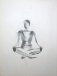
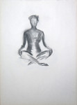
Figure III

This one was definitely inspired by Tamara de Lempickas figure drawings in its bold approach to shape. I used charcoal for the outlines and to block in areas of shadows. The process of drawing was very different from earlier drawings because I mentally prepared each stroke and where I wanted to place it on the paper. There were some corrections involved to make the lines for different parts of the body correspond to each other. The charcoal layer was fixed and then worked over with watercolours. The approach was kind of ‘naturalistic abstraction’ – the forms and shapes are distorted, but they convey much energy and movement and the figure remained recognizable as a female nude in her seated position. There was also a compositional effort to ‘fill the plane’ with the figure, reducing the amount of background area.

IMG_1156

Figure IV

I wanted to develop the abstraction further and spend a lot of time looking at my photo source. I was aware of the danger of monotony by working from a single photo and retaining the same pose for all paintings. So I began to explore compositional alternatives and followed ‘visual phantasies’ I developed while looking at the painting. There was an idea of dissolving the unity of the figure by bringing its components closer to the edges, thus transforming the overall shape. I imagined the face turned upwards to the sky, the arms oriented vertically, parallel to the left and right edges of the surface, and the bent leg parallel to the lower edge of the surface. Another aspect that interested me was the interplay of hard and soft edges to indicate figure versus ground.

These ideas were integrated gradually into the painting. It started again with a pencil drawing where I tried to develop a different shape of the figure, following these ideas. It resulted in distortion and a ‘strange body’. I retained the correctly placed right arm and added a second displaced silhouette with the arm closer to the right edge. I used colour to dissolve the strict distinction between figure and ground, letting the blue background develop into the back figure and taking up the orange of the foreground figure as a second background colour. Then I employed black ink for the shades and edges of contrast. I used a dagger brush and moved it around to approximate the shapes of the shadows. These marks indicate the background behind a shape, but also the shades within the figure.

I intensified the blue and orange colours with several layers of watercolours and finally added a layer of black oil pastel over the background which greatly improved the overall effect because it helps the eye to distinguish between figure and ground.

IMG_1158

What I like about this painting is that it depicts phantasies and imagery, there’s a dream-like quality to it and I feel there are lots of interpretations possible around female identity and self-perception.

On the other hand, after these four paintings, I felt that I had made considerable progress towards abstraction and imposing my ideas and phantasies on the subject, but it all did not make use of the particular qualities of watercolour as a medium. So far, I had used watercolour only to bring selected plain colours into the composition, but I missed qualities like transparency, running colours into one another, and accidental shapes. So I set out to develop a different approach for the final painting of the series.

Figure V

Before starting with the painting, I paused for some research on ‘watercolour figure drawing’ to see how others approached this. I was looking for works that looked like actual watercolour paintings, lighter and more subtle than what I’d done so far. My findings are summarized in this article.

When I had some guiding ideas how I could possibly treat my materials differently, I started with an underdrawing using a watersoluble graphite stick. This time, I made energetic, broad movements, trying to get the main traits of the figure right, but not worrying about details. I was following through a different visual perception of the photo which I had developed over the time working on the series. This is hard to describe. It works like a different reading of light and dark shapes, maybe similar to what happens when a familiar image is turned upside down and the brain tries to make sense of the unusual patterns that no longer resemble known objects. Actually my brain was switching between my standard perception and this new abstract perception, and I tried to focus on the abstract reading of patterns to guide my work.

My colour selection was guided by the idea of having a cooler colour for the background (Indigo blue) to make it recede, and warmer colours for the figure to bring it closer (Perylene Violet and New Gambogue yellow). I used a large round brush and worked fast, with broad strokes. The painting was quickly finished.

IMG_1159

The difference was that I didn’t fiddle around with details, and painting felt more like throwing darts – first concentration to aim, then quickly execute, then pause to breathe. It was a very different experience of painting compared to how I usually work. It reminded me of the cliché of artistic genius, where the artist is celebrated for simple strokes that have high expressive value, but I just let myself go for it.

I think I slightly overworked the painting and the yellow turned out less friendly than I wanted it, but overall I’m quite satisfied with the result. It does look more like a watercolour painting and it’s energetic. I also captured elements of the abstract shapes I perceived. This might not make a difference to other viewers because after all the abstract shapes are just different interpretations of the same object. A possible path for extended work on this subject might be to further emphasize these abstract elements and make them more prominent and easier to detect for others. I remember that part of a quote: ‘Art (is not …), Art makes visible’. I’m not sure what this would lead to, but it could be an interesting task.

References

More Artists: Tamara de Lempicka
Some research on watercolour figure drawing


Some research on watercolour figure drawing

While working on Assignment 5, the series of five paintings, I made a pause to research for a more ‘watercolour style’ approach to figure drawing. To gain a quick first impression, I did a Google image search which came up with several interesting leads I could follow up. None of the hits were by more widely known artists, but nevertheless they helped me forming ideas how to tackle my task differently. Of the many I saw, I selected works from three artists that came close to the qualities I wanted to have in my watercolour painting.

Charlene Thomforder 2008 Rose-IThis nude by Charlene Thomforder (Rose I, 2008) appealed to me for the interplay of delicate, expressive lines and the subtle watercolour washes.

I like how she uses fairly light washes to differenciate between figure and ground: The white paper is left for the highlights of the right shoulder, where the wash denotes the background tones. By contrast, the lower part of the body is indicated through coloured shadows, and the background is just white paper.

The two watercolour figures by Christina Havens (2011) convey a more impressionistic, soft overall impression. The background and the linework are more integrated with the figure, which is a consequence of using watercolour pencils which dissolve when water is applied, as opposed to using pen and ink for lines.

Kristina Havens 2011 purple watercolor figure drawing cr    Kristina Havens 2011 silver and bronze watercolor detail
Steve Fleming 2012 figure 1The nude by Steve Fleming reminded me of Egon Schiele’s expressionist line qualities. On his website, Steve Fleming’s watercolour figures show his development from a conventional to a much looser and expressionist approach. I find this one very appealing for its focus on the essential elements of the pose – the head resting on the arms, and the bent body. There were more on the website with darker colours as well, which I liked a lot.


References

Charlene Thomforder: Watercolourways blog
Kristina Havens: Watercolour drawings from the live model
Steve Fleming: Alternative approaches to the figure

More artists: Andy Warhol

I did some research on Andy Warhol to follow up the resemblance I recognized to my experiments for Assignment 5, where I combined charcoal with watercolours. I think I remembered some of his silkscreen portraits. Looking up his works on wikiarts, I found quite a few that were in that style of grayscale photos colorized with bright colours and no gradations. There were portraits but also images of flowers as well as seemingly arbitrary everyday subjects like shoes. I felt quite close to this idea of seeing the interest in everyday items that surround us and are normally taken for granted and receive no attention. I guess this informed some of my own subject choices, for example when I painted a pair of shoes in the coloured grounds project. I think the research encouraged me to employ bold colours and simple shapes when I worked towards abstraction in Assignment 5.

Besides the silkscreen works, I discovered that Warhol also had made mixed media portraits, using collage and drawing. I’m including those of Albert Einstein and Mick Jagger. I find them quite fascinating in their combination of elements and also in their lightness and simplicity. As I’m now finished with the watercolour course, the inspiration will not become visible in this context anymore, but I’m quite sure that I’ll get back to this in my printmaking work and in painting/mixed media as well.

Andy Warhol XXXX After Marilyn Pink      Andy Warhol 1970 Flowers

Andy Warhol 1964 flowers     Andy Warhol 1987 Beethoven

Andy Warhol 1980 Albert Einstein     Andy Warhol 1975 Mick Jagger

References

Images from Wikiart: http://www.wikiart.org/en/andy-warhol

More artists: Tamara de Lempicka

The charcoal rendering I had employed in the worked out drawings of the male figure and the female nude reminded me of Tamara de Lempicka – the strong contrasts, the shadings vs edges, the style. Therefore I was taking a closer look. at this artist after the first nude painting which I found somewhat “expressionless”.

Tamara de Lempicka 1925 Auto portrait (Tamara in the green bugatti)My memories of Tamara de Lempicka’s works were faint, but looking at her works, I find the resemblance to these charcoal renderings striking. I think her 1932 Self Portrait (Tamara in the green Bugatti) comes close to the essence of what I remembered.

I found a website that presented her works in chronological order, and going through these, I was impressed by the bold figure drawings which were quite different from my own attempts so far.

Tamara de Lempicka 1926c Nude     Tamara de Lempicka 1926c Seated nude, frontal view

Tamara de Lempicka c1924 Femme nue assise     Tamara de Lempicka c1925 Sketch Reclining Nude III

It was interesting to see that de Lempicka had also been working in Cubist style.

Tamara de Lempicka 1923 Nu, fond bleu      Tamara de Lempicka c1923 Abstract composition      Tamara de Lempicka c1924 Deux amies

Later in her life she experimented with a different painting technique, which I actually prefer over those works for which she’s become well known.

Tamara de Lempicka c1963 Lemons     Tamara de Lempicka c1964 Portrait rose

While continuing to paint I hadn’t been aware of it, but there was obviously quite some influence on the approach I took. This concerns particularly my treatment of shadows and lights and figure vs. ground. It’s not that I had de Lempickas paintings in mind while I was working on my series. I think the influence was rather due to similarity in approach so that the resulting images show resemblance. I think seeing her works has also encouraged me to go bold with the female form, in particular with Figure III, the orange figure with green background.

References

Images from http://www.delempicka.org

Themes and series

I approached this project still unsure which topic might work for a series of five paintings. I felt uncomfortable because over the course of part 5, I hadn’t been able to decide on anything particular. Though I had enjoyed the experimental aspects in the projects, finding a topic had always been complicated. Indeed, I seemed to get along best if there was no neatly defined subject at all and I could simply play with visual effects, for example when I experimented with wax resist.

A recurrent subject are flowers, but somehow I did not feel like developing a series from them. Landscape would have interested me most, but there was the problem of organizing my spare free time and being lucky with the weather. I was also not overly confident about my landscape painting skills.

But I had enrolled to a life drawing class starting in October and this turned out to be so interesting that I wanted to base project 4 and the final assignment on the subject of ‘figure’.
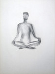
Preparatory work

Approaching the figure subject and first experiments

In the first life drawing session, there was a female model and we were instructed to draw short poses (5 minutes). This was my first life drawing class ever in my life and the time restriction made me choose an approach that was very fast, using the flat side of my charcoal piece to capture the main traits of the pose, without details. The drawings were made on 18×24 inch newsprint, which is approximately A2 size.

This session inspired my first experiments with the subject and technique. I liked the energy that was conveyed by the broad charcoal marks. I had not used charcoal with watercolours so far because I thought the charcoal would smudge and produce a mess when it comes into contact with water. So I used charcoal first, then spray fixed it, and applied watercolour washes afterwards.

IMG_1180     IMG_1182

These were made in the A3 sketchbook. From the first sheet, I particularly liked the flower shape and how it was based on a play with figure/ground in tone, and I explored this idea further in a second sheet. I liked the bold forms and the strong colour contrast between the dark green background and the soft, fleshy orange of the flowers. It reminded me of Andy Warhol’s screenprints and I made a mental note to rmyself, to research this artist later.

IMG_1184Fascinated by the visual effect of watercolour over charcoal, I made a self portrait (A3 format). But I felt that I was struggling with resemblance and all the effort resulted in a somewhat overworked  drawing.

Then I went ahead and worked from selected sketches of the life drawing class to incorporate elements of the figure into a painting. I started with a standing pose and then proceeded to the seated pose, and finally incorporated several poses into a single painting. I used sketchbooks of different sizes and loose watercolour sheets for these experiments with technique, colour and composition. I liked the ideas I was developing, but found it difficult to have only my own sketches to work from, and not a real model.

Trying to develop a focal point – the male figure

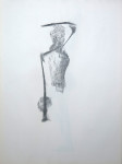
A week later, there was a male model in the life drawing class and we were instructed to do line drawings, initially blind (hence the distortion) and then increasingly “peeking” on the subject to make the representation more accurate. The final task was to make a rendering of an interesting section of the body. I chose the arm and elbow because of an interesting pattern of shadow and light. I had to spray with me and by the time I arrived at home, the drawing had been almost erased, so I reworked that one from memory, then spray fixed it.
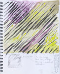
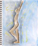
I made attempts to develop ideas from these sketches for the watercolour project, but copying my own drawings for the purpose wasn’t interesting and I felt dried out again without a model. Despite feeling engaged with my figure subject, I did not know how I might develop the idea into a concept that would work for a series of five paintings.
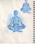
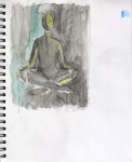
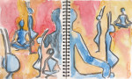
IMG_1188     IMG_1185

Clothed figure and working from photos

Addressing the problem of model availability, I found a drop-in drawing class with clothed models and attended. This class had a single pose for 2 hours with breaks every 20 minutes so the model could stretch. I saw no immediate connection to my idea for the assignment, but nevertheless enjoyed the session and the possibility to explore one pose more fully.

I made a charcoal drawing of the upper body, a pencil drawing of the head (here shown in full and  close up), and a final coloured oil pastel drawing, all on 18 x 24 inches paper format. I liked the pencil drawing and felt that I had captured something of the model’s personality – a somewhat rebellious attitude, I think.

IMG_1136      IMG_1139

IMG_1142      IMG_1143

IMG_1191At home, I made an A3 watercolour sketch from my drawings (the one with the red background), but this felt rather pointless, without the model present and nothing particular I wanted to express.

Since the classes where a model was available were only once a week and I wanted to get on with the project, I began searching for online resources that I might use to practice skills and continue working on ideas for the subject. I finally chose 4 black & white nude photographs, two male and two female, for further work.

Starting with the male models, I made a few charcoal sketches of the full figures, head and parts of the torso, focusing on the volume of shapes and accurate representation. I also made a watercolour tonal sketch.

IMG_1173      IMG_1176

IMG_1190

Full figure rendering and final subject choice

The next life drawing class was with the previous male model again, a single pose and the instruction to make a fully worked out rendering of the entire figure. This time I started by making a layer of charcoal on the paper for a medium starting tone, and worked out the figure from that using eraser and chamois cloth for lights and more charcoal for darker tones. The practice from photos came in handy and despite some struggles with getting proportions right and finding the paper size (18×24 inches too small), I like the result overall.

IMG_1145

From this, I developed a concept for the final series. Starting with a similar idea and using the photo of a female model, I stopped the first drawing at a point where I felt I should leave it as open and unfinished as it was. I knew that I could continue and obtain a worked out drawing of the figure, but I liked the unfinished state because it kind of captures the elements of my process: How I had started with laying the background, then drawn in the main outlines quite roughly, and then begun to work out the shapes and give them volume. I also liked that it was the bust and not the face which was worked out because it was a breach of the convention in classical drawing and reflected what I had unadvertedly/unconcsciously perceived as the most relevant aspect of the image.

IMG_1224

I continued with an new sheet, same technique, and completed a fully worked out drawing. I felt ready to approach the final series of five paintings with this subject.

IMG_1194

Working with music

The outcome of this exercise were five watercolour paintings.

1)      Electronic Pop/Dance music – Faithless: Bombs (from the Album ‘To all new arrivals’)

IMG_1085

2)      Electronic Pop/Dance music – Paul Kalkbrenner: Sky and Sand (Single)

IMG_1088

3)      Jazz/Dance music – Metropolitan Jazz Affair: Moanin’ Darkness (from the Album ‘MJA’)

IMG_1090

4)      Classical piano music – Edvard Grieg: Lyrical Pieces Collection, played by Emil Gilels

IMG_1091

5)      The same music, later hearing

IMG_1094

Assessment of my experience of working with music

I had been looking forward to this exercise because I love music and thought it must be very pleasant to paint while listening. But the practical side began with practical problems: My stereo is from Europe and doesn’t work with the lower US voltage, and I have no speakers for the PC. The PC alone has horrible sound quality. So I used headphones, attached with a long cable to the PC. The sound quality was good, but I felt disturbed by hanging on the line.

The second problem was the choice of music. I have some choice of music: popular/electronic/dance music, some jazz, some ethnic music, and also classical orchestral and piano music. My liking of the dance music is more a memory of liking music – at the time, I heard those pieces again and again and loved them, but now years later I have trouble listening because it gets on my nerves. With the other types of music it’s very mood-dependent, but actually I tend to hear no music at all because I’m typically working on something in full concentration and don’t like the distraction, besides knowing most of the pieces by heart already. I also usually don’t listen to the radio, because I prefer being in a quiet environment.

So I had some trouble selecting pieces I cound stand listening to and working on the paintings in parallel. I pre-selected a pack of 10 CDs of different types and wanted to choose from them after some initial listening. It turned out that from these, only one was later retained for painting because I simply couldn’t stand the others. So I switched strategy and just went through the collection on the PC. I started with an electropop/dance piece, then found another which was heavier on rhythm. Then came a piece of Jazz/Dance mix, and finally I made two paintings while listening to a classical piano recording.

Overall, I found working with music quite irritating because when I listen, this absorbs my concentration and painting at the same time becomes like dancing on the paper, guided by rhythm and the mix of sounds I perceive. This did not work very well with the technicalities of watercolour painting like having to dissolve a hardened piece of paint by rubbing the brush over it before the intensity is good for painting. The dance pieces also made it hard to focus on anything particular to paint and the watercolour sheet was full of paint in a few minutes. This changed a bit with the Jazz/Dance piece, where I chose watersoluble coloured pencil and graphite with which it takes longer to fill a page. I had more time to follow the swing of the music with my movements before the paper was covered with marks.

The character of the experience changed completely with the switch to piano music. The first painting reflects my irritation with the different style after being in the swing of the dance music then thrown into the soberness and brilliancy of classical solo piano music. I decided to make a second one with the same music after having listened for a while, and the second one is more in line with how I perceived the music. It was the ‘Lyrical Pieces’ by Norwegian composer Edvard Grieg, played by Emil Gilels. I always thought that this music was very orderly and clearly structured, but my paintings tell a different story and it made me perceive different qualities in the music. I realized that they must have been quite modern and disturbing at the time they were created, because they are very improvisational and atmospheric. I think the second painting looks a bit like a lawn with summer flowers on a bright day, and that’s how I perceived the music. The music also has darker and melancholic parts, they seem to be more prominent in the first painting.

I don’t think that working to music is currently an option for me, because I’m so disconnected from the musical world and have a hard time finding something I actually like to hear. This may change, because as said at the beginning, I like music a lot, and if I had something I wanted to hear, I’d certainly enjoy hearing it. But there are also the practical problems as mentioned. It might work better if I used a simple medium like graphite or charcoal because there wouldn’t be interruptions from having to prepare a brush with paint, but then I’d miss out the possibilities of colour in the painting altogether. So overall, I guess working with music is not for me at this time. Nevertheless, I found the experience interesting and would certainly be open to try again now and then.

Free expression

I finished these paintings over two days and got along quite well. I did not select one of the suggested titles but tried to find my own themes. In all cases, I had a broad idea and a keyword for my painting, but the actual title developed while I was painting and trying to get to the core of the subject. All three paintings are 33 x 43 cm, landscape format.

The devastating virus (Ebola)

IMG_1079

The first painting takes up a subject that concerns me since reports about the current Ebola outbreak appeared in the media. It’s not so much the fear of contracting the illness but rather a sense of horror when thinking about the effects of the virus on the human body.

I had mixed feelings whether I could allow myself to choose this topic and considered using a different title to mask what it was really about, out of respect and empathy with those who are ill or at risk. There is a notion of shame in my knowledge that I live in a relatively safe part of the world and can luxuriously paint something of which I have no real idea. But then again, the sense of concern and empathy for others is real for me, as is the scariness of the virus’ activity. So I decided to stay with the subject and hope it is not perceived as lacking respect.

I used black ink and a bamboo pen for the virus-like creatures and their tentacles and made additional tentacles in transparent wax. I continued with watercolours on wet paper by hitting the colour-loaded brush so it would make drops and splashes that would run into each other. The wax lines created an interesting barrier effect in some spots.

To me, the choice of media, technique and colours works well to convey the destructive work of the virus to turn healthy tissue into a bleeding mess. These drastic words correspond well to what I had in mind. But I’m also surprised about the aesthetic effect of the applied technique and wonder whether anyone would have so grave associations if I’d choose a more innocent title.

Sunny autumn day

IMG_1082

This painting was inspired by my idea of the colourful autumn foliage in upstate New York. It’s an imaginary landscape with a postcard blue sky, a view on trees whose foliage is about to turn from green to yellow and red, and an earthy ground. It was painted in a wet in wet technique over some yellow oil pastel and transparent wax marks intended to create a glittery light effect.

I like how the colours run into each other and the technique is something I’d have wanted to explore much earlier, so this was a welcome late occasion. I’m less sure wether the image idea comes across, because the tree area also looks a bit like a burning wood. There is a lack of visual clues for the size of the trees and and the depth of field is unclear. My conclusion is that abstract landscape paintings would benefit if I had more practice with landscape painting. I’m quite sure that I’ll get back to the landscape subject again, I’m just having so many practical issues with making excursions that I keep postponing it.

Dental surgery

IMG_1084

This may sound like an even weirder idea than that of the virus, but I chose this subject because it refers to a recent incident of very intense emotions of fear. I had to undergo a medical procedure involving all teeth and I experienced the minutes when I received the numbing injections as very painful and frightening. Making this painting brought back the emotions, and writing about it does so as well. Luckily the surgery went well, it was necessary and I’m glad it’s behind me!

What made me choose this topic was the memory for the intense feelings I had, and I wanted to try whether I could capture and convey them. The emotions are reflected in the way I painted. I started with the black lines using oil pastels. They were made in violent, rushing gestures and stand for those moments of consecutive painful injections. These were followed by feelings of dark numbness, interrupted by tinglings through the mouth when nerves responded to the Novocain, before they went numb. The tinglings are symbolized in the yellow broader oil pastel marks surrounding the center, made with equally forceful, quick gestures.

From a compositional point of view, there’s something like a center of pain, followed by numbness in the middle, surrounded by quieter, unaffected areas of both my body and my mind.

I think this painting works really well even without saying anything about the actual story behind it. There’s much energy conveyed in the black lines, and it’s quite disturbing, thus creating an interesting contrast to the abstract shapes and flow of colours. Maybe a less obvious, more abstract title to capture the essence would be ‘numbness and pain’, or ‘fear, numbness and pain’. But again there’s a striking contrast between the bright and exciting colours and the more or less horrific subject.

Some thoughts about free expression

What I particularly liked about this exercise was the freedom to choose my own subject, combined with the relief of not having to worry about resemblance with observed objects. It allowed me to concentrate on colour, on brush movements and on what happened on the paper. It was also naturally more open to an experimental approach. I’m realizing that I feel much more at ease with the abstract approach than with the observational approach, that’s quite interesting and highly appreciated experience.

I also see the correspondence of this exercise with using art as a therapeutic instrument. It was impressive how I was able to connect to lived emotions and how powerful these emotions still were.

Guided reflections

Did the title summon up images before you began?

Yes I think so. I started with searching for feelings/memories that would work and when I had decided on a topic then some imagery developed. It was quite faint and abstract, rather a quality/perception of visual movements than concreate objects.

Did the title suggest colour, line or shapes?

It wasn’t the title but the suggestions came when I immersed myself in memories and feelings associated with the title. This guided my pre-selection of colours and choice of media.

How did you progress with the painting?

I tried to stay focused on my subject and live through the associated emotions while painting. I also tried to let the emotions guide the gestures I made with the painting media.

Did one gesture lead to another or did you have clear idea of your intentions from the outset?

Some elements were clear at the outset, but then the painting developed gesture by gesture. In the virus painting, I started with the black spots and created the tentacles. The colour splashes then developed out of this. The autumn painting started with an idea for the blue sky, the burning foliage area and the earthy ground. The surgery painting began with an idea of lines or arrows and a central dark area. The coloured areas developed around this.

Are there figurative elements to your painting? If so, what?

Yes, there are the black virus elements and the black lines representing the injection needles.

What has influenced your painting?

The first painting took up imagery developed in the ‘Collage from random elements’ where I was inspired to draw ink tentacles out of the paper strips glued on the surface. I was very impressed by the sense of illness and morbidity it conveyed and apparently there was a need for me to get back to the topic.

The influences for the autumnn painting are more difficult to trace. Maybe it was the friendly sunny atmosphere that morning, where I looked at the potted plants outside which are now with green, yellow, red and brown leaves. It makes me think of the beautiful autumn foliage for which this area of the US is well known. I wish I’d be better organized and get myself out for a trip to actually see this, rather than just fantasizing about it!

The final painting might have been influenced by my research on Robert Delaunay the evening before. I was quite impressed by the colourful abstract paintings and remembered the paintings of rings and circles in bright intense colours. Before starting I went through more abstract ideas and was considering to make a painting in the style of Delaunay, but decided against it in favour of an emotionally more intense subject. I think the influence manifests itself in the intensity of the colours I painted.

Magnification

This was an interesting exercise. As my topic for magnification, I choose a photograph from the trip to Greenwich, CT, which had been part of the themed collage and painting (previous exercise). I really liked the rock formation, and thought it was a good idea to work on this because it had been the weakest element in the earlier painting.

I started out with the original photograph in portrait format and then isolated a section of it which was in landscape format. The selection process was based on intuition. I searched for an interesting and balanced composition by looking at different sections of the large photo and finally sectioned out an area in the lower middle. This section of the photo was the basis for all subsequent studies.

IMG_0576     IMG_0576-section

IMG_1054 I started with an observational drawing in my 23 x 30 cm sketchbook, using pencil and pastels for colouring.

Overall, I made 10 paintings in two series, the first series of 6 (34 x 48 cm) and the second series of 4 paintings (33 x 43 cm). I was tempted to follow the course materials’ suggestions on ways to produce abstract paintings, but I felt it would be more beneficial for me personally if I allowed myself to struggle and find my own way.

The first painting was an enlarged watercolour painting where I focused on similarity with the original, not yet on abstraction. I used oil pastels and watercolours for this one. The next 5 paintings were aimed at working out what I considered the essential elements of the composition: The shapes of the rocks, the white areas around them, the deep black shadows, and the patches of blueish sea water, green moss and brown seaweed. I alternated between transparent wax and white or light coloured oil pastels for the white dry areas. I tried out light green vs orange oil pastels for the moss, and tried to create a brownish organic texture for the seaweed. I used washes of Sepia or Payne’s grey over the oil pastel marks for the stones. I employed indian ink to achieve real black for the shadows which wouldn’t bleed when painted over with watercolours.

IMG_1060     IMG_1061

IMG_1063     IMG_1065

IMG_1067     IMG_1069

In these paintings, I tried to capture the fluorescent colour effect of the moss, the layered texture of the stones, and the separation of areas within the rocks through white dry lines. I recognized the similarity of the dark shadows with Chinese Calligraphy and tried to incorporate this into the painting. I also wanted to capture a feeling of transparency, fluency and depth for the water areas.

In this series, I think my attempts at abstraction were only moderately successful. I felt I was working too close to the original which hindered me to “go abstract”. I also felt that my concern with resemblance restricted the energy that was conveyed in the marks I made. I think I got about as far as I could with my chosen approach, but I wasn’t satisfied with the degree of abstraction I had achieved.

For the second series, I chose a slightly smaller paper format and allowed myself greater departures from the original. During reflections on the first series, I had recognized that I had different qualities in my composition: The organic (seaweed and moss), the anorganic (the rocks), and the fluid (water). I then tried to focus on these essentials and to work with more energy, less restriction in the subsequent paintings.

IMG_1071    IMG_1073

For the first painting, I deliberately chose colours and techniques to achieve the opposed effect to the essetials I had identified: I chose blue watercolour tones for the stones and applied them in a very fluid manner so they’d resemble more water than stone. By contrast, I chose red for the water patches and applied it so that it would look very flat and like a concrete surface. The textures for seaweed and moss were made with oil pastels and look quite soft. So the first painting of this series was quite a departure from realistic depiction.

In the next painting, I took up the idea of energy and movement and got back to the “white on white” resist technique explored earlier. I wanted to use this to convey more fluidity in my depiction of the rocks. I started with transparent wax, then made energetic oil pastel marks in orange for the moss and black for the seaweed. I worked over this with ink marks for the shadows and after drying, a wash of Payne’s grey for the rocks, and dark red for the moss.

IMG_1076I found the different areas in that painting not coherent enough and therefore in the following painting, made an experiment with washes and wet-on-wet over transparent wax. Unfortunately the wax became covered and did not protect white areas as I had intended, but I quite like the areas where the colours mixed on the paper.

For the final painting, I chose yellow oil pastels to indicate the lighter areas and the contours within the rocks, then laid washes “wet over moist”. This time I did not use ink because I found the deep black did not integrate so well, and used only watercolour to indicate moss and seaweed.

IMG_1077

Over the course of these 10 paintings, I think there was indeed some progression towards abstraction and I’m satisfied that I ventured into finding my personal way of doing it. I like the energy in the yellow lines and the play of colour in the washes in the last painting and think some significant abstraction has taken place, compared to the initial paintings. I also like that this painting conveys the characteristic fluidity of a watercolour painting – as opposed to the first painting which looks more like an oil pastel drawing.

To summarize, I’m glad I took the challenge of working towards abstraction following my intuition and think it is an approach I could develop further in the future. It was an interesting experience that using several media began to feel quite natural, whereas a few weeks ago I had strong objections and a sense of awkwardness when combining watercolours with other media.

Themed collage and painting

This exercise did not work well for me. I was very uncomfortable with the suggested process of using bits of photographs or studies for a collage and to use this as a starting point for a painting. The first problem was that the photos I had chosen were made with a zoom camera and thus my elements did not fit very well together in size.

IMG_1050

The second problem was that once the collage was done, I tried to make a realistic painting and saw no way how the suggested working sequence might encourage me to work towards abstraction.

So the result is a loosely worked, mixed media painting of a seaside landscape. I used Jet black pencil for the underdrawing, then watercolours to block out my compositional areas with light tones as suggested, then used oil pastels as resist and to give some more structure, and finally reworked the painting with watercolour and white gouache.

IMG_1053

Possible future applications

I was surprised and a bit disappointed how uncomfortable I actually was with the suggested process. I’d have thought that this is a very good way to develop a composition from a selection of photographs, and it would have been a great and convenient way for me to work, because I always have the time to take photos when I’m out but it’s much more difficult to sit down quiet and draw a sketch, a study or even a considered painting.

Actually I don’t know what went wrong and why I did not find a way towards abstraction. Maybe my image idea was too ambitious and I get along better if I use only a single photo and select just a section of it to study the abstract nature of what I see. After all, I’ve been working quite a lot from photos directly off the computer screen. A typical phenomenon is that I try to include everything in the picture, which is quite a pain as the photo includes so much detail, but only on a small scale.

The exercise leaves me relatively confused and doubtful of future applications of the technique.

Collage made from random elements

I chose an 18 x 24 inch watercolour paper for this exercise, as A2 format isn’t available here… the sheet should be roughly the same size, maybe a little larger. For papers, I used a scrap bag of coloured Mulberry paper in all different colours. I sorted them by colour and then selected some green tones, blue tones, grey tones for muted colours and yellow, red and orange for some bright accents. I tore them apart into small pieces which gave a nice effect at the torn edges because that paper contains lots of longer fibers. I also prepared short bits of paper band and some brown craft paper for different shapes and textures.

I let these fall over the paper sheet on the floor colour by colour and obtained a nice and very arbitrary pattern. The trouble began when I tried to glue the pieces. I had layers of bits and wanted to glue them in the order they had fallen on the sheet, but this meant glueing those at the bottom first and so I had to lift up those on top – which swirled the entire heap and I lost the original patterns. Then the pva glue was a nightmare because it soaked through the paper bits onto my hands and made them so sticky that I hardly could fiddle the paper bits off to get them back onto the sheet. But after two hours or so, I had finally glued my composition on the sheet and found it looked quite interesting.

IMG_1043

Maybe it would have been better to glue one colour before getting to the next, but I guess then I’d have lost a bit of the random character in the colours. But for practical reasons, I might do that if I repeat the exercise.

Assessing the pictorial qualities of the random composition

Are there colour combinations or juxtapositions that especially appeal to you?

I like the red and yellow-orange bits because they stand out as accents against the more muted colours, just as I intended them to be. I also like the pieces of paper band because of their different shapes which adds interest. Then there’s a degree of transparency where pieces are glued in layers which I think should correspond nicely to the transparency of watercolours.

The feathery torn edges versus cut edges and the fibers in the coloured papers add a nice textural element.

Are there areas of tonal contrast that are interesting?

The dark blue papers in the center create strong tonal contrasts with their adjacent bits, but also the red bits stand out quite dark against their respective backgrounds.

Are there elements of patterns emerging?

Yes, I think the composition has a center weight in the middle area of the sheet and from there it seems to explode to the outer edges. It looks quite energetic. But I think I will not work with this too straightforward, rather “slow down” a bit for a less violent overall effect.

Can you read in possible figurative elements?

Maybe a bird or a dancer.

Can you link up separate areas to make a more satisfying composition?

I think the current random composition is dense enough to permit multiple linkages of areas. The challenge will be to establish some of these to achieve an overall interesting result.

Completing the painting

I started with a light yellow watercolour wash for the upper area because I thougth this colour would match nicely with the colours of the glued paper bits there. As I moved downwards on the right side, I mixed in some red to work towards orange and red for the lower area. This was supposed to take up the orange coloured piece on the bottom and create a colour contrast to the blue papers of that area.

I began realizing that my washes could respond to the colours of my glued papers in different ways, and I tried a dark blue next to the center blue papers and from there added yellow to get into green which corresponded to the green papers to the middle left. From there, I added more yellow and thus met the starting colour in the upper middle area.

After a break I began with black ink for wiggly lines emanating from the tighter ends of the light green paper strips. I tried to maintain an intuitive working style with micro-movements and meandering pathways for the lines.

Again I needed a break where I just looked at the painting and let myself be inspired for the next media to add. I thought that my coloured accents needed some more weight and began working with oil pastel. Rather intuitively I began making wiggly marks that took up the fiber textures and extended over the boundaries of the coloured papers like tentacles. I wanted to intensify the colour effects and therefore tried to match the colour of the papers, plus adding a tonal variation, for example yellow and orange on a yellow paper.

At this point, the painting began to look quite scary to me. I had associations of fibrous growth and something very unhealthy. I was fascinated and repelled at the same time, but felt that I was doing the right thing because I responded to my own composition so far. I think it was the fibers of the mulberry paper that inspired me to do the wiggly ink lines and oil pastel marks. When I realized this, I was ready to take it a little further and worked out the oil pastel marks over most of the paper bits. Then I used ink to add even more wiggly lines to support and emphasize the oil pastel marks.

In another pause where I assessed the painting so far, I found there were too many “empty spaces” between the papers with their wiggly extensions, and I remembered I technique I had seen a while ago in paintings by watercolorist Sherly trevena. She uses watercolour pencils to scrape off some pigment over a wet area, which creates interesting speckles. I thought this would be the right thing for my painting and went ahead. Now my wiggly paper bits really came alive and they looked like little water creatures emanating particles while flowing through their space.

IMG_1045

Taking another break, I thought that the painting was quite done, but somehow not yet finished, and I wasn’t sure what exactly was missing. I let the painting sit for an hour or so, them came back for the final assessment. Looking at it from a distance, my eyes wandered along the cut edges of the papers, and I found they would benefit from being brought out a little stronger. I really hesitated but then went ahead with more black ink and a piece of watercolour paper that I used as a ruler for straight lines. I emphasized some of the paper edges and found this added depth and a sense of purpose to the cut edges. It was very difficult to decide which edges to emphasize and how long to draw the lines. Not all my decisions were right but I think overall the lines were a good thing to add, because they provided additional structure and from this point on, my eyes had a sense of orientation when wandering over the picture surface. The lines seemed to support a visual exploration process for all the little things that happen in the different areas.

IMG_1048

There was a moment rather at the beginning where I hesitated if I should take up the idea of a bird and connect my elements to form a bird-like shape. But I decided against that because I found it too literal and did not want to become concerned with resemblance. I think this was the right decision because it meant that the entire process stayed more open and experimental.

I think the final painting is quite successful and starting from my initial perception of something like an explosion, I think I have developed it into an “organic explosion”, something like a floating growth process. So in a way, I’ve accomplished the goal of creating something less violent than a typical explosion.

Working in such an abstract way was really interesting. There were moments where I found the painting ugly and asked myself why I never seemed to be able to create something “pleasant for the eye”. But I said to myself that this was about discovery and it was not important how pretty the outcome would be. I think by letting myself be guided by some intuitive notion of what the painting needed, there was a nice turnaround. It probably had to do with a change in approach from trying to conceal ugly parts to going forward and emphasize what I found in front of me. This somehow turned the ugly parts into something visually interesting and important for the entire composition.