Monthly Archives: May 2014

Research point: Artists who painted the sea

Before you do this exercise [painting the sea] spend some time researching the work of artists who have painted the sea in different ways and think about their approaches and techniques.

Winslow Homer (North America, 1836-1910)

It seems that Winslow Homer is becoming one of my most favourite watercolour artists… true that I really admire his work. Looking at how he paints the see, I recognize all the qualities I like in watercolour paintings. It’s so colourful and vivid, nothing overworked, and I love the subjects he paints.

Winslow Homer 1897 Canoe in the Rapids: Not actually the sea, but water looks as if it were the sea.

The sponge diver 1898-99: the sea from very close, shape of the body under water
https://www.artrenewal.org/pages/artwork.php?artworkid=31507

The coming storm 1901: very quiet water, darkened in the shade of a huge storm cloud
from http://www.nga.gov/collection/gallery/homerwc/homerwc-55578.html (with date)

Key West, Hauling Anchor, 1903, watercolor over graphite on paper
from http://www.nga.gov/feature/homer/homer26.htm

Winslow Homer 1897 Canoe in the Rapids   Winslow Homer 1898-99 the_sponge_diver Winslow Homer 1901 the-coming-storm   Winslow Homer 1903 Key West, Hauling anchor

Winslow Homer 1899 The Gulf Stream (oil on canvas)The Gulf Stream 1899: It’s oil on canvas and depicts a highly dramatic scene – the man on a small boat in the tormented sea, sharks lurking to get him. There are strong contrasts from very dark, almost black blue, to almost white foam on the wave tops. Looking from close, I can’t help thinking that compared to oil, watercolour is the better medium to capture the fluidity and transparency of actual water, and I find this confirmed in Homer Winslow’s watercolours. Image from http://en.wikipedia.org/wiki/Winslow_Homer

J.M.W. Turner (England, 1775‑1851)

I’m including four examples of watercolour seascapes. I find these very different in style from Winslow Homer. Turner apparently observed particular phenomena – waves, weather conditions – and captured them in a very light and loose style. At first I found these watercolours very unfinished but looking at them a little bit longer, I’m beginning to appreciate the correspondence between the style and the characteristics of the sea – fleeting, always changing, very undefined.

Sea and Sky circa 1813-1818 by Joseph Mallord William Turner 1775-1851   Running Wave in a Cross-Tide: Evening circa 1820-30 by Joseph Mallord William Turner 1775-1851   Sunset over Water circa 1825-7 by Joseph Mallord William Turner 1775-1851   Arch of Clouds over the Sea circa 1840 by Joseph Mallord William Turner 1775-1851

A stormy sea and sky by daylight, c. 1813 https://www.tate.org.uk/art/artworks/turner-a-stormy-sea-and-sky-by-daylight-possibly-a-study-relating-to-the-eddystone-d10256
Running wave in a cross-tide, evening, c. 1820-30 https://www.tate.org.uk/art/artworks/turner-running-wave-in-a-cross-tide-evening-d25433
Sunset over water, c 1825-7 https://www.tate.org.uk/art/artworks/turner-sunset-over-water-d25332
Arch of clous over the sea, c. 1840 https://www.tate.org.uk/art/artworks/turner-arch-of-clouds-over-the-sea-d33671

Other artists, not watercolour

I came across Egon Schiele’s Port of Trieste and was intrigued how the artist’s style of strangely distorted lines that characterize his drawings comes back here in the depiction of the reflections on the water. It really captures the wiggly movement of still water in a port.

Leonid Berman’s painting was interesting because of the viewpoint – a bird’s eye perspective, and I wondered how the artist took up the position. It looks as if it was painted from a balloon slowly moving through the air. What is also interesting are the colours – the blue that switches to turquoise and back to blue, with white foam in between.

Since these two paintings are not watercolours they can’t help on the technique for watercolour, but they are inspiring for their approach the subject and how the artist’s personality shines through.

Egon Schiele 1907 Port of Trieste, Oil & pencil on cardboard
Leonid Berman 1952 Faraduro, Portugal, Oil on canvas

Egon Schiele 1907 Port of Trieste, oil & pencil on cardboard Leonid Berman 1952 Faraduro, Portugal Oil on Canvas

Some more reflections

I will leave it at that for this research point, knowing that there’s a wealth to explore and study, but not being able to devote more time now because coursework has to continue. The water subject has increased my attention since I first read the course materials on it and I began looking out for depictions of water and sea. I guess this will continue and apparently water comes right next to my other favouriste subject, plants and flowers.

Painting water: Moving water

Fulmer_Falls 614pxFor this exercise, I chose a photo of the Fullmer Falls in Pennsylvania, USA, that I had found on Wikimedia Commons (http://commons.wikimedia.org/wiki/File:Fulmer_Falls_Downstream_View_1800px.jpg). I particularly liked how the composition included different kinds of moving water and different distances: A flat, fast stream in the foreground that curled around some stones and wood, in the middle ground a little pond with almost still water, and behind this the waterfall with fast, vertically moving water. I also liked the subdued tones of dark green and grey tones, which still had a lot of contrast.


I started with a pencil sketch to help me study the composition and some details, and then made a first watercolour sketch of the middle section only. I painted the water wet in wet, using a sponge to take off colour and create swirls. To improve contrasts, I added a purple tone to the stones, a green tone to the water, and browns for branches. I got a bit distracted from the water by the details of the branches to the right. I think what worked well in this painting was the coloured grey tones and the depiction of the moving water. I think I captured a bit of the energy.

P1070774    P1070792
pencil sketch, 30 x 23 cm
watercolour sketch, 24 x 34 cm

To study the wood a bit closer, I made detail pencil sketches of the thin branches to the right and the thicker wood in the middle of that section (sketchbook, 23 x 30 cm). I wanted to capture how the light fell on the branches and created those black and white patterns and deep contrasts. I found the second sketch was no improvement over the first and realized that I was at the limit of my ability, because I wasn’t able to visually disentangle the interwoven branches. I think this problem has to do with my deteriorating eyesight. I was quite frustrated and unsure how I could proceed. I took a break and on the next day, I decided to take a looser approach – not attempting to depict the details and shapes exactly, but looking at the general pattern and types of contrast.

P1070775    P1070778

So I deliberately changed my focus for the next painting, approaching it in a more generous way. I was quite satisfied with the result because I found it was not overworked, and I liked the looser style.

P1070794
Fullmer Falls, PA, watercolour on paper, 54.5 x 36 cm, May 2014

Some distraction: The lily on my terrace

For a change, I studied the lily on my terrace that was beginning to bloom. One day, I made a pencil sketch of the buds, and a few days later a drawing with inktense pencils and wash (both in sketchbook, 23 x 30 cm). I think the coloured drawing is a bit too tight, but I liked working with the pencils. I used a refillable water brush for the wash and found the technique quite nice for outdoors excursions. The colours from inktense pencils become very intense when worked out with water, and the water brush is a small tool that I could take with me easily.

P1070780    P1070782

Painting water: Still and disturbed water

I continued working from photos for this exercise and selected two pictures: A view on the pond in the Brooklyn Cemetery (2013), and a scene from Spreewald near Berlin in Germany (2004). This is a beautiful water landscape where the river Spree originates, and I’m certain to return there to paint when I’ll be back in Germany.

Work on this exercise was dominated by my attempts to paint accurately, at the same time loosen the tighter approach… probably two things that don’t go together! I painted 4 versions of the cemetery pond in different formats and two versions of the Spreewald, alternating between the two subjects. I’ll present the paintings by subject to discuss the challenges.

The pond at Brooklyn Cemetery (photo source, 2013)

2013-11-01-Brooklyn-CemeterThe main problem here was the fountain which I did not manage to integrate well into the painting. I tried oil pastels as a resist but found my shape too gross. Maybe I should have made a light wash underneath it to connect it to the rest of the painting.

Another problem was with the colours. I tried to be true to the photo, but found that in my painting, the blue sky did not work well with the autumn colours of the trees. Maybe this was because I did not mix my greens from blue and yellow but used pre-mixed hues instead. I might try to work from a more restricted palette and mix my own tones.

Overall, I think the studies are too tight and overworked and this comes from my aim to depict all the details as accurately as possible. I experimented with the dry brush technique and was surprised how intense and opaque the colours came across. Versions 2 and 3 are made with more water. I was experimenting what worked well for blending colours and creating the reflections on the water. These first three versions were guided by the attempt to improve on the details. Unfortunately, each time I got annoyed after a certain time and then lost concentration. So I guess this is not my most preferred way of painting with watercolours.

Then to try a really different approach, I followed a recommendation by my tutor and painted with the left hand. I painted entirely wet in wet, focusing only on colour and placement in the composition. This painting is the least recognizable, but the most pleasant to look at, I think.

P1070714   P1070719

P1070721   P1070722

Version 1 (33 x 43 cm): First try, dry brush technique
Version 2 (27.5 x 38 cm): Using a flat brush wet in wet and wet on dry, making different marks
Version 3 (24 x 34 cm): Round brush and mixture of dry brush and wet in wet, small format
Version 4 (24 x 34 cm): Left handed painting, wet in wet

Spreewald near Berlin (photo source, 2004)

2004-08-22-spreewald-007The greates challenge in this scene were the branches in the middle hanging over the water, and their reflections on the water surface. I found it very difficult to visually separate the two from another. Another difficult aspect was the red wall to the left behind the large tree. I considered using resist for this, but then found the area to cover too extensive and decided to try a different approach: Painting the background as a wash after painting the foliage. I think this worked quite nicely in both versions. I did use resist for the banister and in version 2 for the highlight around the little duck in the center.

I mainly focused on the trees and their foliage, trying out my new brush technique of holding the brush sideways onto the paper to create irregular marks. I think I like version 2 better than version 1 because the greens of the trees are more like I wanted them, and I also like that the water reflections are softer in version 2. To note is that I’m beginning to experiment with the brushes and try to fit the brush to what I want to do, and also try to make more varied marks.

P1070716   P1070725

Version 1 (33 x 43 cm), Version 2 (33 x 43 cm): Trying to improve the foliage of the trees and the appearance of the water.

Concluding reflections

I see some skills developing but am not very satisfied with my paintings. This is mostly because I still find the style too tight. I don’t think I captured the beauty of the scene that I saw when I took the photographs. I think I’d benefit from painting more in the looser style. On the other hand I’m kind of stuck to the idea of accurate representation and have great difficulties of just letting go – I perceive strongly the obligation to follow course instructions. Maybe it would help to alternate between approaches to loosen up.

It is also interesting to see how the painting develops when I re-work to improve tonality. The price is that the painting becomes overworked but it is also helpful to observe what happens when contrast is increased and really dark tones are added. Maybe this helps to become more confident in applying intense and dark tones right away so that the overall tonality needs less corrections.

Painting water: Still life

The task was to set up a still life, using a large shallow bowl partly filled with water,  and place one or two objects into the water, then draw and/or paint the arrangement.

I chose a blue ceramics bowl and placed a coffee mug inside. At the beginning, this felt like a very weird idea and I struggled with the perceived ridiculousness of the arrangement. But once I began drawing, I got really captured and actually enjoyed working on it.

I made a tonal pencil study first, then a watercolour painting of the same view in artificial light, and on the next day in watercolour a different view of the bowl in (diminishing) afternoon daylight.

P1070707The drawing was made with watercolours in mind – I tried to identify main shapes and capture the overall tonal distribution. While I was quite satisfied with the drawing, I felt like a beginner with the watercolour painting – again those irregular and stripy washes and I didn’t manage to get tonal values right, all the fiddly details and the result was overworked. For the composition, I found the bowl too small on the paper.

I tried to improve on these aspects in the second watercolour. The washes are still stripy but I think I applied a better technique so hopefully with time the washes will improve.

P1070709   P1070711

The main challenge of this exercise was that with every tiny movement, the appearance of the reflections on the water surface changed and I found it extremely hard to maintain the exact position while painting. I also had some trouble getting the proportions right. The drawing is quite correct I think, but the watercolours not so.

All in all, I really liked this exercise. It is not the way I really like to paint in watercolours, because I prefer a looser approach. But I think the detail studies and even overworking helps to get the practice necessary to loosen up later. At least that’s what I hope.


Painting sky, continued: Different kinds of clouds and sky dominated landscape

I began this series with reading about cloud types and researching the web for illustrative pictures. After a while I got totally confused by the many different varieties and the naming conventions and thought I’d never be able to make sense out of this. But then again, I liked the idea that clouds could be classified and appeared in recognizable patterns. I decided on the simple appearance of things for now and just tackle the technical difficulties with watercolours.

These two exercises were very important for me and I think I had a personal breakthrough with the last painting. I mostly used photos, but also included one session of painting from life. The development went from the tight to a looser approach. I also switched from artist quality watercolours to inexpensive student grade materials which helped me becoming more experimental and generous with the pigment.

I tried different formats and made several attempts for each exercise. I tried different approaches for taking out the white of the clouds: Kitchen towel, diluting, lifting off with a dry brush. Because of my dissatisfaction with all these attempts, I watched Youtube videos on watercolour technique for painting skies and clouds. Watching others paint helped me tremendously to make sense of the written technical instructions.

There were two important moments that stood out as particular learning experiences. The first occurred while I was making a pencil study from a photo of a cloud formation in the sketchbook. Initially I had no perception of the cloud volumes, but saw them as complicated pattern of diffuse shapes in white to grey tones with some blue from the sky in between. Then after spending some time trying to depict these patterns, I had a shift in perception as I looked at the photo and suddenly the patterns grew together into two larger shapes before a blue background. The change was very remarkable. The new perception guided me when I made the watercolour sketches after the pencil study. The effect happened only once during this slow detailed prep study, but not with the quicker and more sketchy other studies I made. I guess it has to do with the quality of processing visual information that happens when working slowly.

The second important situation was towards the end of the second exercise. I became increasingly frustrated with my inability to create soft blendings and unskillful handling of the medium. I made another Youtube video watching session and must have grasped something very essential. The third attempt of the second sky dominated landscape was made in a very loose approach and for the first time, my mixing of colours and the wet in wet technique actually worked to produce some nice watercolour effects and blendings. I found these in stark contrast to the “made” approach of using kitchen towels of diluting already dried layers, or overworking existing layers, to create cloud-like shapes. So this last piece felt like a personal breakthrough and I’m glad that the work I put in this project resulted in a step forward!

Working from photos is not ideal, but it permits me to be independent of the weather and avoid loosing time with searching out outdoor locations where I feel safe enough to paint. I made one series of paintings and sketches from life, looking into the sky from my terrace. The most important differences were how much more light there is outdoors – it takes time for the eyes to adapt! It is also a very different experience to select what section of the sky to paint. Also, since the clouds were moving across the sky and changed their shapes, I felt a bit like chasing behind them and trying to finish shapes that in reality no longer existed. Nevertheless I liked the experience because it was much more lively than painting from a still photo.

I’m documenting here the studies I made with some technical information, and also include the photo sources I used.

Different kinds of clouds

Series 1: Philipse Manor, New York (photo source, 2013)

01---Lumix-2013-10-27-Phili

I painted the left upper section of the sky. I also tried to achieve tonally graded washes with mixed success. The problem was that my attempts to overwork and improve the contrast between blue sky and white clouds screwed up the relatively even distribution of blue pigment. The blue area looked better the more I resisted the temptation to rework the contours, but I wasn’t happy with the degree of white, struggling with the wet in wet technique and the surface drying too quickly for soft contours. All three 33 x 43 cm.

P1070674   P1070676   P1070677

Series 2: Mallorca (photo source, 2005)

2005-09-08-mallorca-061

I began this series with a 23 x 30 cm sketchbook study using coloured chalk pencils. I think this helped a bit for the watercolours because I became more confident with the cloud shapes, but I still had massive difficulties with the graded wash and the wet in wet technique, and my fiddling didn’t improve matters. I tried out different blue tones for the sky and included a bit of the landscape in the last sketch.

Turqoise: 33 x 43 cm, ultramarine: 31 x 40.5 cm, violet: 33 x 43 cm

P1070639    P1070668

P1070670   P1070672

Series 3: Cuba (photo source, 2005)

2005-hava-059     P1070642

I made a detailed sketch of the middle upper sky section, using HB pencil and a blue coloured pencil (23 x 30 cm sketchbook). This was the study where I experienced the shift in perception of the cloudscape. I did not take the time to fully work out the pencil sketch but proceeded to watercolours instead. The first study captures much of the shapes I saw – the dark swirl to the lower right and the smaller blocks to the upper left and right. This painting was built up in many small strokes which was not an ideal technique but I came closer to the colours I wanted (24 x 34 cm).

In the second watercolour, I included a bit of the landscape and introduced a purple tone. I think this colour adds depth to the scene (28 x 38 cm).

P1070680     P1070682

Series 4: Clouds seen from my terrace

These sketches were made from life and it was actually great fun. I worked quickly and stopped worrying about particular contours, but again had huge trouble with the washes. I think these were painted dry on wet, with a little mixing occurring if one layer wasn’t completely dry when I applied the next. So technically it was chaotic, but nevertheless a great experience – important because I have so few confidence to paint outside. Maybe with more practice and growing confidence I’ll overcome my anxieties and go for watercolour painting excursions.

The first three sketches in the A4 watercolour sketchbook, using Reeves student watercolours:

P1070649   P1070652   P1070653

Then I wanted to try out graphite drawings with washes in the 23 x 30 sketchbook. I inadvertedly began with non-soluble graphite, then added watercoluble coloured pencils for the wash. The second was with watersoluble graphite and coloured pencils. I wasn’t aware how different the sketchbook paper was: Not only lighter than watercolour paper (only 160 gms), but also with a much smoother surface. It felt like the pigment stayed on the surface and I was shoveling it around with the brush. Quite a difference to watercolour paper.

P1070644   P1070646

Sky dominated landscape

Philipse Manor, New York (photo source, 2013)

2013-10-27-Philipse-Manor

I found the backlight effect very attractive, but difficult to paint in watercolours. I wanted to abandon the kitchen paper towel technique because I found it so wasteful. I really wasn’t happy to first apply an intense layer of blue only to take off 60 percent of the area into a kitchen paper. On the other hand, I found the technique very effective to take off the pigment.

The first painting was an attempt in wet on dry, painting with a dark blue mix around the cloud contours. The problem was that I wasn’t fast enough to avoid stripes then covering the rest of the sky, and I didn’t manage to get a uniform blue tone (33 x 43 cm).

The second one was wet in wet in a lighter blue tone, then kitchen towel for the white shapes, and then the paper had dried so the grey shades became much too defined. I softened the contours with a damp brush, but it didn’t work very well. The blue was too pale to bring out the backlight effect. I made a second layer in the middle area but realized this destroyed the softer contours created with the kitchen towel technique. So I stopped there (24 x 34 cm).

In the third attempt, I stayed with the kitchen towel approach but rewetted the paper inside the cloud area before adding the shades to achieve softer contours. I didn’t manage to get the tone dark enough and my shapes did not look cloud like.

So I made an after study of the central backlit cloud in the 23 x 30 cm sketchbook. I used watersoluble graphite drawing and inktense coloured pencils with wash, in several layers and overdrawings. I used a kitchen towel wrapped over my finger to just soften and smudge the pigment a bit. It was fun to make, but looks quite strange and not like a cloud. Somehow the sky background is more cloud like than the actual cloud shape.

P1070684   P1070686   P1070687    P1070648

View from Empire State Building, New York (photo source, 2005)

2005-02-18-empire-027

This is a view from the Empire State Building southwards, with the Hudson river to the right and the Liberty statue very tiny in the middle. I found this sky photo intriguing because of the lower thick cloud layer with a touch of rose below from the sundown, and above this a second layer of clouds before a blue fading sky.

I made a very small study first. Small formats previously had helped me to let go of detail and paint a bit looser. I made it partly wet on wet and partly layers wet on dry. It was without underdrawing and I used rubber gum resist for some white highlights. This didn’t work out because I painted the shapes around the highlights at different locations while in flow. I realized that for this resist technique to work, an underdrawing is needed and one has to stick to it! Nevertheless I think it’s a nice little study, just still a bit too tight (15 x 22 cm)

The second painting was much larger, based on an underdrawing where I sketched the main shapes and cloud layers, then placed my highlights using the rubber gum. I also adapted the paper format to the panorama section of the photo by covering off the lower third of the paper. I began with very light layers of colour in the shapes I had sketched and this looked really beautiful and transparent. The next layers to add depth with the middle and darker tones dulled the painting. I probably made the wrong colour decisions by mixing in too much Payne’s grey (23 x 43 cm).

Then with growing frustration about the technical problems and unnatural looking skies, I watched several Youtube videos on landscape painting, in particular skys and wet in wet technique. I have a real dislike for made-easy-recipes, but looking at artists working with watercolours was very helpful. I realized that I needed to work differently with the brushes and with the water. I decided to make another attempt and deliberately go for a much looser approach, similar to what I had seen it in the videos. I also added some yellow to the palette.

The last painting was made medium size, slightly larger than A3 format (33 x 43 cm). The paper was dampened and I took care not to have it too wet, then worked from left to right and downwards. After the upper area in blue I washed out the brush (!) and continued with some yellow, sometimes going into the blue and sometimes leaving a bit of space. I worked quickly with a large flat brush. Next I added an area of violet for the underside of the upper clouds, then washed out the brush again before going back to the blue between the two cloud layers. More yellow, then violet for the dark hanging clouds, and then the rose stripe below this. Then I let the painting dry before I was going to add the lower part wet on dry.

The land part of the painting is less successful, I think the colour of the sea is too dark and uniform so it gives not enough contrast to the dark silhouette of the skyscrapers and against the distant land. But overall, I am much happier with the looser approach and really delighted about the first nice looking wet in wet sky I have produced.

It is strange how written technical instructions seem to leave out essential bits that I finally grasped by watching other people paint. I’m quite sure there will be drawbacks where I’m not able to paint loosely, but this painting is like light at the end of the tunnel and I feel the technique is much more appropriate for the medium. Quite happy with it after such a long time of dissatisfaction!

P1070689         P1070692

P1070694


Painting sky: Tonally graded wash and simple clouds

It was a completely grey and rainy day, so I decided to continue working from photos. I chose two images I had made recently in New York, with blue sky and few cloudy areas. I worked on 28 x 38 cm watercolour sheets, roughly A3 format. I made 6 washes – three monochrome and three where the blue was combined with yellow ochre. There wasn’t that much of a yellow tone in the photos, but I wanted to practice the technique.

I found it quite difficult to achieve smooth graded washes. Mine were stripy and changed tonal intensity abruptly. So I tried different brushes, varied the amount of water, the angle of the painting board, and also experimented with sponge, paper tissue and wet brush to create the white spots for the clouds. I also used different blue tones and tried mixing in Payne’s grey. I think I need much more practice. Making washes won’t improve in a day so I’ll leave it at that for the moment and proceed with the other exercises, but will certainly get back to the topic.

P1070593 P1070595 P1070597 P1070599 P1070602 P1070604

Research point: Painting sky

For this research point, I looked at four artists: J.M.W. Turner, John Constable, Winslow Homer and John Singer Sargent. I have already researched them elsewhere and found it interesting to see how they treated the sky in their watercolour paintings.

J.M.W. Turner (English, 1755 – 1851)

Looking at Turner’s sky studies makes me feel less miserable about my own attempts at painting skies! There are brushstrokes, many ambiguities, muddy areas… things I didn’t like seeing in my watercolours. So maybe there’s hope I might improve if I continue to practice…

The skies Turner creates are very atmospheric. It’s interesting to see how he blends the colours wet in wet and they still remain separately visible as blue, yellow, orange and red.

Venice: The Doge's Palace and the Riva degli Schiavoni, from the Bacino 1840 by Joseph Mallord William Turner 1775-1851   A Sunset Sky circa 1825-30 by Joseph Mallord William Turner 1775-1851
Crimson Sunset circa 1825 by Joseph Mallord William Turner 1775-1851   Running Wave in a Cross-Tide: Evening circa 1820-30 by Joseph Mallord William Turner 1775-1851

Venice: The Doge’s Palace and the Riva degli Schiavoni, from the Bacino 1840 https://www.tate.org.uk/art/artworks/turner-venice-the-doges-palace-and-the-riva-degli-schiavoni-from-the-bacino-d32154

A sunset sky c. 1825-30 http://www.tate.org.uk/art/artworks/turner-a-sunset-sky-d25486
Crimson sunset, c. 1825 http://www.tate.org.uk/art/artworks/turner-crimson-sunset-d25331
Running wave in a cross-tide, evening c. 1820-30 http://www.tate.org.uk/art/artworks/turner-running-wave-in-a-cross-tide-evening-d25433

John Constable (English, 1776 – 1837)

John Constable was a direct contemporary of J.M.W. Turner and I see some resemblance in how the sky was treated – with respect to some attempts to make brush mark contours disappear by overworking them with water.

In the study of clouds and trees (1821), the sky looks very fresh and not overworked. By contrast, the other skies look like there’s been considerable effort to create the desired shape from some initial painting. Nevertheless, there is a really dramatic effect from the choice of colour and the strong contrasts within the sky. If Old Sarum and Stonehenge had a clean blue sunday afternoon sky, this would create a completely different and much less dramatic atmosphere.

John Constable 1821 A study of clouds and trees w-o frame      John Constable 1932 A house amongst trees
John Constable 1834 Old Sarum      John Constable 1835 Stonehenge

A study of clouds and trees 1821
A house amongst trees, 1832
Old Sarum, 1834
Stonehenge 1835

all from http://paintwatercolorcreate.blogspot.com/2014/01/constables-watercolor-landscape.html

Winslow Homer (North America, 1836 – 1910)

I’m completely overwhelmed by Winslow Homer’s skies. What I admire is that the brushstrokes are so nicely integrated in the paintings, and also the intense and brilliant colours.

Winslow Homer 1880 Sunset fires   Winslow Homer - Storm, BahamasWinslow Homer 1889 Adirondack Lake   Winslow Homer 1880 Gloucester Sunset
Winslow Homer 1880 Eastern Point Light   Winslow Homer 1880 Sailboat and Fourth of July Fireworks

Sunset Fires, gouache, watercolor, 1880
Storm, Bahamas, watercolor on paper
Adirondack Lake, watercolor, 1889, Museum of Fine Arts, Boston, MA
Gloucester Sunset, watercolor, 1880, Private Collection
Eastern Point Light, watercolor, 1880
Sailboat and Fourth of July Fireworks, watercolor, 1880

All from http://paintwatercolorcreate.blogspot.com/2013/05/picturing-sky-with-watercolors.html and http://paintwatercolorcreate.blogspot.com/2014/05/homers-watercolor-evening.html

John Singer Sargent (North America, 1856 – 1925)

The skies by John Singer Sargent have much more prominent brushstrokes. I don’t know if I were satisfied if I had made them (taking into account that I’m practically always dissatisfied), but looking at them as made by someone else, I do like them and think they work well as a sky. So maybe… just be more friendly with myself? That is, besides practicing a lot which is definitely required!

John Singer Sargent 1905-6 From Jerusalem   John Singer Sargent c. 1900-10 Sky
John Singer Sargent c. 1909-11 Sky and mountains    John Singer Sargent 1897 Clouds

From Jerusalem 1905-6,
Sky c.1900-10
Sky and Mountains c.1909-11
Clouds 1897,

All from http://paintwatercolorcreate.blogspot.com/2013/05/picturing-sky-with-watercolors.html and http://paintwatercolorcreate.blogspot.com/2014/05/homers-watercolor-evening.html

Aerial perspective, follow-up

Feeling motivated by the research point on landscape depictions, I decided to make a second version of the Cuban landscape. I wanted to improve the colours and the shapes. Again I was undecided between trying the same approach again, or applying a more experimental technique. I chose the standard way again because I thought that’s what I wanted to improve.

Midway through the painting I found that I had produced an almost identical version, some aspects better, some less successful than the first, and I asked myself what would have been the reason for painting a second version if there was no real step forward in what I did.

I took a step back, compared the actual painting to the first one and looked at my photo source, and tried to identify what made these paintings weak and how I might improve.

One problem was again the colours, which had become dark and muddy not by mixing, but by my choice of hue. Another problem was that I generally wasn’t very close to depicting the shapes I saw, rather trying to create a rough resemblance. This did not work very well.

So I first reworked the sky and this time tried to paint the actual white cloud contour on the right top using a fairly intense sky blue. This looked much better than before. I then mixed a very yellowish green and went over the agave plants. This considerably improved the overall impression and also made the plants appear closer. Then I reworked the foreground by adding more darker colours, which increased the contrasts and made the lighter colours come out better.

At that point I found that the paper would not permit more overworking and decided to stop. I’m looking at this painting with mixed feelings. I know I made some tiny bits of progress, although the overall image is still much too dull and muddy in colours for my taste.

P1070575   P1070590 Version 1 (left), Version 2 (right) of the Cuban landscape

cuba-2005-hava-162-smallThe dull colours may have to do with the photo source I used, which depicts the landscape on a slightly foggy day and the colours are indeed subdued. I worked from the computer screen and depending on the angle of the screen, the photo appeared lighter or quite dark. Interestingly, the dark version had much more appeal to me because the plant shapes against the sky came out much more clearly and in greater light-dark-contrast.

So one idea would be to make another version of the landscape, based on the much darker view on the screen. This might help me focus on the shapes and would also change the entire colour selection. And of course the other idea is to proceed to the more experimental technique which I had in mind, with oil pastels and maybe collage or stencils for the stone fence.

Third version of the Cuban landscape

I set out to make a more experimental version, using oil pastels… but then, while planning the painting, changed my mind and decided to go for watercolours again. I chose a slightly larger format this time, 45 x 61 cm. I wanted to achieve better colours and contrasts. After painting a while, I realized that I was simply repeating what I had tried already, and then came a shift to a somewhat looser approach. The problem was mainly that I got stuck with the same old detail problems again, which I then threw over board in favour of painting “wrong things in the wrong colour, much too quickly”. But somehow I like the resulting painting. It’s less overworked than the earlier versions.

On the one hand, it might seem repetitive to do multiple versions of the same photo, but on the other, I actually felt this is beneficial for me because I get to the point where I consciously try out different approaches and techniques.

P1070591

Research point: Landscape depictions

I was quite overwhelmed by this research point. The instructions mentioned 7 or 8 artists from different time periods, and I came across three more contemporary watercolourists. I was curious about them all, so I researched them all… it was a decision between selecting only one or two and digging deeper, or trying to get acquainted with them all, but more superficially. I chose the latter and will include selected works that I found particularly interesting.

Contemporary watercolourists

David Prentice, David Curtis, Trevor Chamberlain
Edward Wesson, Edward Seago, John Yardley

David Prentice (English, 1936 – 2014)

What I found interesting in these watercolours was how the complex landscape was simplified into larger shapes, and how the light was captured. Both paintings I selected are backlit scenes, which accounts for a reduction of detail and dominance of silhouette shapes rather than surface texture. I particularly like the intense colours and would like to adopt some of this in my own watercolour practice.

David Prentice 2007 Black_Hill_below_British_Camp    David Prentice Herefordshire-Lane-Green-July

Black Hill below British Camp (2007) http://en.wikipedia.org/wiki/David_Prentice
Green July, Herfordshire Lane http://www.lemonstreetgallery.co.uk/exhibitionImages/summer-exhibition-2012/Herefordshire-Lane-Green-July.jpg

David Curtis (English, born 1948)

Another contemporary watercolourist, but with a much more detailed approach. I was impressed by how the glaring summer light was captured in these two watercolour paintings. Interesting is also how the amount of detail is balanced from foreground to background. I think the atmosphere of a hot summer day in New York is captured perfectly in the second. The colours are much less intense, I think the main focus on was the extremely bright light.

David Curtis The-main-street-through-Bubinon-Sierra-Nevada    David Curtis Street-corner-Vendor-New-York

Main street through Bubinon, Sierra Nevada
Street corner vendor, New York

Artist home page with gallery of watercolours: http://www.djcurtis.co.uk/david-curtis-watercolours.php

Trevor Chamberlain (English, born 1933)

I found these watercolours very atmospheric. They are less detailed than those of David Curtis and mostly in pale colours, with few hard contrasts. The focus is on tonality here. The rain scene is painted in cooler colours. The harbour scene is in warmer colours which creates the atmosphere of late afternoon on a sunny day. The landscape elements are mostly painted as shapes against a lighter background. Internal details are present in the foreground, but not in the background.

Technically, I think there is a mix of wet-in-wet and wet-on-dry: Wet in wet makes the colours run into another, while wet-on-dry is used to create the more defined shapes.

What I would like to learn is this way of focusing on simple structures and including only the amount of detail that is necessary to create recognizable elements. I realize that I need much more practice in the different watercolour techniques!

Trevor Chamberlain Rowers River Lea    Trevor Chamberlain - (rain scene)

Trevor Chamberlain - (some boats and buildings in the background)    Trevor,Chamberlain River,Arno,Florence

Rowers, River Lea http://www.mineonline.co.uk/trevor_chamberlain_roi_rsma__.php
Umbrellas, Charles Bridge, Prague. http://imageweb-cdn.magnoliasoft.net/bridgeman/supersize/trc115549.jpg
(Boats on a river with Buildings in the background) http://www.wetcanvas.com/Community/images/02-Oct-2004/47691-Chamberlain.jpg
River Arno, Florence http://www.myartprints.co.uk/a/chamberlain-2/riverarnoflorencewconpape.html

I found three more contemporary watercolour artists referenced in a Webforum post: Edward Wesson, Edward Seago, and John Yardley, and decided to follow up.

Edward Wesson (English, 1910 – 1983)

Edward Wesson - London Bridge at dawnThese watercolours are also very atmospheric, buildings included as silhouettes in the London Bridge painting and in brighter colours with more details in the Ostend Harbour scene.

I’m beginning to recognize the watercolour principle: Wet-in-wet is used for tonal gradations, wet-over-dry when clearer lines for details and shapes are needed. Leaving out white areas creates the impression of intense sunlight.

Edward Wesson - Ostend Harbour   Edward Wesson - Waxham beach, Norfolk

London bridge at dawn
Ostend Harbour
Waxham Beach, Norfolk

From Somerset Fine Art collection of works online, http://somersetfineart.co.uk/rw_shop/ShopViewCat.php?&cat=1405&man=867&dx=1&ob=3&rpn=shopviewcat1405&page=2&sid=a8401e87e77e424b41fcf460acb6cf7d&page=1


Edward Seago (English, 1910 – 1974)

The style is again atmospheric with few details. The focal points of the paintings are where contrasts are stronger and details are included.

Edward Seago - Spanish coast, Torremolinos   Edward Seago - Boatyard on the Norfolk Broads

Spanish coast, torremolinos from Portland Gallery – very minimalistic both in colours and detail.

Boatyard on the Norfolk Broads – more details, more contrasts, more colours. The houses and boats are defined shapes in contrast to the loose style used for the landscape elements. The clouds are impressive in this one!

Image collection at Portland Gallery, UK http://www.portlandgallery.com/artist/Edward_Seago

John Yardley (English, born 1933)

Boats at Cadaquez – a harbour scene with boats, houses and hills in the background. Strong contrasts in small elements create a very vivid picture

Winter at Philips House – A house, fields, cows, and snow. I wonder a bit whether the cows would really be outdoors in winter – I know only cows that are kept inside during wintertime! But the watercolour is lovely.

Both watercolours make use of the dry brush technique. This breaks up some otherwise uniform areas of colour and creates the effect of light reflecting on the surface, for example at the edges of the boats and the shadows in the snow.

Again I’m impressed by the simplification of detail and the apparently very fast working style. This is something I’d like to adopt!

John Yardley - Boats at Cadaques    John Yardley - Winter at Philips House

Bourne Gallery, Artist page and online gallery at http://www.bournegallery.com/artist/details.asp?artist_id=101

18th and 19th century

Sandby Brothers, Turner, Girtin

Sandby Brothers: Paul Sandby (1730 – 1809) and Thomas Sandby (1721 – 1798)

These watercolours from the 18th century are very different in style from the contemporary ones. To me they look like colourized drawings and less like paintings. The difference may also be a consequence of different painting materials available at that time.

Paul Sandby was the younger brother. Despite the much more detailed and naïve approach, I see a similarity to contemporary watercolourists in focus on light effects and the attempt to capture mood and atmosphere of a landscape. But the buildings have finer internal structure details, apparently painted slowly and with attention to small elements and exact shadings.

Paul Sandby Iron_Forge_Barmouth_North_Wales   Paul Sandby The Old Welsh Bridge

Rochester, Kent circa 1785-95 by Paul Sandby circa 1730-1809     Paul Sandby c1760 Windsor Castle Northeast terrace

Iron Forge, Barmouth North Wales, http://commons.wikimedia.org/wiki/File:Iron_Forge_Barmouth_N._Wales_by_Paul_Sandby.jpg
The Old Welsh Bridge http://www.darwincountry.org/assets/userfiles/index.php?GetFile=/assets/userfiles/large/sy1496.jpg
Rochester, Kent c. 1785-95 http://www.tate.org.uk/art/artworks/sandby-rochester-kent-t08474
Windsor Castle, Northeast terrace c. 1760 http://pt.wikipedia.org/wiki/Paul_Sandby

Thomas Sandby, the elder brother, was an architect by profession and this is reflected in his watercolours. They focus on accurate depiction of building details, and correct perspective. Landscape elements like trees are stylized, but differently from comtemporaries in that there is much more internal structure.

Thomas Sandby Windsor Castle from the Great Park   Thomas_Sandby_-_Whitehall_Showing_Holbein's_Gate_and_Banqueting_Hall_-_Google_Art_Project

Windsor Castle from the Great Park http://www.vam.ac.uk/__data/assets/image/0004/238549/sandby_windsor_castle.jpg

Whitehall Showing Holbein’s Gate and Banqueting Hall, c. 1760 http://commons.wikimedia.org/wiki/File:Thomas_Sandby_-_Whitehall_Showing_Holbein%27s_Gate_and_Banqueting_Hall_-_Google_Art_Project.jpg

J.M.W. Turner (English, 1775 – 1851)

Turner has the label “romanticism” attached. I think he has a somewhat revolutionary treatment of colour in his watercolours, compared to his contemporaries – loosening up the boundaries given through a detailed underdrawing.

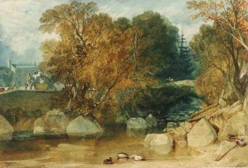
Ivy Bridge is a more conventional depiction of the subject, but a much more painterly approach, compared to the Sandby Brothers’ style. In the Dudley watercolour, showing the effects of industrialization on the Landscape, the use of colour dominates over the drawing and the contrasting colour areas almost seem to explode.

JMW Turner 1813 Ivy-Bridge    JMW Turner c1832 Dudley

Ivy Bridge 1813 http://antonk.com/wp-content/uploads/2012/04/Ivy-Bridge-water-colour-painting-by-J.-M.-W.-Turner-in-1813-trees-river-ducks.jpg

Dudley c1832 http://www.artfund.org/what-to-see/exhibitions/2014/02/14/turner-travels-light-and-landscape-exhibition – depicting the effects of industrialization. In the typical style of turner – no details.

Thomas Girtin (English, 1775 – 1802)

Although born at the same time as Turner, his works look much more conventional and closer in style to the Sandby brothers. But this may also be because he died at young age. Maybe he’d developed very differently with increasing maturity.

I found the two versions of Durham Cathedral very interesting. The earlier one is a drawing with monochrome washes to increase contrasts, the second is a coloured drawing with some looser, more painterly elements in the water and sky. A bit of loosening up the definition given by the drawing is happening.

Thomas Girtin 1799 Framingwell bridge     Thomas Girtin c1800 Durham Cathedral and Castle

Thomas Girtin 1801 Kirkstall Abbey, Yorkshire Kirkstall Abbey, Yorkshire (1801) also looks like a colourized drawing. But although less radical than Turner, I also see the departure from the Sandby’s more illustrative style towards a more painterly use of watercolours.

Framingwell Bridge 1799. http://commons.wikimedia.org/wiki/File:Thomas_Girtin_002.jpg

Durham Cathedral and Castle c1800 http://commons.wikimedia.org/wiki/File:Thomas_Girtin_%28British_-_Durham_Cathedral_and_Castle_-_Google_Art_Project.jpg

Kirkstall Abbey, Yorkshire 1801 http://en.wikipedia.org/wiki/File:Thomas_Girtin_003.jpg


Beginning of the 20th century

John Singer Sargent, John Piper

John Singer Sargent (USA, 1856 -1925)

I already researched John Singer Sargent in a separate article, but haven’t looked particularly at landscape depictions. I love his colourful watercolours.

John Singer Sargent 1917 palmettos-floridaI discovered the Palmettos, Florida (1917), which are not exactly a landscape but they are personally important for me because of the similarity to my agave plants! Great how Sargent played with the green tones. I realize how much more I could have made out of my cuban plants… It may be a question of courage to paint what I see and be more radical in my use of colour and contrast.

All in all, it was quite difficult to find depictions of buildings in landscape in watercolour made by John Singer Sargent! What I found was either landscape/nature or building, not both, or it was made in oil on canvas… The Hills of Galilee c 1906 was one of the few which offer a wide open view over a landscape. I found it interesting to see how Sargent’s style worked with this different subject. The Venetian Canal Scene shows some houses and a more open view than other Venice watercolours. But somehow I find both of them not very characteristic for Sargent’s style, of which I see more in the palmetto watercolour.

John Singer Sargent c 1906 Hills of Galilee     John Singer Sargent venetian-canal-scene

John Singer Sargent 1918 a-wrecked-sugar-refineryThe Wrecked Sugar Refinery (1918) impressed me by the choice of subject. It may have been related to the war, or simply because of changes in the economy of the sugar industry? The painting is difficult to read because elements of comparative size are missing. A sugar refinery must consist of huge steel constructions, but the painting does not have any elements to assess the size of what is depicted, for example some humans or houses. As it is, this could also be a little heap of rusted metal! Nevertheless, I think it’s an extraordinary painting for the use of colour and the unromantic topic.

Two more landscape depictions I found interesting were Corfu (c1909) and Fortress reads and rocks (undated). The Corfu painting has that tree stem going from lighter-than-background to upwards much darker. I encountered this effect in my Assignment 3 watercolour and had great trouble to paint it! Here it actually looks quite simple to achieve… The style is very rough and bold, even more so in the Fortress road and rocks painting. This is quite a departure from the 18th/19th century accuracy in depicting trees and houses in a landscape.

John Singer Sargent Corfu    John Singer Sargent fortress-roads-and-rocks

The 1917 Palmettos, Florida http://uploads3.wikipaintings.org/images/john-singer-sargent/palmettos-florida-1917.jpg
Hills of Galilee c 1906 http://www.wikipaintings.org/en/john-singer-sargent/hills-of-galilee
Venetian Canal Scene http://uploads1.wikipaintings.org/images/john-singer-sargent/venetian-canal-scene.jpg
Wrecked Sugar Refinery (1918) http://uploads1.wikipaintings.org/images/john-singer-sargent/a-wrecked-sugar-refinery-1918.jpg
Corfu c.1909 http://www.jssgallery.org/paintings/corfu.htm
Fortress roads and rocks http://www.wikipaintings.org/en/john-singer-sargent/fortress-roads-and-rocks

John Piper (English, 1903 – 1992)

John Piper’s works are quite distant from typical landscape depictions. I found it difficult to select images because what I found were mixed media paintings with drawn elements, and many prints. So in a way, they are difficult to compare to the more traditional approaches.

The artist had been among the officially designated British war artists, and I recognize an element of darkness which I had found in works of other war artists researched earlier, for example Paul Nash and Eric Ravilious.

I selected four paintings that fall broadly under the heading of landscape to illustrate the modern approach. Slopes of Glyder Fawr (1947) is indeed a landscape, made in watercolour with pen & ink. I still find it radical in its use of colour (all dark) and perspective, with almost no sky left and contrasting horizontal and vertical elements. The Dairy, Fawley Court (1940) depicts a church and some trees, the style apparently influenced by cubism.

John Piper 1947 Slopes of Glyder Fawr, Llyn Adwal, Caernarvonshire, Wales pen, ink & watercolour   The Dairy, Fawley Court 1940 by John Piper 1903-1992

The Whitehorn Priory is another church, but a very different style. It is based on a drawing, but then watercolour is applied in a very patchy manner, making the building and the painting look vibrant and “unfinished” in a positive sense. The Town in the Charente (1957) is a mixed media work, combining watercolour with gouache, ink and wax resist. The style is abstract beyond cubism, with a dark yet vivid pattern of colours, contrasts and shapes.

John Piper Whitehorn Priory    John Piper

What I appreciate is that these works illustrate that is no rule to forbid mixing watercolours with any other media or technique appropriate to convey an idea. This is important for me because when I was thinking about technical approaches to the Cuban Landscape I painted for the Aerial Perspective exercise, I had considered using oil pastels for the Agave plants in the foreground, and for the light effects of the stone fence. This would have permitted a more generous working style for the background, with darker washes which would not overpaint the foreground elements in oil pastels. But then I shyed away, sticking to a more conventional approach, maybe postponing experiments to a later stage.

Slopes of Glyder Fawr, Llyn Adwal, Caernarvonshire, Wales 1947 http://poulwebb.blogspot.com/2012/08/john-piper-part-1.html
The Dairy, Fawley Court 1940 http://poulwebb.blogspot.com/2012/08/john-piper-part-1.html
Whitehorn Priory http://www.portlandgallery.com/artist/John_Piper/item/all/12898/Whitehorn_Priory
Town on the Charente 1957 http://www.olympia-antiques.com/gallery/item/john-piper-ch-lg-town-charente

Concluding remarks

I’m not sure whether I’ve done myself a favour with this research point. Somehow it was too much squeezed in a single research session. It is one thing to look at artists’ works and be inspired, and another to write a text about it. The obligation to write down notes and observations in the learning log switches the focus from internal engagement with a topic to communicating something intelligible about it. Despite these objections, I found the research quite interesting. I only wish I had more time to do everything more thoroughly, both the research part and the writeup part.

I have seen so much that it’s hard to decide where to begin with all the possible improvement and inspirations I came across. Maybe there’s one central theme for me – be more adventurous and experimental, and practice many different approaches. I thought it’s all a matter of practicing to see and depict things, but there’s also the technical aspect of learning the different effects that can be achieved with watercolours.

Aerial perspective

Preparatory studies: Experimenting with elements of aerial perspective, using the palette of Thomas Girtin in Westminster and Lambeth

Despite some theoretical knowledge, I had never before actually painted “aerial perspective” and therefore wanted to make some colour testing before approaching the exercises. I chose Thomas Girtin’s painting and tried to isolate the elements of aerial perspective that the course materials described. So I experimented a bit in my watercolour sketchpad. I chose the Yarka Watercolours which come in a box, anticipating these might be the colours I’d take with me on outdoors excursions. First I selected colours resembling those used by Thomas Girtin: Russian green, gold ochre, raw umber and neutral black. The green was a bit too colourful, but otherwise I found the hues were a good match.

Thomas Girtin c1801 Westminster_and_lambeth from British Museum        P1070584

P1070580Then I made one abstract sketch with just dots to try out colour contrasts. I wanted to have areas with strong contrast of reddish orange and green, and other areas with less intense contrasts by mixing in raw umber to tone down. I think the red-green contrast comes indeed to the fore, whereas the areas where colours are more similar seem to recede. The funny thing is that I misinterpreted the course text which referred to “Tonal contrast” to mean colour contrast and this way seem to have discovered another element that can add to a sense of depth.

P1070583I made a second page to look at tonal contrast, using the colour sepia. The idea was to see whether areas of high contrast, where very dark and very light elements were adjacent, would come to the foreground compared to other areas with more similar colours in dark, medium or light tonal values. I used geometrical forms and painted in portrait format. Indeed the highly contrasted areas seem to capture attention, compared to those areas with more similar colours. This may be a combined effect of my painting little dots and patterns of dark onto light background, which can be interpreted as the third aspect: More detail in the foreground. I feel that the darker colours in general seem to come to the foreground and the lighter colours recede. This would be the fourth element (lightening of palette).

So the problem with this kind of abstract experiment is that the elements are normally supported by the actual traits of the landscape and do not appear in pure forms. But doing this exercise helped me internalizing what to look out for!

Exercise: Aerial perspective in an uban landscape: Drawings
Exercise: Aerial perspective urban landscape – painting

I made an excursion to the Brooklyn Bridge for this exercise, taking a sketchbook, drawing utensils and a camera with me. It was Sunday, Mother’s Day and beautiful weather, and the bridge was crowded… no way could I have bring myself to draw there amidst all the people. Nevertheless I enjoyed my trip and made several photos of the bridge itself and taking views onto Manhattan from the bridge and later from the promenade in Brooklyn Heights.

Reviewing my photos, I decided on two for exploratory sketching to find out which one might work as a watercolour painting. One had people in the foreground, whose clothes gave nice colour spots, but then I decided against this one because I thought that the figures would look frozen in a painting focused on an urban landscape. So I chose the second view which also seemed to work better because the lower half wasn’t blocked by the construction fence.

P1070558    P1070560

I began by making an outline drawing, as suggested by the course materials, then painted light colours first and increasingly darker tones. I painted several hours, almost an entire day, with breaks.

I’m not really happy with the result because I think the painting looks overworked and the colours are not bright and glowing. Somehow I think I did not do justice to the medium, rather treated my material as if it was Gouache paint. Assessing my work so far, I don’t think that there’s progress compared to the initial perspective paintings. It rather feels like I was repeating old errors – fiddling with detail, too many layers, unskillful brush strokes. I made a second painting after the first one, trying to work more energetic and generous, and improving the colour intensity. Both paintings are on 40 x 50 watercolour sheets.

P1070561   P1070564

Unfortunately I’m at a motivational low with the course right now. I don’t feel that the exercises help me to move forward. Maybe they are too complex for my current skill level. I feel overwhelmed by the complexity of a landscape and the task of painting from photo seems like a chore. I really wanted to paint outside but I cannot get over my embarrassment of drawing or painting in public settings. I’m really frustrated at the moment and can’t find pleasure in this part’s exercises. I really hope that the more experimental approach of the next course part will get me back on track with watercolours. Otherwise I might never touch the medium again after completing this course!

PS: Looking at them now, some days later, I’m much less negative about these paintings. In particular the first, more detailed one – I’m beginning to like it. I don’t know why I’m so often extremely dissatisfied immediately after finishing a painting, only to find “oh it’s not that bad actually” when I look at it again a few days later! I was tempted to delete the paragraphs with all the negative comments and my frustration, but then decided to leave it in – to remind me of how I actually felt!

Exercise: Aerial perspective in rural landscape

The weather forecast wasn’t good and rather than again postponing my work for the course, I decided to continue working from photos. I chose a photo made in 2005 when I travelled to Cuba. I saw many elements of aerial perspective: Stronger colours of plants and a stone fence in the foreground, a midground of subdued tones and less contrast, and finally a far background with a line of mountains in a blueish tone.

I began my work on this topic with a pencil drawing from the photo in my 23 x 30 cm sketchbook and was surprised by my own patience for the task. Compared to what I achieved in the drawing course, I think this is one of my better landscape drawings. Then I made two watercolour studies in the A4 watercolour sketchbook, one of the entire scene and the other of the plant detail. I made another pencil study of the further background because I found it very difficult to depict “non-detail” the tiny trees, bushes and fields. Finally I attacked a larger painting in 38 x 48 cm.

P1070566   P1070573

P1070568   P1070569

P1070575

I’m quite satisfied with my work for this exercise and luckily got over the motivational crisis from the previous exercise. I think there are small improvements everywhere – the wash for the sky is more regular and the clouds have something cloudy about them. I tried out different brushes and how I could capture the somewhat bizarre shapes of the agave plants in the foreground.

I think the final painting captures distance quite nicely, in particular the silhouette of the mountains in the very far background helps to achieve this. The foreground has much more detail and stronger contrasts. I struggled with the middle distance because there were so many small elements in low contrast, and I didn’t know how to depict this. I tried several techniques, like making marks with a dry brush and a sponge, but it worked out less well than I had hoped. Nevertheless I feel the painting represents a step forward.

The colours in this painting are colder than that of the landscape in the photos, particularly in the medium distance. This is probably a result of my choice of brown tones – apparently I chose the cooler tones. But it may also effect from too much layering in the midground. The effect is still exaggerated in the digital image I took of the final painting. Maybe another layer of golden ochre would improve the overall effect, but I’d risk to create a muddy overall tone so I’d rather not try on this painting. Probably choosing warmer base tones would have been necessary.