I was quite overwhelmed by this research point. The instructions mentioned 7 or 8 artists from different time periods, and I came across three more contemporary watercolourists. I was curious about them all, so I researched them all… it was a decision between selecting only one or two and digging deeper, or trying to get acquainted with them all, but more superficially. I chose the latter and will include selected works that I found particularly interesting.
Contemporary watercolourists
David Prentice, David Curtis, Trevor Chamberlain
Edward Wesson, Edward Seago, John Yardley
David Prentice (English, 1936 – 2014)
What I found interesting in these watercolours was how the complex landscape was simplified into larger shapes, and how the light was captured. Both paintings I selected are backlit scenes, which accounts for a reduction of detail and dominance of silhouette shapes rather than surface texture. I particularly like the intense colours and would like to adopt some of this in my own watercolour practice.


Black Hill below British Camp (2007) http://en.wikipedia.org/wiki/David_Prentice
Green July, Herfordshire Lane http://www.lemonstreetgallery.co.uk/exhibitionImages/summer-exhibition-2012/Herefordshire-Lane-Green-July.jpg
David Curtis (English, born 1948)
Another contemporary watercolourist, but with a much more detailed approach. I was impressed by how the glaring summer light was captured in these two watercolour paintings. Interesting is also how the amount of detail is balanced from foreground to background. I think the atmosphere of a hot summer day in New York is captured perfectly in the second. The colours are much less intense, I think the main focus on was the extremely bright light.


Main street through Bubinon, Sierra Nevada
Street corner vendor, New York
Artist home page with gallery of watercolours: http://www.djcurtis.co.uk/david-curtis-watercolours.php
Trevor Chamberlain (English, born 1933)
I found these watercolours very atmospheric. They are less detailed than those of David Curtis and mostly in pale colours, with few hard contrasts. The focus is on tonality here. The rain scene is painted in cooler colours. The harbour scene is in warmer colours which creates the atmosphere of late afternoon on a sunny day. The landscape elements are mostly painted as shapes against a lighter background. Internal details are present in the foreground, but not in the background.
Technically, I think there is a mix of wet-in-wet and wet-on-dry: Wet in wet makes the colours run into another, while wet-on-dry is used to create the more defined shapes.
What I would like to learn is this way of focusing on simple structures and including only the amount of detail that is necessary to create recognizable elements. I realize that I need much more practice in the different watercolour techniques!


Rowers, River Lea http://www.mineonline.co.uk/trevor_chamberlain_roi_rsma__.php
Umbrellas, Charles Bridge, Prague. http://imageweb-cdn.magnoliasoft.net/bridgeman/supersize/trc115549.jpg
(Boats on a river with Buildings in the background) http://www.wetcanvas.com/Community/images/02-Oct-2004/47691-Chamberlain.jpg
River Arno, Florence http://www.myartprints.co.uk/a/chamberlain-2/riverarnoflorencewconpape.html
I found three more contemporary watercolour artists referenced in a Webforum post: Edward Wesson, Edward Seago, and John Yardley, and decided to follow up.
Edward Wesson (English, 1910 – 1983)
 These watercolours are also very atmospheric, buildings included as silhouettes in the London Bridge painting and in brighter colours with more details in the Ostend Harbour scene.
I’m beginning to recognize the watercolour principle: Wet-in-wet is used for tonal gradations, wet-over-dry when clearer lines for details and shapes are needed. Leaving out white areas creates the impression of intense sunlight.


London bridge at dawn
Ostend Harbour
Waxham Beach, Norfolk
From Somerset Fine Art collection of works online, http://somersetfineart.co.uk/rw_shop/ShopViewCat.php?&cat=1405&man=867&dx=1&ob=3&rpn=shopviewcat1405&page=2&sid=a8401e87e77e424b41fcf460acb6cf7d&page=1
Edward Seago (English, 1910 – 1974)
The style is again atmospheric with few details. The focal points of the paintings are where contrasts are stronger and details are included.


Spanish coast, torremolinos from Portland Gallery – very minimalistic both in colours and detail.
Boatyard on the Norfolk Broads – more details, more contrasts, more colours. The houses and boats are defined shapes in contrast to the loose style used for the landscape elements. The clouds are impressive in this one!
Image collection at Portland Gallery, UK http://www.portlandgallery.com/artist/Edward_Seago
John Yardley (English, born 1933)
Boats at Cadaquez – a harbour scene with boats, houses and hills in the background. Strong contrasts in small elements create a very vivid picture
Winter at Philips House – A house, fields, cows, and snow. I wonder a bit whether the cows would really be outdoors in winter – I know only cows that are kept inside during wintertime! But the watercolour is lovely.
Both watercolours make use of the dry brush technique. This breaks up some otherwise uniform areas of colour and creates the effect of light reflecting on the surface, for example at the edges of the boats and the shadows in the snow.
Again I’m impressed by the simplification of detail and the apparently very fast working style. This is something I’d like to adopt!


Bourne Gallery, Artist page and online gallery at http://www.bournegallery.com/artist/details.asp?artist_id=101
18th and 19th century
Sandby Brothers, Turner, Girtin
Sandby Brothers: Paul Sandby (1730 – 1809) and Thomas Sandby (1721 – 1798)
These watercolours from the 18th century are very different in style from the contemporary ones. To me they look like colourized drawings and less like paintings. The difference may also be a consequence of different painting materials available at that time.
Paul Sandby was the younger brother. Despite the much more detailed and naïve approach, I see a similarity to contemporary watercolourists in focus on light effects and the attempt to capture mood and atmosphere of a landscape. But the buildings have finer internal structure details, apparently painted slowly and with attention to small elements and exact shadings.


Iron Forge, Barmouth North Wales, http://commons.wikimedia.org/wiki/File:Iron_Forge_Barmouth_N._Wales_by_Paul_Sandby.jpg
The Old Welsh Bridge http://www.darwincountry.org/assets/userfiles/index.php?GetFile=/assets/userfiles/large/sy1496.jpg
Rochester, Kent c. 1785-95 http://www.tate.org.uk/art/artworks/sandby-rochester-kent-t08474
Windsor Castle, Northeast terrace c. 1760 http://pt.wikipedia.org/wiki/Paul_Sandby
Thomas Sandby, the elder brother, was an architect by profession and this is reflected in his watercolours. They focus on accurate depiction of building details, and correct perspective. Landscape elements like trees are stylized, but differently from comtemporaries in that there is much more internal structure.


Windsor Castle from the Great Park http://www.vam.ac.uk/__data/assets/image/0004/238549/sandby_windsor_castle.jpg
Whitehall Showing Holbein’s Gate and Banqueting Hall, c. 1760 http://commons.wikimedia.org/wiki/File:Thomas_Sandby_-_Whitehall_Showing_Holbein%27s_Gate_and_Banqueting_Hall_-_Google_Art_Project.jpg
J.M.W. Turner (English, 1775 – 1851)
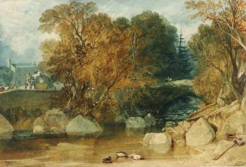
Turner has the label “romanticism” attached. I think he has a somewhat revolutionary treatment of colour in his watercolours, compared to his contemporaries – loosening up the boundaries given through a detailed underdrawing.
Ivy Bridge is a more conventional depiction of the subject, but a much more painterly approach, compared to the Sandby Brothers’ style. In the Dudley watercolour, showing the effects of industrialization on the Landscape, the use of colour dominates over the drawing and the contrasting colour areas almost seem to explode.


Ivy Bridge 1813 http://antonk.com/wp-content/uploads/2012/04/Ivy-Bridge-water-colour-painting-by-J.-M.-W.-Turner-in-1813-trees-river-ducks.jpg
Dudley c1832 http://www.artfund.org/what-to-see/exhibitions/2014/02/14/turner-travels-light-and-landscape-exhibition – depicting the effects of industrialization. In the typical style of turner – no details.
Thomas Girtin (English, 1775 – 1802)
Although born at the same time as Turner, his works look much more conventional and closer in style to the Sandby brothers. But this may also be because he died at young age. Maybe he’d developed very differently with increasing maturity.
I found the two versions of Durham Cathedral very interesting. The earlier one is a drawing with monochrome washes to increase contrasts, the second is a coloured drawing with some looser, more painterly elements in the water and sky. A bit of loosening up the definition given by the drawing is happening.


 Kirkstall Abbey, Yorkshire (1801) also looks like a colourized drawing. But although less radical than Turner, I also see the departure from the Sandby’s more illustrative style towards a more painterly use of watercolours.
Framingwell Bridge 1799. http://commons.wikimedia.org/wiki/File:Thomas_Girtin_002.jpg
Durham Cathedral and Castle c1800 http://commons.wikimedia.org/wiki/File:Thomas_Girtin_%28British_-_Durham_Cathedral_and_Castle_-_Google_Art_Project.jpg
Kirkstall Abbey, Yorkshire 1801 http://en.wikipedia.org/wiki/File:Thomas_Girtin_003.jpg
Beginning of the 20th century
John Singer Sargent, John Piper
John Singer Sargent (USA, 1856 -1925)
I already researched John Singer Sargent in a separate article, but haven’t looked particularly at landscape depictions. I love his colourful watercolours.
 I discovered the Palmettos, Florida (1917), which are not exactly a landscape but they are personally important for me because of the similarity to my agave plants! Great how Sargent played with the green tones. I realize how much more I could have made out of my cuban plants… It may be a question of courage to paint what I see and be more radical in my use of colour and contrast.
All in all, it was quite difficult to find depictions of buildings in landscape in watercolour made by John Singer Sargent! What I found was either landscape/nature or building, not both, or it was made in oil on canvas… The Hills of Galilee c 1906 was one of the few which offer a wide open view over a landscape. I found it interesting to see how Sargent’s style worked with this different subject. The Venetian Canal Scene shows some houses and a more open view than other Venice watercolours. But somehow I find both of them not very characteristic for Sargent’s style, of which I see more in the palmetto watercolour.


 The Wrecked Sugar Refinery (1918) impressed me by the choice of subject. It may have been related to the war, or simply because of changes in the economy of the sugar industry? The painting is difficult to read because elements of comparative size are missing. A sugar refinery must consist of huge steel constructions, but the painting does not have any elements to assess the size of what is depicted, for example some humans or houses. As it is, this could also be a little heap of rusted metal! Nevertheless, I think it’s an extraordinary painting for the use of colour and the unromantic topic.
Two more landscape depictions I found interesting were Corfu (c1909) and Fortress reads and rocks (undated). The Corfu painting has that tree stem going from lighter-than-background to upwards much darker. I encountered this effect in my Assignment 3 watercolour and had great trouble to paint it! Here it actually looks quite simple to achieve… The style is very rough and bold, even more so in the Fortress road and rocks painting. This is quite a departure from the 18th/19th century accuracy in depicting trees and houses in a landscape.


The 1917 Palmettos, Florida http://uploads3.wikipaintings.org/images/john-singer-sargent/palmettos-florida-1917.jpg
Hills of Galilee c 1906 http://www.wikipaintings.org/en/john-singer-sargent/hills-of-galilee
Venetian Canal Scene http://uploads1.wikipaintings.org/images/john-singer-sargent/venetian-canal-scene.jpg
Wrecked Sugar Refinery (1918) http://uploads1.wikipaintings.org/images/john-singer-sargent/a-wrecked-sugar-refinery-1918.jpg
Corfu c.1909 http://www.jssgallery.org/paintings/corfu.htm
Fortress roads and rocks http://www.wikipaintings.org/en/john-singer-sargent/fortress-roads-and-rocks
John Piper (English, 1903 – 1992)
John Piper’s works are quite distant from typical landscape depictions. I found it difficult to select images because what I found were mixed media paintings with drawn elements, and many prints. So in a way, they are difficult to compare to the more traditional approaches.
The artist had been among the officially designated British war artists, and I recognize an element of darkness which I had found in works of other war artists researched earlier, for example Paul Nash and Eric Ravilious.
I selected four paintings that fall broadly under the heading of landscape to illustrate the modern approach. Slopes of Glyder Fawr (1947) is indeed a landscape, made in watercolour with pen & ink. I still find it radical in its use of colour (all dark) and perspective, with almost no sky left and contrasting horizontal and vertical elements. The Dairy, Fawley Court (1940) depicts a church and some trees, the style apparently influenced by cubism.


The Whitehorn Priory is another church, but a very different style. It is based on a drawing, but then watercolour is applied in a very patchy manner, making the building and the painting look vibrant and “unfinished” in a positive sense. The Town in the Charente (1957) is a mixed media work, combining watercolour with gouache, ink and wax resist. The style is abstract beyond cubism, with a dark yet vivid pattern of colours, contrasts and shapes.


What I appreciate is that these works illustrate that is no rule to forbid mixing watercolours with any other media or technique appropriate to convey an idea. This is important for me because when I was thinking about technical approaches to the Cuban Landscape I painted for the Aerial Perspective exercise, I had considered using oil pastels for the Agave plants in the foreground, and for the light effects of the stone fence. This would have permitted a more generous working style for the background, with darker washes which would not overpaint the foreground elements in oil pastels. But then I shyed away, sticking to a more conventional approach, maybe postponing experiments to a later stage.
Slopes of Glyder Fawr, Llyn Adwal, Caernarvonshire, Wales 1947 http://poulwebb.blogspot.com/2012/08/john-piper-part-1.html
The Dairy, Fawley Court 1940 http://poulwebb.blogspot.com/2012/08/john-piper-part-1.html
Whitehorn Priory http://www.portlandgallery.com/artist/John_Piper/item/all/12898/Whitehorn_Priory
Town on the Charente 1957 http://www.olympia-antiques.com/gallery/item/john-piper-ch-lg-town-charente
Concluding remarks
I’m not sure whether I’ve done myself a favour with this research point. Somehow it was too much squeezed in a single research session. It is one thing to look at artists’ works and be inspired, and another to write a text about it. The obligation to write down notes and observations in the learning log switches the focus from internal engagement with a topic to communicating something intelligible about it. Despite these objections, I found the research quite interesting. I only wish I had more time to do everything more thoroughly, both the research part and the writeup part.
I have seen so much that it’s hard to decide where to begin with all the possible improvement and inspirations I came across. Maybe there’s one central theme for me – be more adventurous and experimental, and practice many different approaches. I thought it’s all a matter of practicing to see and depict things, but there’s also the technical aspect of learning the different effects that can be achieved with watercolours.

 Version 1 (left), Version 2 (right) of the Cuban landscape
 The dull colours may have to do with the photo source I used, which depicts the landscape on a slightly foggy day and the colours are indeed subdued. I worked from the computer screen and depending on the angle of the screen, the photo appeared lighter or quite dark. Interestingly, the dark version had much more appeal to me because the plant shapes against the sky came out much more clearly and in greater light-dark-contrast.